Typophile

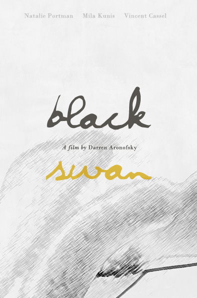
(My) Black Swan poster

TheFlyOnTheWall

Hello!

I'm fascinated with the "Black Swan" movie, I just had to make my own poster for it. :)
I went the minimalist way. Any comment/critique would be welcome! ;)
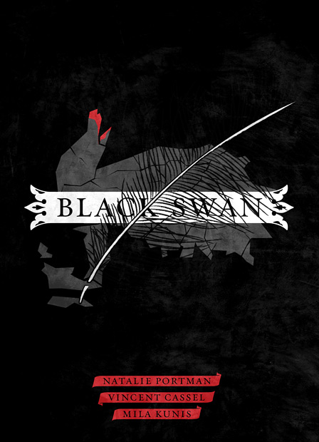
P.s. The movie had some interesting teaser posters: http://www.laboca.co.uk/LB3site/portfolio_BlackSwan.html

This last one seems a little bit too much on the horror side…

You do have a point. The movie is pretty scary, though. :)

Here's the first version:

I like it more: it goes the minimalist route to the end.

Nice start! The feather is a bit distracting.
Could you try to integrate it more with the type?
Or get rid of the ornamental place holder?

I'll try. :)
Thanks for commenting! Will post new versions...

New version. :)

I plan to make an illustration combining the "nude" and a swan.. (there are some similarities in certain lines and shapes) the above poster is just a sketch... I would like to hear any comments if you have them. :)

I find it interesting. The drawing is a bit confused, though. And I’m not sure about the colour of the word “swan”.

Captured from web.archive.org on 18 Apr 2015. view this capture