Hi, Nice one!
I think the stem if I'm not mistake of a could be a little more longer and the counter smaller.
I don't like the bowl of g, the bottom part looks skinny.
Hi all,
First of all, Merry Christmas to all of you who celebrate it on 25th.
We, orthodox, need to wait for it till January 7th, so I hope we're all find new ideas in 2011.
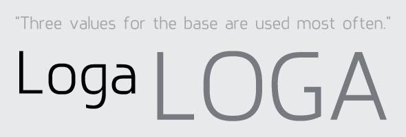
This is another sans serif typeface I'm working on.
It have some roughen look and it gives a impression like it's something between square/techno/block and sans typefaces.
What do you think?
Does it have some personality and flow?
Ignore metrics.
| Attachment | Size |
|---|---|
| Loga_ver1.pdf | 121.62 KB |
Hi, Nice one!
I think the stem if I'm not mistake of a could be a little more longer and the counter smaller.
I don't like the bowl of g, the bottom part looks skinny.
Thanks Claire.
I agree with you.
- "a" is not looking good;
- bottom part of "g" should be longer;
Captured from commoncrawl.org on 19 Apr 2015. original URL