
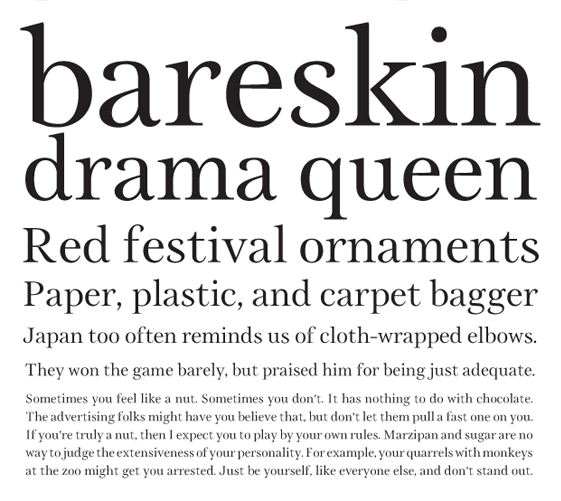
Since this is my first font meant for text sizes, I'd appreciate any constructive criticism. The goal is to make a readable magazine-friendly typeface that appears very crisp and curvy— maybe even floral.
| Attachment | Size |
|---|---|
| myserif.pdf | 121.54 KB |
| Attachment | Size |
|---|---|
| myserif.pdf | 121.54 KB |

That's a great start! I really like the g. I think the bowl of your /a/ could use some more didot'ness. Meaning the top part of the bowl going in a more horizontal direction, but perhaps that's just personal flavour. I think you should give the /y/ a round terminal. The way it is now really looks out of place to me. It would probably be better for legibility if you make the arm of the /r/ end more open, so that the terminal points in a more horizontal direction, instead of downwards. That way you could also make it more compressed which would make IMO a better texture. For comfortable reading at small pntsizes, it would probably help if you make all thin lines a little thicker. Keep going!

The details and delicacy of this don't say "text sizes" to me. It's handsome work, though.
You might want to extend the baseline serif of r on the right to help fill in that gap.

Very interesting....would love a TTF font file myself of your typeface....

What a beauty. There was any further development?

Very nice. It's like Baskerville after a couple of pints.
hhp
Sorta, it turned into a higher-contrast display face, seen in this thread: http://typophile.com/node/91783
Captured from web.archive.org on 19 Apr 2015. view this capture