Typophile

GRUMPY! DISPLAY!

I've started the extreme contrast variant of Grumpy. What do you think?
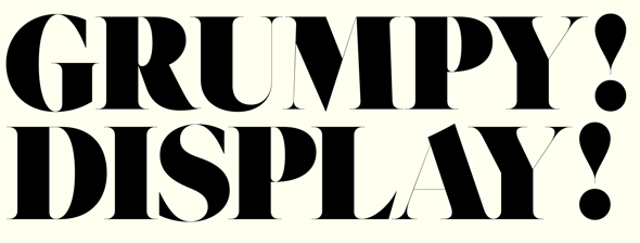

Some of the diagonal hairlines are pretty tough to handle, but overall it seems to work pretty well.
I also finished the basic Black variant, and ended up with some 2000 kerning pairs, and with class based kerning on top of that, so there should be enough to go around.

AttachmentSize
Grumpy-sample.pdf121.06 KB

That's a very attractive Numero. Just so you know, the character does have its own Unicode point: Ux2116, by the Cyrillic block.

Hoo-boy, is that a tsundere!

On the regular black, the R looks light, the s still looks light and the z still looks wide to me.
I love the three! And the alt seven is fun too.
For the display, did you try blowing the serifs on the thins way up? They look so puny to me.

Grumpy Black looks like a Bodoni/Cheltenham lovechild, I love it!

Captured from commoncrawl.org on 26 Apr 2015. original URL