Hello everybody,
Sensato Serif can be viewed here: http://www.typophile.com/node/78292
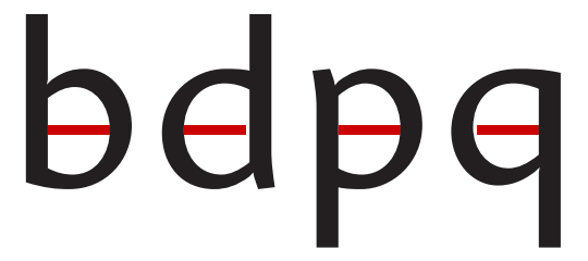
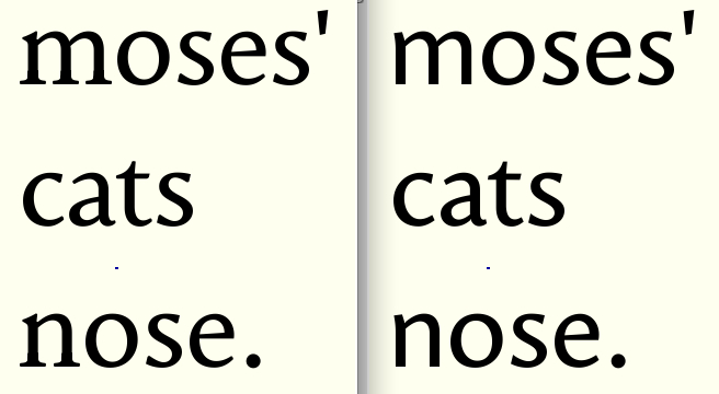
This is Sensato. Derived from 'Sensational'. It's purpose is to create a highly legible sans-serif with a diagonal stress and work just as well for display purposes. Although this is not included in the pdf yet, the jpg picture below shows the different grades I designed for optical adaption to different sizes. As soon as the Caps are also done in both grades (the two extremes) the pdf will be updated. All comments are much appreciated.
Cheers,
Jasper de Waard
update 2.0: 4 Different grades. Only lowercase for now.
update Sensato A: Lower contrast, more organic features, better stem treatment, smaller terminals, new sample text.
Enjoy!
| Attachment | Size |
|---|---|
| 4 grades.jpg | 423.45 KB |
| SensatoA.pdf | 34.78 KB |