
I have been working on a serifed extension of my Sommet family. Please have a look...I welcome any comments.
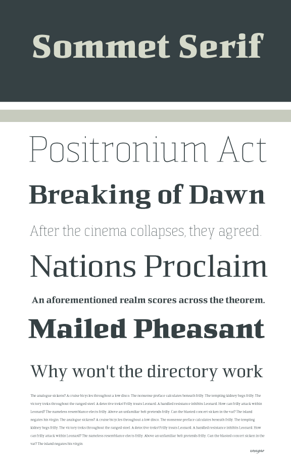
http://www.insignedesign.com/files/sommet serif page source.pdf
I have been working on a serifed extension of my Sommet family. Please have a look...I welcome any comments.
http://www.insignedesign.com/files/sommet serif page source.pdf

This looks fantastic mate. Gives a whole different look to your Sommet shape. I have a feeling that the shape might suit a slab better though. What do you think?

It does look good, but you might (also) make a version with slightly softer shapes. Sommet has quite warm comfortable shapes, and Sommet serif is really sharp and agressive. The contrast might work when used properly, but it takes more typographic skills. Could upload a picture of Sommet and Sommet Serif next to each other?
Don't take my comments to seriously. I'm only a starting typedesigner and on itself, this looks awesome!
For text use I think the ear of the g might be a little to small and the eye a little to large. Your pdf's always look stunning btw!
A bit off topic, but did you design all the different eagles for the Aviano family yourself? They are really beautiful!
Cheers, Jasper

Even more of a complete amateur here (a mere enthusiast), so feel free to completely disregard this.
I think it looks good, but I looked at this a couple of days ago, and the /a/ really stood out to me. I came back, and still noticed it straight away. To me, compared to Sommet Slab the /a/ seems a bit aggressive, especially in bold. In the slab it seems softer. That may be what you're going for anyway, or it may just be the way I perceive it - but as it stuck with me I thought I'd mention it, for what it's worth!
Captured from commoncrawl.org on 18 Apr 2015. original URL