
Hi,
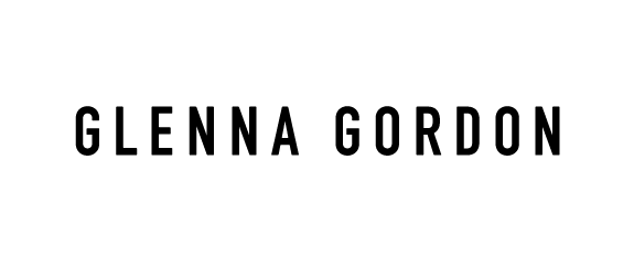
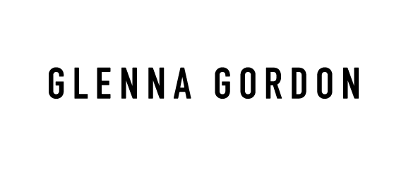
would appreciate any spacing suggestions for this logo. NN is throwing me off. Thanks in advance.
Hi,
would appreciate any spacing suggestions for this logo. NN is throwing me off. Thanks in advance.

Can you lighten the /N/s a little? The spacing looks good but the /N/s look dark to my eye.

NN looks a hair tighter than the rest with an exception of OR that looks looser than the rest.
Thanks for that. The diagonals on the NN fill out that space and seem to drag the Ns together. Subtle change.

You can always explore the option of opening up the intersecting strokes, especially for print purposes. I am assuming this will go on a business card or something? Creating some "clog reduction" would most likely reduce the "type color" for the NN, especially if it is displayed at a larger size or for print, and it does not compromise the rest of the letterform. You can see this extreme example here from Matthew Carter's font Bell Centennial.
Thanks Wesley, I'll have a look at that option. It will eventually be used in print and on screen.

Final version looks amazing! Did you draw the logotype yourself?

In light of Wesley's remarks I would also shorten the crossbars of the G's a bit…
And on an altogether other matter: the wordspace def. looks American (in other words: too wide. The same width as an N works better, I think.
I'd also consider removing G's crossbar altogether. Worth a try.
Captured from web.archive.org on 5 Aug 2014. view this capture
