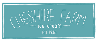
Any thoughts on my logo please :) thank you!
Here is the company and it's background explained:
I am to brand a) the ice cream as a high-end product, and b) the farm itself, which is an attraction for families, children, school groups, etc. The decision has been left to the designer to decide on factors such as the USP and target market. After visiting the farm, trying the ice cream and seeing it in situ at the Hollies Farm Shop, I have decided the products USP is the fact that it is made fresh on the farm; from the milking of the cows to making the ice cream, everything is done at the farm. I wanted to get the high-end feel to the brand, as well as keeping the 'farm fresh' feel to it, as this is my USP. Below you can see my finished logo :) It is intended that the logo has a real 'stamp of approval' feel to it. It feels very farm/homemade like without cheapening it. The colour was simply chosen from the colour of the farm building, which I think works really well. The subtle arching of the 'Cheshire Farm' is supposed to hint at hills and greenery. The 'EST' mark as I mentioned before, is intended to add the seal of approval feel, as well as perhaps expense and heritage. The typeface is hand drawn by myself.