
one of the most noteworthy font releases of this year has got to be legato by evert bloemsma. being a curious sort, i had a peek at the outlines. i was surprised that rather a lot of points are being used to describe the curves.
the green i is the legato outlines, the orange i is what i would have *expected* to see (ie minimum number of points)
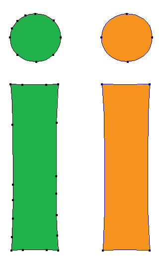
i wonder if additional points are being added at the 'font development/output stage' (ie. after the glyph has been drawn). if that's the case, why exactly? is it something to do with format conversion?
typophile input welcomed.
cheers
geraint


 but the 'tension-giving' properties of the curves is only one of legato's innovations. i think you've done an amazing job.


