
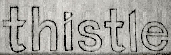
This is a concept I've had for a while, that I've only recently began to digitize. It started from the idea of an i, in which the principal stroke and the tittle form a diagonal slice. Here's my original freehand sketch:
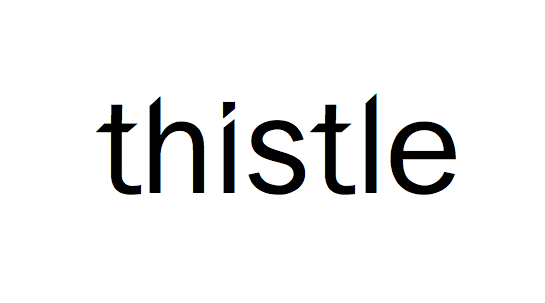
I wanted to perhaps turn this idea into a legible gothic typeface with a high x-height, round, open letterforms, and ascenders/descenders/tittles with slanted, angular ends. Here it is digitized in Fontographer:
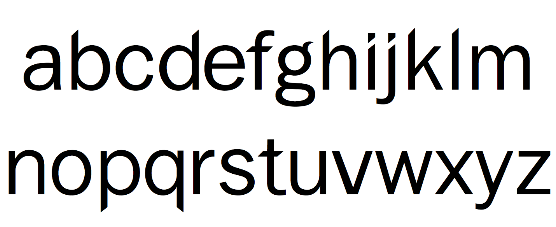
The lowercase letterforms:
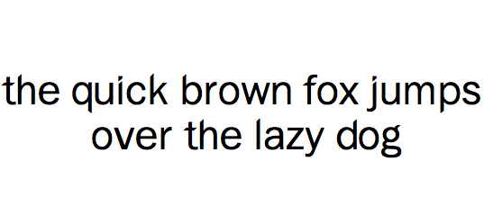
At the moment, Thistle seems better suited for a display font (it could make an excellent logotype). It's surprisingly legible at smaller sizes (although much of the distinguishing slanted strokes and tittles become lost).
Here's an example at a smaller size in a sentence:
It's still very much an inchoate idea (and I'm still a complete novice!), but I wanted to share with you what I've created so far.
Let me know your thoughts, and any ideas for the capitals, numbers, and symbols!
Cheers,
Trevor


