
I posted earlier wanting help with the tittles, currently diamonds.
here is the rest of the lowercase. I've included a few extra letters that I want some input with.
the /a/, /b/, /k/, /y/ and /z/
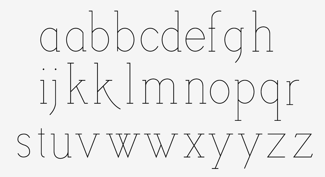
thanks
I posted earlier wanting help with the tittles, currently diamonds.
here is the rest of the lowercase. I've included a few extra letters that I want some input with.
the /a/, /b/, /k/, /y/ and /z/
thanks
just noticed the extreme difference in the descender of the /g/, /j/ and /p/, /q/, /y/
fixed now, not updated.
do you think the /c/ and /s/ need serifs?
ok, last post before someone else says something, I promise.
just plugged this in and got an .otf to test drive, debug.
results:
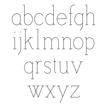
bump.
I added a meager contrast to the forms for a less formal appeal.
Also sloped the serifs away from something too angular and distant.
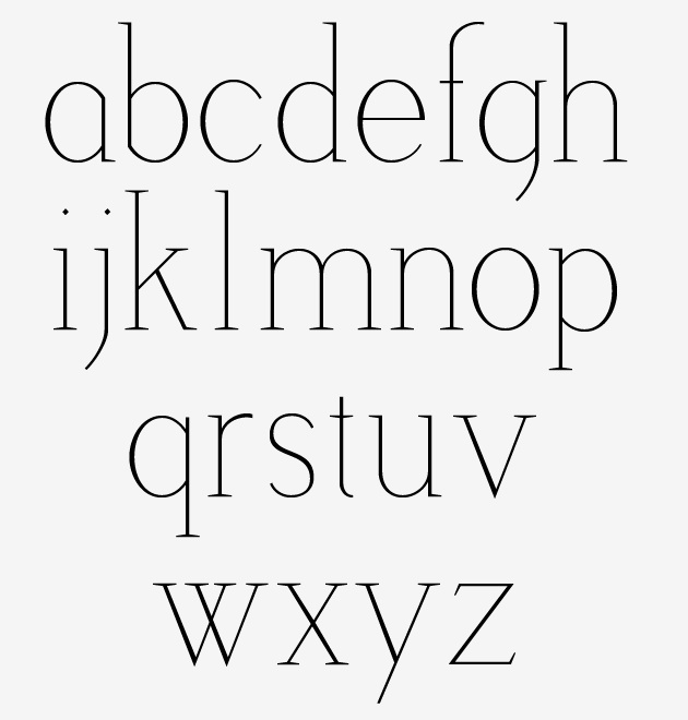
thoughts?

the s feels a bit top-heavy to me. You may also want to consider increasing the size of the dot on the i and j. They will probably start to get lost at smaller point sizes.

I like it. The new version is more distinguished. But this kind of thin contrast is tricky (see s, for example).

My thoughts:

the /o/ is very black compared to the weight of the /n/
the /s/ /r/ and /e/ will be easy fixes.
I'll work on the /j/ and post updates.
I've made sketches for the uppercase and have a lot more decisions to make.
thanks for all the help.
Captured from commoncrawl.org on 19 Apr 2015. original URL