so I've just began an idea of a simple hairline serif typeface.
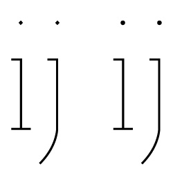
I am very early in the process of putting it together but I've come across a small dilemma: should I dot my /i/s and /j/s or do diamonds add a little class or sophistication? is there certain protocol for this or is entirely based on opinion, etc.
I've attached the letters for reference.
thanks