Hello dear Typophiles,
I'm currently working on my architectural portfolio prior to the big jobhunt, and am having some difficulty picking a typeface to suitably match the energy and vibe of the architecture.
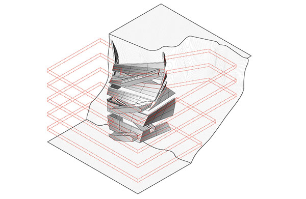
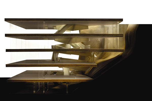
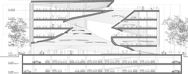
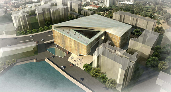
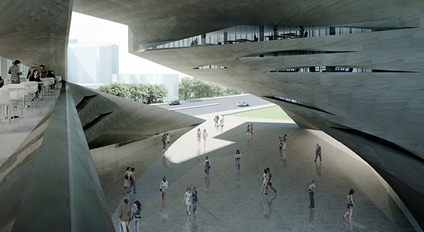
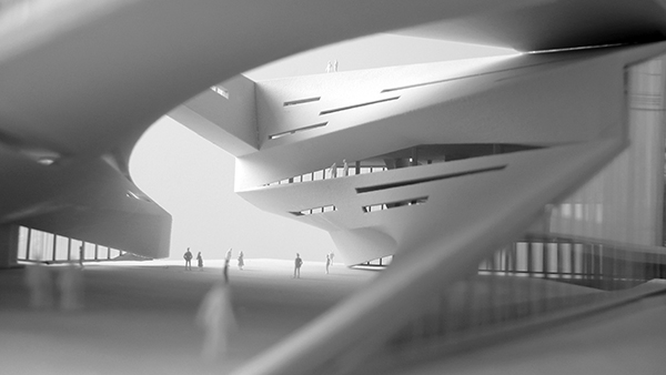
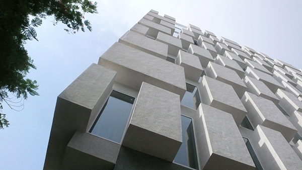
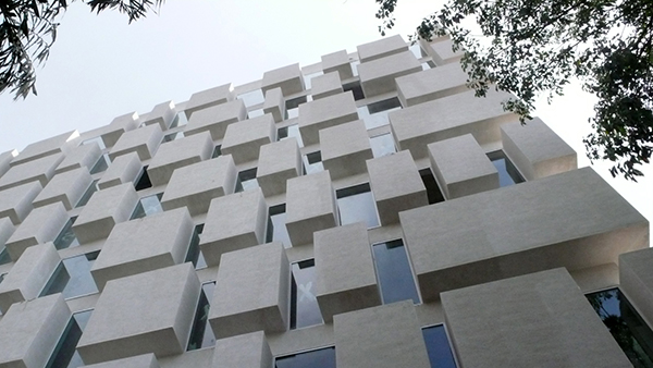
The images below show the architecture - it's very contemporary, fairly complex, bold and still somewhat delicately crafted. Would you encyclopaedic typophiles have any typefaces you could recommend to match or contrast with these buildings?
I need one Headline face and one Body Text face - I'm currently using Eureka and Myriad, but I think I could use some help. The layouts will be fairly minimal, with enough white space to let the work stand out.
Thanks in advance for your input!