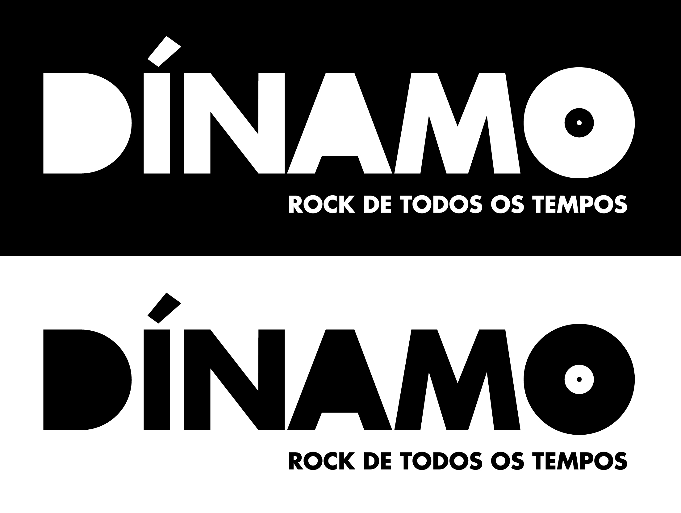
Hey guys, I'm having some difficulties with letter spacing in this logo.
Can anyone help me?
| Attachment | Size |
|---|---|
| dinamo.jpg | 456.92 KB |
Hey guys, I'm having some difficulties with letter spacing in this logo.
Can anyone help me?
| Attachment | Size |
|---|---|
| dinamo.jpg | 456.92 KB |

I wonder if there is a way to get the acute to be the arm or needle of the record player. Hmm...

The A and the D in the logo are very heavy, especially the A, and always attract my attention more than the O, which should be the focus. Also the acute looks too thin for the font.

The acute needs to be bolder and the D appears weak in comparison to other characters) whether this is fault of the typeface or not is irrelevant, I would suggest widening these a little manually). The N on the other hand looks a little too bold in comparison to the M. Possibly the centre of the O could be larger with a larger 'record-centre' if you will.
Lovely idea and not too far off being a brilliant graphic.
Thanks for all your comments, I'll work on your advices.
I'll post here once it's done.
:)
Captured from web.archive.org on 22 Aug 2013. view this capture