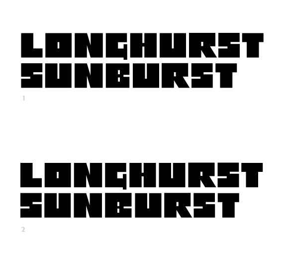
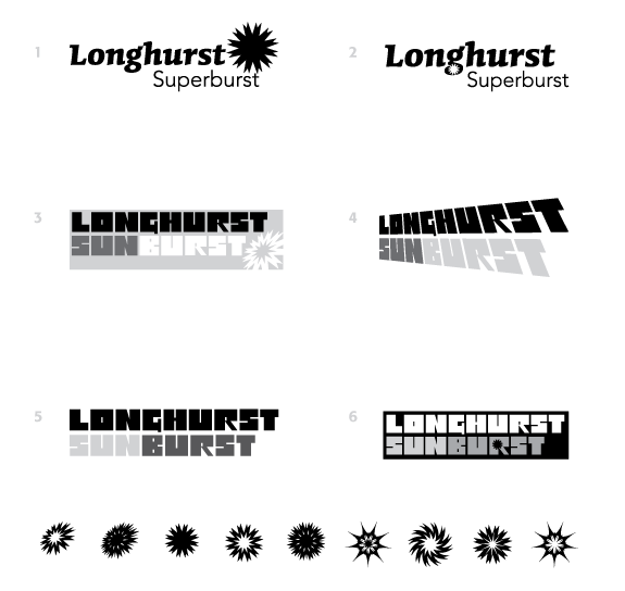
Hello. I'm putting this project up here for some critique. It is a logo design for a pro audio manufacturer start-up: Longhurst. The various products (pre-amps, compressors, tape-delays) will have names such as "Superburst," "Sunburst," etc. The company will be positioned as a small boutique manufacturer with unique sounds. Aesthetically, we're looking for something slightly nostalgic, but also fresh and solid.
The first two options use u&lc type, which is how I often approach logos. But something made me decide to try some custom lettering, and after a few different attempts, I settled on the blocky all-caps look of the lower four options. (Also came up with a whole lot of "bursts!" and tried to integrate them somehow.)
So I'd be happy if you could spare a minute to let me know what you think...
| Attachment | Size |
|---|---|
| LSB_Ideas01.png | 14.15 KB |