
Hello there,
Anyone recognizes this Geometric Sans? The "a" is very Din alike, but the characters are a bit more into the square form (look at the e).
Thanks!
a,

Hello there,
Anyone recognizes this Geometric Sans? The "a" is very Din alike, but the characters are a bit more into the square form (look at the e).
Thanks!
a,

Not so much like DIN.
More like Microsoft Sans Serif.

Hard to be certain at this size, but could be Replica. I wonder how Lineto would feel about the MS Sans comparison — ha!
Thanks. Replica is very close! Maybe this sample is from another foundry simmilar to Lineto's flavour like Neubau's.
I think It's Replica with custom thickness on illustrator, i'll let you know.
thanks again,
a,
Sorry guys for being stubborn, but this is MS Sans Serif, with a fake bold effect on the segura and maybe squooshed a little.
Check the /g/’s and the /m/!
My attempt of rebuilding it using MS Sans (quick and dirty):
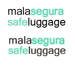
(first one MS Sans Serif / second: your example)
Joerg,
Indeed! I'll try to get a higher res version from the client, and update this topic. ;)
thanks!
a,
Just confirmed with a higher version of the logo... MS Sans Serif! We now know a cheaper alternative for Lineto's Replica ;)
Thanks!
a,
Captured from commoncrawl.org on 18 Apr 2015. original URL