Typophile

Please help: reductionist fonts, fonts with missing pieces

Jeffrey0 votes

Hi all,

I'm looking for specific fonts that have parts missing, or are very reductionist in their structure. I want to use it for a set of covers for Georges Perec books. In his books the missing memory, a void, missing letters etc. play a very important part, and I would like to reflect this in the type. It still needs to be legible, but it's OK if it's a bit puzzling. I would prefer sans-serif or slightly flared typefaces, with possibly a certain "french connection". I like Futura Black but I don"t know if this is completely what I'm looking for. Any ideas?

Thanks a lot!

Try AW Conqueror Carved Number Four.

http://www.fontsquirrel.com/fonts/aw-conqueror-carved

This link goes to Number One. But if you choose Number Four from drop-down you'll see what I mean.

I think this fits your description well:

http://www.fontbureau.com/fonts/Avia/

Avia is lovely, Kent. That might well be the right direction.

FF "Can you read me" is not really suitable I think, as it does not really fit the style of illustration I want to use. It needs to be more of a display font. But thanks.

I knew about the AW Conqueror fonts and like them a lot, but a shadow font is not really what I'm looking for here.

Any more ideas?

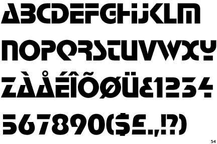
What about Stop (by Aldo Novarese; Società Nebiolo, 1971)?

Or Bifur (by A M Cassandre; D&P, 1929)?

Also, Typophile David Sudweeks had a project like this going. You may want to contact him and see where it stands.

Morphica.

Cutoff.
Auriol: you could delete parts or color parts faintly. You could do that with any stencil font.

.

Thanks Chris. Done.

Thanks all for the suggestions! I think Avia is still the closest for now to what I'm looking for.

Stop, Tralfamadore, and Morphica are a bit to techy for this. I've been considering Bifur as well, but I'm not sure yet if it's not too geometric. I like the idea of the multicolored parts, but would be better in a bit more 'postmodern' design.

Auriol is a bit too oldfashioned, Art Nouveau for this.

Just to give some more info on Perec; he lived from 1936 to 1982, was a member of Oulipo (Workshop for experimental literature) and one of the best postmodern authors. In his work he often uses constraints and mathematical structures. He was jewish (both of his parents died in WWII) and this had a significant implicit impact on his work. Missing elements (like a novel without the letter E) or storylines that revolve around a void, a loss of memory.

I hope this helps give you some ideas?!

Alphaville is constrained to vertical, horizontal, and 37° strokes (and is named after a French film).
Panoptica, which was designed for constraints-based verse by Christian Bök, is constrained to one case and monowidth (and is named after ideas in Foucault's Discipline and Punish).

Not precisely per your brief, but Alejandro lo Celso designed a large family based on Perec's work. The "Ludiques" are amenable to the puzzling, mysterious aspects you mention.

Since it's for a book cover, you could take any font and cut out various bits with most any image editing software.

See Dala Floda here:
http://commercialtype.com/

Narcotix from Sokratype?

Thanks all for the suggestions.

I was aware of the Perec typeface, and it is very nice but not what I would like to make. Might be nice for another time though.

Dala Floda is nice as well, but as I'm thinking about using Photina as well, I might try to customize it, which could be an interesting new experience for me.

Sorry Renko, I failed to read.

Captured from web.archive.org on 28 Feb 2018. view this capture