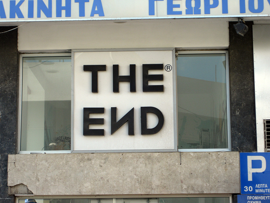
WAH! The End Is Nigh!

Cyrillic, ay? :-)

I bought a sweater there at one in Firenze, about 11 years ago.

still wondering what language this is... 

German.

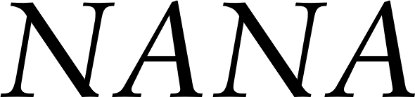
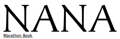
That N is rotated 180 degrees.

Is this what the "Report a problem" link at the bottom is for?
> Is this what the "Report a problem" link at the bottom is for?
if that's the case, I hope no one's gonna report that problem, as that N has been amusing me for more than four years now :)
I agree with Lindenhayn, Some things have far more value as accidental humor than for their original purpose.

Nils, they might have been thinking of «Rechtsverdreher» when they did this. A Freudian slip so to say.

There was an entire site devoted to the upsidedown N:
http://www.upsidedownn.com/

Was... it's now 403 Forbiddeu

ТНЕ ЕИD НАS СОМЕ!

>That N is rotated 180 degrees.
... on the horizontal axis. Rotating an 'N' 180° on the vertical (y) axis is still and 'N'.
?
Rotating this particular N 180° on either X or Y axis would net the same result. That is, it doesn't matter a crooked fig if it's 'up side down' or 'left side right'. Either way, it ends up looking mirrored.
@russellm - Wrong axis. The only 180° rotation that doesn't net a mirror effect on this N is the one on the Z axis.
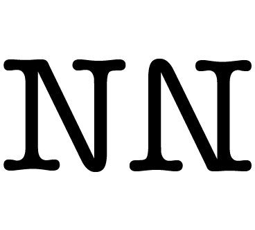
180 degree rotation.
:o)
I did make it through geometry class, but is has been a while.

Aster has a rotatable N.
I kind of did it in Richler.
Any others? (Serifed, that is.)
Any others? (Serifed, that is.)
Artefact and Morphica ;-)
True, but does the "no top left serif" category really qualify?
I mean, there are way more of those.
http://www.identifont.com/find?font=trajan&q=Go
http://www.identifont.com/find?font=elan&q=Go
http://www.identifont.com/find?font=giovanni&q=Go
http://www.identifont.com/find?font=weiss&q=Go
&c., &c.
**
In the “sort of” category:
http://new.myfonts.com/fonts/emigre/tribute/
http://new.myfonts.com/fonts/sudtipos/monroe/
@russellm - Check the top-thread pic again. That's a sans-serif, symmetrical N, the N I'm thinking of. Were you talking west, perhaps, while I was talking east?
@Nick - Behrmann's Rundfunk has a symmetrical, seriffed N, as far as I can tell.

The end is near - 2012
@dezcom: the /и/ may come from a Cyrrilic alphabet (but from the looks of it, it's just a rotated Latin /N/ as others have pointed out), but the photo is of somewhere in Greece. The sign in the lower right reads "30 ΛΕΠΤΆ" which means 30 minute parking. Note that the Greeks use a /P/ not a /Π/, quite sensibly, because the word Parking is English!

C’mon everyone — *flopped*, not rotated. Let’s get the terminology right.
Or, if you’re not old school, then perhaps “reflected (or mirrored) across 90° axis”. But not rotated.
It would also appear that I am having spehlin probblemms. I meant Cyrillic, not Cyrrilic, whatever that is....
James--I know it was not Cyrillic, and I know what it said; I was just joking with my own heritage. :-)
I had an uncle from Greece who was tighter with a penny than a vicegrip. When he had a restaurant in the 1950's, he would easily, flop, rotate, even disembowel, any letter he had just to avoid paying for the correct one, if he needed it. ;-)
[more to come on this]
Kent, the original image is flopped, but the one posted in the thread is rotated.
Why do people post links to images, not the actual image?
And wouldn't it be just wonderful if the original letter was a Z after all?

Of course, reading it as a Cyrillic I, although since it's the brand for a pants store, it's clearly intended to be an unusual N, makes me think of the feast that marks the end of Ramadan - which, of course, is not intentional.
Nick -- Yes. The original topic, not the subsequent tangent. More specifically, I suppose I was reacting to this comment (immediately preceding mine): "the /и/ may come from a Cyrrilic alphabet (but from the looks of it, it's just a rotated Latin /N/ as others have pointed out)"
Kent, points taken! I have a similar family member, although he is Jewish not Greek (not exactly parallel descriptors, those). My wife speaks Russian and I am currently trying to learn, so the house is full of four alphabets. Confusing place for our son!
Nick, Kent, my apologies for confusing the flopped/rotated matter further!
-J

My dad recently returned from Peru with this brochure.
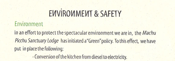
This is the "more to come" part:
I wish I had the original photograph but since I don’t, here is my best recollection of what it looked like. Uncle Tasso’s hand skills were actually quite good so in my “reenactment” I am leaving a few more hints than his black and white photo would show. I also embellished with a bit of the color he had described to me:
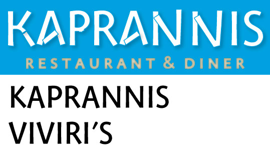

Marathon
Captured from web.archive.org on 20 Oct 2013. view this capture