
Hi,
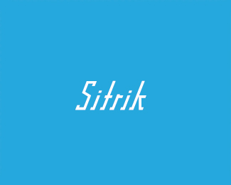
Im looking for some outside criticism of this logotype. Perhaps it will provide further refinement.
Thanks.
Hi,
Im looking for some outside criticism of this logotype. Perhaps it will provide further refinement.
Thanks.

What is it for?
It was created for fun. It could be used for something in the future.
Like what?
Providing context about your wordmark will yield a better critique.
I think it's a clever type concept suggesting speed or motion. It just flows.
maybe the t should be a bit shorter??
there is something about the r..

Possibly work on a rule from the 'left-foot' of the k to the i? Maybe scrap the swash on the bottom left of the i.
This is purely a remark on how it could look 'kool' as I have no idea what it could be for, the genre, its characteristics, whether its selling something etc.

Logos 'just for fun' aren't really something that can be critiqued other than asking: did you have fun making it?

On first viewing I like it! Good sense of movement, but not boy-racer speed...
Unfortunately, I think it might lose some legibility at smaller sizes - the 'k' and 't' are a bit too similar. Maybe you could give 't' a medium ascender height?
@aliminum
of course you can give feedback on a fun logo
for instance about it's aesthetics and legibility
this way he can improve his techniques
Captured from web.archive.org on 5 Aug 2014. view this capture