Typophile

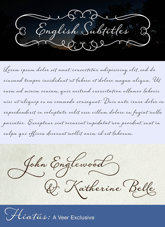
Announcing Hiatus

Hi all,

I would like to announce Hiatus, my latest font release on Veer.

Hiatus is a connecting script with a low x-height and generous letter spacing. It is semi-formal in appearance and is loaded with alternates and OT features.

http://marketplace.veer.com/fonts/UMT0001084_Hiatus#

Thanks,
Stephen Rapp
This is excellent!!!
Congratulation!

Good stuff!

Very nice Stephen!

Real nice work!

Very nice. I liked the relaxed sense it has.

Thanks, All.

Very nice. So readable, yet very elegant. I especially like the flourishes.

Beautiful.

Relaxed and Stylish at the same time! This one will be seen a lot.

Thanks.
@William «So readable» Working in the greeting card business will do that to you. ;-)

I'm not a big fan of script fonts, but this is gorgious! It would be a waste not to make at least one extra weight IMO.

Nice.
Why do some d and l glyphs not loop up to join the next character, but terminate pointing down, terminating below the baseline?

Great work, Stephen!

Reckon I'll see this one in quite a few ads in the future. Probably on a bunch of book covers, too.

@Nick Shinn - He's demoing the alternates?

Thanks.
@Nick: In most of my script fonts I will include some endings that just taper off. It's sort of a remnant of calligraphy. It seems more natural to leave an occasional disconnect. Just like you would lift a brush or pen to cross a "t" or dot an "i". I do this between letters in places that would seem natural to my own writing.

This is beautiful!

I actually love what the »occasional disconnects« do to the text! It does look more natural and livelier – a lot of script fonts with more »homogeneous«/»logical« connections tend to generate a certain monotony in longer texts.
Its liveliness enhances readability, it feels very good to the eye.

I can see two consecutive l's and f's are different, but 2 c's and s's are the same? I'm not criticizing because it's gorgeous anyway, just an observation.

I think that this certainly won't cause a haitus in your career. Ha ha.

Booo! lame! Get off!

Nor cause a hyena to laugh, Nick ;-)

Two c's: yes, the same.
Two s's: slightly different, but hard to see at the small of size.

Based on the thread title, I thought you were going to take a lengthy break from Typophile.

This is better.

T

Thanks, Thomas.

Pretty nice. In addition to the beautiful designs of letters I think the generous letter spacing will be an asset for this typeface. I really like your “florish” ampersand.

@André: There are 4 ampersand choices, 2 are flourished.

@ Stephen: Great!

Amazing!

Lovely stuff. Well done!

Very pleasing indeed!

Nothing finer than that!

I really like the flow. Simply wow!

Nice work, Stephen!

Thanks, Everybody.

I had to buy Raniscript, your previous masterpiece (very happy with it!) and I want this one real bad too! I ask my husband for fonts on Valentine's day instead of candy...

He must be a man of letters ;-)

Some of the most beautiful, naturalistic swashes and flourishes I've seen yet. Great work!

Dina, you must have a gem of a husband. Keep him. ;-)

Freaking beautiful! I think my wife and I are going to use this for our matching tattoos.
http://derekweathersbee.com

One of the nicest script fonts I've seen! Keep up the excellent work and happy Easter!

Captured from commoncrawl.org on 25 Apr 2015. original URL