
Herein are the Unicode Values for the Hebrew Characters,Vocalization Points, Punctuation, and Cantillation Marks etc., diagrams and more.

This thread ran to 2 pages of replies and only one was recovered, so replies are missing.
Herein are the Unicode Values for the Hebrew Characters,Vocalization Points, Punctuation, and Cantillation Marks etc., diagrams and more.

A beautiful and informative chart, which will no doubt prove helpful to many people considering the design of a Hebrew typeface.
However, it creates the appetite for more.
Under "Characters Used for Hebrew Grammar", we see two forms of the Komatz, one longer than the other. But these distinct characters aren't named, nor are Unicode points given for them.
Shvah and Komatz are both shown aligned below the characters - and it appears that the same alignment applies for both of them, making those two charts redundant (except for differences caused by the fact that Shvah is narrower). But the correct alignment of marks that appear above the characters isn't shown.
Oh, and the alignment of Shvah and final Nun is missing.
In the entire Tanach (Hebrew Bible), a combination of a final nuhn and shva never occurs. A combination of a final nuhn and komatz however does occur. Hence, only the latter appears.
In the entire Tanach (Hebrew Bible), a combination of a final chaf with shvah or komatz occurs many times. Therefore, these combinations appear as a standard item in a vocalized (with nikud and dagesh) font.
In a font, the dagesh version of a final chaf has the shvah or komatz appear either above the baseline, to allow the taam to be positioned below the baseline, or in order for these nikud vowels to stand out, as a nikud rarely occurs in the final form of a Hebrew letter.
A final mem does have chirik appear under it when followed by a non-appearing yud, as in the world, Jerusalem ירושלים. Hence, there is a dedicated glyph for this combination.
In OpenType, only Unicode values appear. The "advanced" or "intelligent" Hebrew fonts substitute and reposition the required combinations (GSUB and GPOS), so additional Unicode values are not necessary.
Above the alignment rules are visually described, as you noted.
Basically, the nikud vowel is centered under the medium width Hebrew letter. In the case of a Daled or Reish, it is right aligned under the vertical stem of the letter. In the case of the narrow or wide Hebrew letters, the nikud vowels are centered as well, though some modification is done by the type designer, based on the particular design of that Hebrew letter.
The characters for Hebrew grammar are also those for the shvah-na. A Unicode value is not given, because the Unicode Consortium has not assigned one as of yet. I will post the Unicode value for the komatz katan.
The folded lamed (the ascender is folded to be parallel to the ascender height (important for narrower line spacing, and/or not bump into the nikud vowels in the line above.
The brilliance of this whole automatic OpenType Biblical Hebrew font logic is due to Ralph Hancock and John Hudson.
At GoHebrew, I am extending this MS Volt system (or "program"), first, to be used for non-Biblical vocalized text, superior text-only Hebrew typesetting, and in the next year or two, Hebrew grammar typesetting (special thanks to Prof. Dotan, Rabbi Shmuel Rabin, Eli Fried, and David Hamuel).
updated chart

updated chart ver 3

Version 4


Yiddish Characters:
1. Why do you have the letter alef + dagesh/mappik? alef + dagesh/mapiq is pure Biblical Hebrew.
2. The letter alef + kamats is actually a vowel (o); this isn't the 'regular' kamats. The letter ayin is the vowel e.
Yod Yod + patah is the diphthong ei -- e.g. in German: rein, briet, mein, and Yiddish:מײַן
So the title is Yiddish Vowels :)
>> 1. Why do you have the letter alef + dagesh/mappik? alef + dagesh/mapiq is pure Biblical Hebrew.
That is what the Unicode Corsortium stuck in. Thanks for the clarification. Where in Tanach is it used?
>> Yod Yod + patah is the diphthong ei -- e.g. in German: rein, briet, mein, and Yiddish:מײַן
Please give me two more examples. Can you include all three examples with a ײַ in a sentence in Yiddish. Please email it to me.
> Where in Tanach is it used?
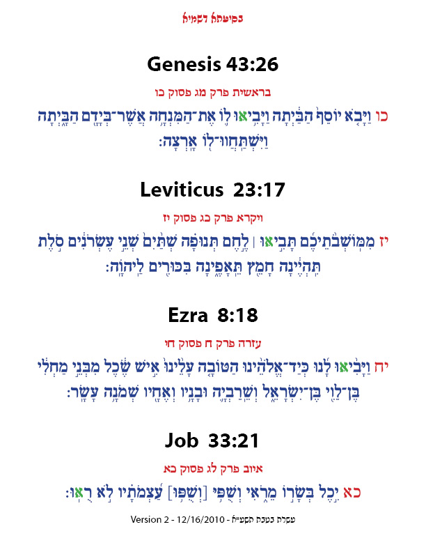
only 4 times: Gen 43:26, Lev 23:17, Ezra 8:18, Job 33:21
> Please give me two more examples
the verb to write:
די קינדער שרײַבן איבער
ער שרײַבט אונטער אויף דעם טשעק
pass by, alongside: פֿאַרבײַ
tailor שנײַדער
דער שנײַדער פֿאַרעכט דאָס קלייד
Thank you, David.
How is Yiddish typed in? Mac or Windows?
David,
Which Aleph in each verse?

I'll send you a PDF too.
Gen -- fourth word; Lev -- second word; Ezra -- first word; Job -- last word
In Genesis 43:26, the fourth word, in which Aleph is the second letter from the last.
I couldn't find the ones in Leviticus or Job; I'll look a bit harder in other copies.
Todah rabbah, Doveed - thank you, David.
Raphael,
Does the Koren Bible have them?
Chaim says his will.
> I couldn't find the ones in Leviticus or Job

Which time periods do we have manuscripts with these 4 marks?
When did we find them?
Did Rabbi Breuer or Mr. Koren include them?
Are they Mapiks?
@David Hamuel: They just weren't there in the particular versions I looked at - I also do have a downloaded copy of an older "Rabbinic Bible", which would be more likely to have all of these things, but after I saw you had answered the question, I did not try to attempt the task of navigating it without being able to read Hebrew (by comparison with the versions I did use which had the names of the books in Latin, and Christian chapter and verse numbers).
I never saw them, except in David's hand scribed manuscript.
Does Rabbi Winefeld of Shai L'Morah publishers include it?
In the picture, the first two lines might be from a very well-executed manuscript, but the third line is definitely typeset.
John, you're right.
Which printed Genesis had this character?
The van der Hooght Biblia Hebraica of 1849 is the one in which I saw the Dagesh or Mappiq in Genesis 43:26.

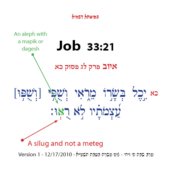
Kososky quote Rabbi Breuer that every meteg at the end of a verse is a silug.
Hence:
John,
In your example from Genesis 43:26, the aleph in the 4th word, "va-ya-vee-ooh" - "...ooh" has to dot not in the center space below on the left side, but in the center space above on the right side.
Perhaps, it's not there at all. What you see is ink splatter or dirt.
David, do you have the van der Hooght Biblia Hebraica of 1849 to compare? Why would they put the dot above.
I don't think that it is a dagesh at all. Rather, it must be a mappig, because there is greater space for placement in the middle height on the left or right (though we put a dagesh on the left of the letter). So, if it was placed below, it was in order to teach us that it was not a dagesh, but a mappik.
The typesetter at the van der Hooght Biblia Hebraica of 1849 likely made an error.
> Rather, it must be a mappig
No. Mapik is inserted into the letter he - ה when it's in a final position in the word! However, there are Yemenite MSS with mapik even when it's not in a final position in the word! In a surprising manner... see L Codex (letter ה+ mapik in a middle position):

Ginsburg:
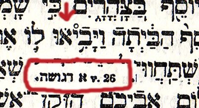
> every meteg at the end of a verse is a silug.
Verses are divided into two independent clauses: the first half is marked and ended by etnachta and the second half is marked and ended by siluk!!! Forget the name meteg!!!!
David,
Is the following a correct understanding of your words?
>> No. Mapik is inserted into the letter he - ה when it's in a final position in the word! However, ...
A Mapik only occurs at the end of a sentence that has a dottend hei. It will never occur in another place in a sentence, nor it will never occur to any other dotted letter.
However, there is an occurance where a Mapik does occur not at the end of a sentence, but never to any other letter.'
So, David, are you saying them the dotted Aleph is not a Mapik?
Where is the Mapik rule written?
David,
>> > every meteg at the end of a verse is a silug.
Verses are divided into two independent clauses: the first half is marked and ended by etnachta and the second half is marked and ended by siluk!!! Forget the name meteg!!!!
<<
Every passuk has two phrases; the first is marked with an etnachta, while the latter is ended with a meteg-like symbol, which we call a silup. Are you saying this?
Hence, are you saying that any meteg-like symbol at any other place earlier in a sentence is not a siluk?
Where are these riles for a siluk written?
Like this:

Both the essay by Haralambous on Biblical Hebrew with TEX, and Gesenius' grammar refer to the Silluq as a vertical line, standing under the tone letter of the last word in a verse.
Meteg is also a vertical line, but it is used for a different purpose, to restrain the pronunciation of a vowel. So it appears he is correct about this.
What about the mapik, or the dot in the aleph?
I wouldn't be able to help with the answer to that one: the information I have is that a dot in an aleph is not normally used either as a mappiq or a daghesh hazak, but that there are rare occurrences of it being used in each of those ways in the Masoretic text of Scripture. Since these are both exceptional cases that break the rules, a grammar of Hebrew might not give me the needed information.
In the book "A Sign and a Witness", I remembered a reference to an unusual letter that appeared somewhere near the end of the fifth chapter of Exodus or the beginning of the sixth that wasn't referred to in the work by Haralambous. I eventually hunted up that information today, and found that there was a reason it was not mentioned there: the "phe lefufah" is found in some traditions, but is outside the Masoretic mainstream. So I am still only beginning to assimilate some of this information, which is still confusing in places.
Hebrew Language Chart, version 6

> the "phe lefufah" is found in some traditions, but is outside the Masoretic mainstream...
The curved, spiral and anomalous letters are part of the kabbalistic tradition:

How so?
The Lost Kabbalah of Spaghetti?
> How so?
Well, I guess that you are not familiar with Mishneh Torah -- Rambam.
From what I read, the spiral phe is found in some manuscripts from Yemen and from Bohemia. As to which Kabbalistic school of thought this is connected with, perhaps this will help you find the answer.
Here is one page that I found; it claims this letter is "characteristic of the Ben Asher school of Masoretes".
Of course, a Karaite Kabbalist is almost a contradiction in terms...
> Of course, a Karaite Kabbalist is almost a contradiction in terms...
?
Given that there were, and are, Christian Kabbalists, I probably did overstate matters there. I had just come across a mention of the Shekinah in an English translation of Targum Onkelos the other day, and thus assumed that this sort of thing would be among what they rejected.
I was excluding Madonna from my thinking intentionally, though.
>A Mapik only occurs at the end of a sentence...
End of a word!
> It will never occur in another place in a sentence
Why not?
> Every passuk has two phrases...
Two independent clauses! Clauses not phrases.
Since when the letter pe + raphe is a vowel?
>> a Karaite Kabbalist is almost a contradiction in terms
Do you mean that since a Karaite by definition rejects any teaching as Divine, except the 5 Books of Moses, then a Karaite can not accept Kaballah as Divine?
>> >A Mapik only occurs at the end of a sentence...
End of a word!
> It will never occur in another place in a sentence
Why not?
<<
Excuse me, I was confusing mapik with silug. A silug may be earlier than the last meteg-like symbol, but only the last one in a sentence is certainly a silug, according to all opinions, says Rabbi Breuer.
A final peh with a lifted kamatz in an acronym, I believe.
As I noted, my reasoning was faulty. Christians, other than Roman Catholics and Orthodox Church members, who have an apostolic succession, don't accept anything as Divine except the Tanakh and the New Testament, but that didn't stop the emergence of a Christian Cabala - so the Cabala doesn't depend on things only found in the Targums or the Talmud.
Incidentally, Karaites, as I understand it, accept the entire Tanakh. It's Samaritans who only accept the Torah.
not a komatz, a dagesh.
Where did I see it? A finak feh with a dagesh?
I think it's in an acronym in the Mordechai or the Maharam Shif: Rabbi Paltiel, one of the baalei tosephos. A contemporary of the Ra"tz, Rabbeinu Tzvi (ratz k'tzvi). The subject was left-footedness as opposed to left-handedness, and if they're linked. Hence, halitza and tefilin may be linked.
About Kaballah, most subjects attributed to Kaballah are not considered valid Torah subjects.
True Kaballah is divided into two parts. Torat HaKaballah, Kaballah Study, such as that which is fond in the holy Zohar, and its clarification in Torat HaChassidut (mainly in Chabad-Lubavitch). And Kaballah HaMaasit, Applied Kaballah.
Few people know Applied Kaballah. It is dangerous, and kept hidden away from the average person. Certain very great holy rabbis practiced it, usually for the benefit of others, like the Maharal of Prague did with the Golem.
Usually Jewish people reject as fraud non-Jewish people who claim to be able to practice Applied Kaballah.
---
Are there any Karaites or Samaritans today?
There are exceptions.
I personally was witness a simple Jewish woman, who retired early, to travel across the USA, to heal people. Her formula was simple: in part of her prayers, called "Rafehnu" in the Amidah, she thought of the person who needed healing. As a result, the person was healed.
Rafehnu means "Heal us (O G-d)".
I asked my rabbi how this was possible. He explained that during her life she must have done something remarkable. And in the merit of that good act, G-d granted special powers.
I return to the woman, and prodded for that something special she did. She told me that it must have been when she was a small child. Her grandfather lived with her family when he was very old, as was the beautiful custom years ago. Every Shabbos he want to walk to an Orthodox shul, which was many many miles away. Each Shabbos she walked with her grandfather, while her parents and siblings drove in the family car. Even when it was winter, her grandfather and her tredged through the freezing snow.
That must have been the special good and kind act.
Apparently, there are Karaites today - they are among the refugees Israel admitted from certain Muslim countries, including Egypt. I believe there are also Samaritans, although I am not entirely certain.
Ah. Wikipedia tells me there are 217 Samaritans in Israel, living in Kiryat Luza and in Holon - and a few others in the United States. It also notes that there are about 12,000 Karaites in Israel, and about 4,000 in the United States.
Are Samaritans the same as Sadducees of long ago? I was told that the name Sadducees is in Hebrew "tzadukim". I think that it means "self-righteous".
What is the difference between Karaites and Christians (besides the Jesus factor), as they both only believe in the Bible as being Divine, and reject the Oral Law?
My understanding is that while the Sadducees didn't believe in an afterlife, the way the New Testament referred to the Pharisees and Sadducees together implied that they were both respected portions of the Jewish community, even if they were in disagreement. But the Samaritans, on the other hand, were despised, hence Jesus' parable of the "Good Samaritan", to illustrate that righteousness towards one's fellow man comes before correct theology.
The Sadducees may have, like Karaites, rejected the Oral Law, or simply placed less emphasis on it; but they were definitely not Samaritans.
As to the Karaites, yes, they are very similar in some ways to Christians - and, thus, they have been the targets, even more than ordinary Jews, of efforts to convert them to conventional Christianity, or to become "Messianic". But as long as they not only do not accept Jesus as the Messiah, but also do not accept the New Testament as scripture, there would still be plenty of room for differences between them and Christians.
Thank you for your explanation. This is a tangent on a tangent, and a discussion of theology as well. But to best understand Hebrew letter forms, it's best to have a full picture of the people and their Judaism. To best understand what something is, at first we must understand what it is not.
Still, I do not understand what are the factors that make Samaritans despised.
With all due respect to my Christian friends, I think that analogy of the "Good Samaritan" is misleading, like the answer about what goes out of a mouth can justify what wrong things go in the mouth. Like the gay rights activists argue about great gay people in the arts.
A good thing doesn't justify a wrong thing. They are two separate issues.
Sure, be kind to others, speak fine words, be creative even inspiring, but don't do the wrong things.
It's misleading to suggest that a good act automatically justifies anything else.
I'm sure that there were good Nazi fathers at home with their wives and kids. But on the Jew street, they yanked out beards, threw babies in the air and shot them with their guns, or raped wives in front of their husbands.
In Machiavellian thought, the end does justify the means. This is in regarding political battles, but it does not apply to morality.
Captured from web.archive.org on 14 Apr 2015. view this capture