Typophile

Business cards - Polo Club

hkuiper

Dear Sir or Madam,

I recently joined a polo club, and we have decided to create business cards which we can handout during events. Since appearance plays a large role at such events I really want to put some effort into creating great looking business cards. Currently I am considering using some decadent colored paper. I have also looked into using gold or pearl lettering. To top it off i might want to use gold edging, not sure about that though.

Since this seems to be the place where typophiles hang around I am open for suggestions on fonts. Can anyone recommend some free fonts which would create a classier look? I browsed the forums and saw some very nice fonts, such as the Diamond font from http://www.orangeitalic.com/ but 299$ is too exotic for me!

Here is what I created so far:
(still has the bleed margins or something)

If you want to have something that feels expensive an exclusive you may want to consider thermography or blind embossing which both make the business card quite luxurious and definitely decadent.

If you're interested, I have some really good contacts in the industry and I'm sure I can help you out.

Michael Preston
Typographic Print Designer/Print Production Expert/Photographer

Creative19 Website: http://www.creative19.com
Design Portfolio: http://tinyurl.com/C19-DesignP
Photographic Portfolio: http://tinyurl.com/C19-PhotoP
Our Ethics: http://www.kiva.org/team/creative19
Want a Meeting? http://meetwith.me/creative19

Dear M. Preston,

Thank you for your offer, however I live in the Netherlands and I am very busy with my studies and cant afford to drop by your London office :) I will have a look at your suggestion of thermography or blind embossing the cards. Do you have any further suggestions on the font or other ideas?

de gustibus non est disputandum

It’s strange that you are willing to pay for very expensive printing techniques, but then you want a free font.
Quality applies to printing as it applies to typeface design.
Anyway, about the design: your letters and words are too crowded. Nothing says "class" as a good use of whitespace.

riccard0,

You make a good point as to my spending behavior, but it is difficult for me to justify purchasing fonts when there is already so a broad free offer. You can only spend money once so I always try to spend it wisely.

Personally I don't think thermography creates a high-end look. I associate it with lower-budget projects where someone wants the general look of embossing or engraving but can't afford the real thing.

I agree with Riccard0 that the type (especially the larger type) looks crowded.

Regarding fonts, what fonts are used in your current signage, stationery, etc? Normally you'd want your card to use the same fonts, unless you plan on re-doing those other items to match.

"You can only spend money once"

Printing matter fades away, a font is forever! ;-)

I would say it's a better use of money to get some very nice, professional quality fonts than to put your money into unusual and expensive printing processes. If the thing you're printing isn't top quality, using a pricey printing method isn't going to make it look better. Of course, this is just my opinion — but I think it's something to consider.

Josh

I will reconsider my position on the fonts,

Do you gentlemen have a suggestion for a font?

If you intend to keep the same all-caps formatting, I might suggest letterspaced caps in one of the following:

Adobe Garamond (which I think has special display caps, at least in some versions, and a very nice italic)
Trajan (famously overused and often misused, but may be appropriate and effective here)
Perpetua Titling (looks similar to what you have)
Waters Titling (gorgeous)
Brioso Pro (for a little more personality)

Note that at least the first two faces mentioned above come free with InDesign, and maybe other Adobe software, so depending what program you're using, you may have them already.

Using small caps for the smaller text underneath the name, with oldstyle figures, will add a classier look. It looks like you may already have true small caps, but the osf will help. Letterspace everything more than feels necessary: for the name, you might start with 200 "units" (1000/em) = 20%.

Also, I sometimes find that using large small caps can be better than full caps in this kind of situation, as they're wider and seem to have a stronger stance. (I would use the small caps from the next optical size up, ideally.)

I hope this helps.

Josh

You also could want to make POLO CLUB smaller, but generously letterspaced, so it would have the same length of the name above.

Thanks guys,

I will work on your suggestions tomorrow Josh!

Fonts, especially custom ones, are great but if you are going to spend money I recommend doing so on a designer.

Wil

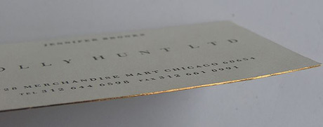
Personally, I think thermography looks cheap, but we've had customers come through our shop who thought otherwise. I have one word for you: letterpress. Some classy letters punched so deep into a luxurious, thick paper that you can feel the valleys... Mmm...

Something like this. In particular, check out the third card over, but don't go square like that one. I say, stick with standard-size business cards.

I think fine letterpress results are had when the paper stock is not too heavy, and the bonk is subtle. A heavy bonk, to me, looks as unrefined as thermography. The message of the design becomes subservient to its main message: 'I just wanted you to know first and foremost that this is letterpress!'

While I'm new here and appreciate the exchange of knowledge and advice, it strikes me as this being a case where the level of advice being asked for here is borderline something I would normally charge a consulting fee over. No offense meant though, but designers' knowledge is a valuable commodity.

I see your point, typenazi, but the original poster was basically just asking for font suggestions, which is a pretty common question here.

To me it's like someone sitting next to you on the bus asking for some quick advice. It's not the same thing as taking someone on as a client. But I certainly agree that design advice has value.

In regards to this issue (and I am also new here), I usually assume that the person asking for advice is the designer in regards to the specific project. For instance, even if the original poster of this thread is not a professional graphic designer, he is the designer as far as this project is concerned, and I don't personally have a problem sharing insights and ideas among designers. If contributors started actually redesigning the business card or posting comp images and so on, I think I would agree with typenazi.

Captured from web.archive.org on 15 Dec 2010. view this capture