
Some help guys..
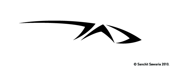
Need a suitable typeface for this logo.
It says 'Transportation & Automobile Design'
The letters TAD.
Some help guys..
Need a suitable typeface for this logo.
It says 'Transportation & Automobile Design'
The letters TAD.

Now this is a logo I'd want to see on my car. Bells, this is the look I'd want to see on my car! But a face that goes with the logo without looking like garish go-faster stripes... is that even possible?
I know! Im struggling here....
I don't want it to be a typical all caps italic font.
Hmm... maybe some upright bold expanded sans? Small-caps, even?

I'm getting an "early vector art" vibe: Ultra Bronzo
I can see two things:
1. Two or three lines in a fat, wide sans under the T, but the logo already looks like it's moving at a cop-scaring clip to the right.
2. One line in a tyre-track face, like Rich Gast's Eagle GT II underneath the logo.

> 1. Two or three lines in a fat, wide sans under the T, but the logo already looks like it's moving at a cop-scaring clip to the right.
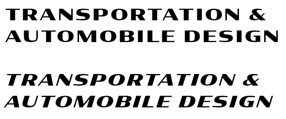
FWIW, the Wide width of the current Typophile featured face, Condor, looks like this:

Or, in the Black weight:

The font you need for this logo is available here...
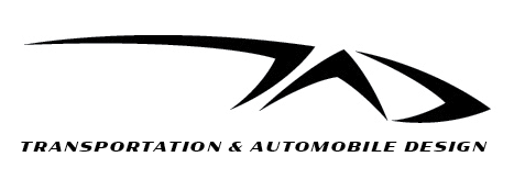
@kentlew: How does this look?
@Nick: How can I try Ultra Bonzo without buying it?
@Sii Daniels: I didn't quite get you.


Yeah, I'm with Kent, Condor (italic) would fit nicely.
@Nick: How can I try Ultra Bonzo without buying it?
Village has an online type tester.

I go with a rock solid sans. Like Alright Sans, Sense, or the like - but bolder and all caps. At least as a starting point.
Captured from web.archive.org on 7 Aug 2014. view this capture