
Hi all,
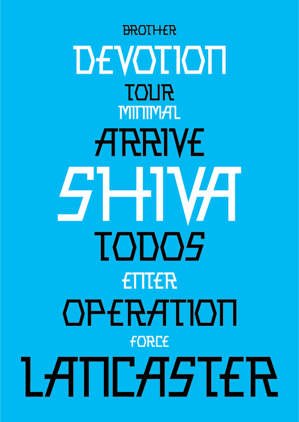
Here's something new I'm working in times between some other jobs, so it's still green and on first ball in some parts.
A couple of facts:
- I wanted to make an disco-metal-urban-fancy-cool-electro-ambiental... typeface;
- Very rough and inaccurate version so far;
- Proportions are not well also;
- Some letters aren't good in some way (probably /S, P, R.../);
Any constructive comments are more then welcomed.
Thanks,
Dusan
