
Hello fellow Typophiles!
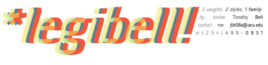
My name is Jordan Bell and I have been working on this Sans for about 3 months now. I study graphic design and typography at Abilene Christian University as a junior and have taken an Intro to Typography course. I realized at the beginning of this semester that I am hopelessly obsessed with typography. So, I started drawing! It started with sketches inspired by fonts such as Info, Dekar, Titillium, and Klavika. I then decided to try to learn how to use Fontlab Studio 5. After reading lots of reviews, tutorials, and blogs, I started drawing in Fontlab and Illustrator. In other words, I am a beginner.
After many, many hours hovering over my laptop, editing, analyzing and tweaking this font, my professor told me I need some other professional critique. So, here I am! Please be gentle though. This is the first typeface I have designed and I know there are some kerning and small design problems, but I really would like to hear what you pro's have to say about the design and readability of the characters. But really, I'll take any feedback good or bad.
btw, I have updated the examples! The first two are former comps. The last 2 are the newest and best examples. Please review and critique. Thanks for any potential help!Enjoy
| Attachment | Size |
|---|---|
| LEGIBELL2.pdf | 264.58 KB |
| Legibellv3(ex).pdf | 421.4 KB |
| example_page_ex_v3.pdf | 335.08 KB |

