Typophile

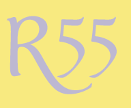
R55

ReneRutten

I'm looking for font with a distinctive '5'. The purpose is the branding of a winehouse (bar) called R55. The bar is located in a vaulted basement. It has to look both luxury, yet contemporary. A great 'R' could also be possible.

Any suggestions?
Thanks!

Instead of basing this on a font, why not ask one of us type designers to draw them for you? This is what we live and breath for, and since it’s a logo you have everything to gain from a unique identity. I’d love to help you with this myself.

Hi Frode,

thanks for your reply.
Indeed the best solution.

The problem is that I have to show my client some different options and styles which can be used. Putting effort (and money) in a handmade proposal that isn't used in the end would be a real pity.

Isn't that just what we call the creative process? A logo proposal is usually a number of rough sketches intended for later refinement.

Off course. I'd have to send you a briefing of the project. If you would help me with this, what are the possibilities/costs, etc? Maybe you have any examples?
Maybe it's better to send your information by email. You can send your email to: studio@renerutten.nl

Thanks.

http://www.flickr.com/photos/joostmarcellis/5191222367/
And you could easily make an "R" to match.

hhp

Garamond oldstyle 5 is beautiful. I think you could just start a competition here on Typophile and give a reward for the winner, say, €200. Personally I would love to take part in it.

You’ve got mail, Rene.

Jasper: For very good reasons competitions like that are frowned upon among professional designers.

Yes. http://www.no-spec.com/

One thing that just occurred to me (while doing a double-take on the thread title):
Make sure to pull it far enough away from looking like "RSS".

> competitions like that are frowned upon among professional designers.

I think that's an unfair -if convenient- blanket statement.

hhp

At least convenient :)

> I think that's an unfair -if convenient- blanket statement.

Design competitions are indeed generally frowned on by professional design organizations and by many designers. Nobody would think of asking a group of doctors or accountants (or most any other professional) to work for free in the hope that 1 person will get paid at the end, and professional designers shouldn't be asked to work that way either.

But with that said, I'd agree with you that not all designers agree with that, especially those just starting their business and those hit hard by the bad economy. I've done it once or twice myself. But it's not good for the profession.

RLV

@Hrant: that's an unfair -if convenient- blanket statement.

It's accurate. Professional organizations such as the AIGA and GDC don't just frown, they prohibit members from spec work.

I consider all type competitions (including type annuals that request submissions) to be spec work, because they require type designers to create a specimen. And they don't even reimburse winners for the cost of doing that.

I was on Creative Review's mailing list for its new type annual, to which I replied,

"Thank you for your interest in my work.
However, I am not disposed to compete for the privilege of providing
your publication with free content."

...and was subsequently "followed up on" several times with comments such as,

"I am aware that previously there was an issue with the fee for an entry,
therefore if you are interested in submitting a typeface or typefaces we
would be willing to offer you a further discount."

The ethics of not doing spec work can seem out of place in the digital era.

**

To return to the topic, even if a client commits to a custom solution, the first step is often narrowing the focus of the brief by seeing which off-the-shelf designs come close to the desired tone and style.

I'm having difficulty visualizing a vaulted-cellar bar as being either upscale or contemporary, but suggest you set up "R55" in the text field and search at MyFonts under the keyword "luxury", "upscale", or "contemporary".

- Nick Shinn, MGDC

Nick, [re]read what James wrote and dump the Official Party Line please.

hhp

I did indeed read what he wrote.
That is why I clarified that professional bodies do not just "frown upon", but prohibit spec work.

But I was wrong.
Apparently in the US prohibiting spec work is considered price fixing, so frowning is all the AIGA can do.
However, as a member of the RGD (Ontario, Canada), I am prohibited from doing spec work.

But you're also Prohibited from doing many
other things you do (just like the rest of us).

hhp

> Apparently in the US prohibiting spec work is considered
> price fixing, so frowning is all the AIGA can do.

Interesting; I didn't know that.

However even if AIGA could prohibit it, designers would be under no legal obligation to follow the AIGA's advice. It's not a union or licensing authority. Their authority just comes from members' respect for their advice.

Hi everybody,

it's not my intention to create any form of irritation amongst you guys.
I'm sorry if I did.

Because my knowledge of fonts, especially remembering their names, isn't as good as it should be, I started this thread hoping for a little help to get started.

@Nick: Maybe I'm using the wrong words, but in my opinion luxury, upscale and contemporary can go together.

I'm thinking a (customized) classic serif font used in a contemporary way.
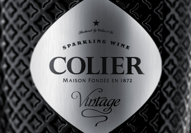
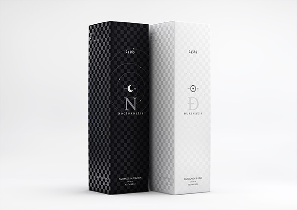
The attached images show what I mean. Sorry if I'm expressing myself incorrectly.


> "I am not disposed to compete for the privilege
> of providing your publication with free content."

This is a mischaracterization (and I'm sure you're smart enough -and a good enough businessman- to know that). Although it was indeed a competition (meaning one can lose) it's basically a marketing gambit: pay a small fee for a chance to be seen.

When they approached me, it was a no-brainer (even more so than when they ran their contest in 2006). And I just found out that I'm included! Ergo: I get some superbly placed advertising for dirt cheap.

On the other hand, if I were just-another-Latin-foundry I would have been much more tentative - since my chances of being included would have been much lower. But still, one has to have a pretty low opinion of one's own work to think $70 is too much.

The only competitions that chap my hide are the ones that charge you for winning! :-/

hhp

It's not just the chance of losing, and the fee, that I object to.
When I spoke of free content, I was referring to the page layout -- the design of a specimen, one page in a book.
As a graphic designer, I resent providing that service for free, to be discarded on the whim of someone who is not a client.

If I'm going to go to the trouble of designing an advertisement for my own ends, I'd like to be sure it will be published.

**

"Featured Face" at Typophile is fine by me -- I just send Zara a font and a link, et voilà!

I'm confused - you must already have specimens for your fonts. You just send that in, and if you're selected you *might* have to make something custom - which actually isn't even the case here; here's what they put together for my entry in 2006, based on the submitted PDF and some post-win info they requested:
http://themicrofoundry.com/ad/CR.pdf

One reason I think this approach is elegant is that good type designers are not necessarily good layout designers.

> I'd like to be sure it will be published.

But then you have to pay much more money. If you do the math it becomes clear that your chances of being selected have to be quite low for the gambit to not be worth it.

hhp

These are the specs:

For each typeface you are submitting please provide a full character set. This should at minimum consist of complete upper and lower case alphabets and numerals 0 – 9 but, in the case of extensive Open Type faces, please also submit a representative sample of extra characters. For Arabic or other non-Latin faces where character sets may vary, please exercise discretion and submit what you consider to be a sufficient character set for the judges to be able to make their choice. These should be supplied at 48 point, as should, as a bare minimum, the sample sentence The quick brown fox jumps over the lazy dog. Non-Latin entries may substitute a similar or equivalent phrase. We would also encourage entrants to submit additional samples to show their typeface in use. You may include headlines, short or long passages of text, or sample layouts showing the typeface in use in eg advertising or publications. With Display or Bespoke entries where entire upper and lower case alphabets or numeral sets do not exist, please supply all the characters available. If the typeface is to be used to set text, please also submit 200 words of dummy text of your choosing set in the following: 8/10 pt, 10/12pt, 12/14 pt. This applies to all Text entries and may also apply to Bespoke or Non-Latin typefaces. Each entry should be set in 100% black on A3 and be provided as a separate 300 dpi PDF, with a maximum file size of 5mb, with the name of the typeface clearly marked on each page.

Why don't they level the playing field and provide a template?
Because that would be too boring, their book would look like a type catalog.
So this way they can have a bit of a format, but enough variety of creative input to make it slightly more interesting.

These publishers are cheap, they knew enough about me to solicit my entry, but couldn't be bothered to have a look-see if any of my faces, all of which have copious PDF specimens, were suitable for their publication. That would have been too much like work, and they would have had to pay whoever was doing it, e.g. give the selection committee a curation fee, rather then just paying them off with the publicity and kudos of being important enough to pass judgment on their peers.

I can understand that the publishers might think this is the same model as for other creative awards, but for ads and brochures etc., those don't have to be specially made up.

Typographica has a good plan for its "fonts of the year"; ask each curator to pick one typeface and write a few words about it -- not too onerous a task -- and then ask the chosen foundry to prepare a specimen, with the guarantee of publication.

@Hrant: If you do the math it becomes clear that your chances of being selected have to be quite low for the gambit to not be worth it.

I prefer not to gamble on this sort of thing. Besides, there are other reasons I don't do competitions, apart from value for money.

> couldn't be bothered to have a look-see

There's an entry fee per typeface.
Did you want them to choose the ones they liked and bill you? :-)

> I prefer not to gamble

I never gamble. Gambling is dumb luck. This however is based on the ability to judge the value of one's work in the eyes of others, and to be committed to promoting it.

hhp

Did you want them to choose the ones they liked and bill you? :-)

If someone wants to use my fonts to decorate the pages of a book, they can license them.
If someone wants me to design a page of a book, to a somewhat unimaginative brief, they can ask me for a proposal, but I suspect I would be "too busy".

...the ability to judge the value of one's work in the eyes of others

I would be very disappointed if my work appealed to the arbiters of taste.
That's another reason I don't do competitions.

Arbiters, shmarbiters. I think you saved $70 and about an hour
of time that you -correctly- discerned would have gone to waste.

hhp

This is a quick sample from my soon to be released display face, Dez Petranian.

BTW, I noticed that the "5", and the numerals
in general, in Font Bureau's Condor are super.

hhp

I agree, but a bit techy for a winehouse.
The font you're working on looks good :)

I was wondering what R55 referred to. I thought perhaps it might be the name of an airship, but I see that while there was an R33 airship and several other related designations were used by Britain, the series skipped from R41 directly to R80.

There are roads in the Czech Republic and South Africa by that name.

Hrant,

Was that the 2006 issue? The CR solicitation said that 2010 was their inaugural Typography Annual.

Chris

Yes, it just came out.

hhp

Have you received it in LA yet?

Not yet - any day now I guess.

hhp

Thanks! Then I will be patient as well ;-)

Captured from web.archive.org on 20 Aug 2013. view this capture