Hi typophilers,
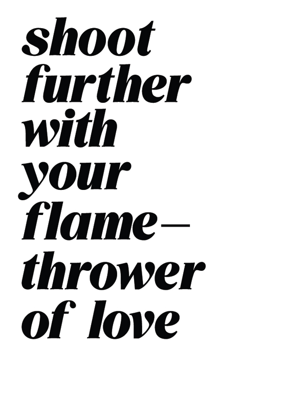
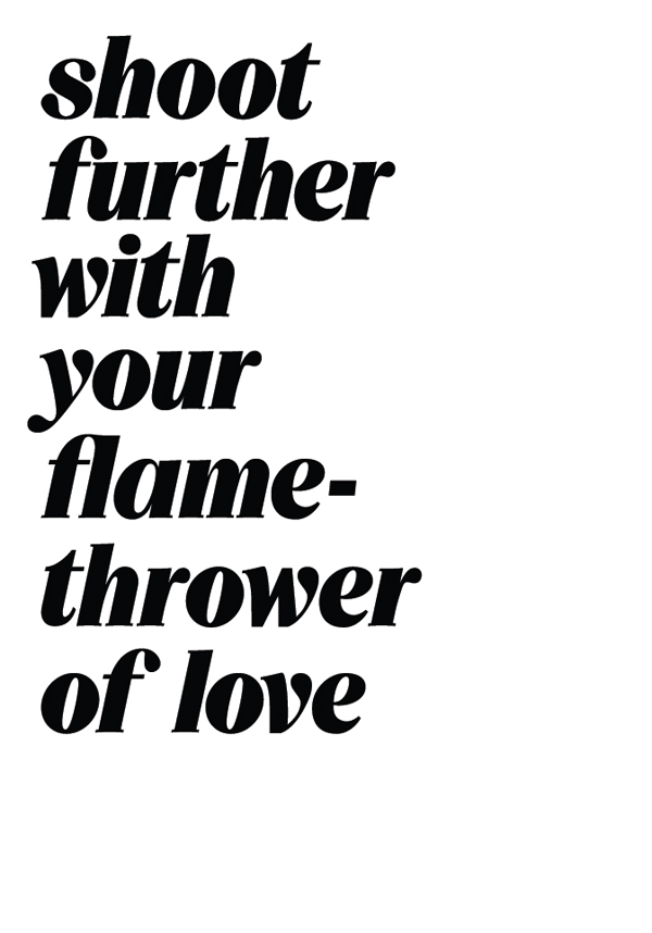
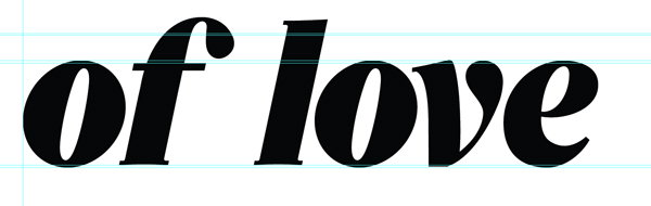
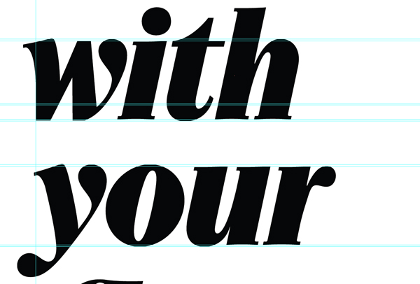
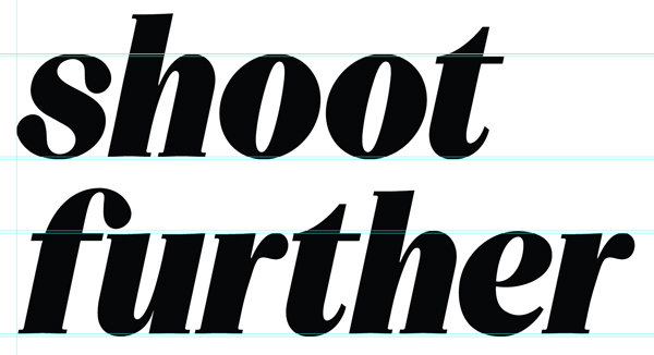
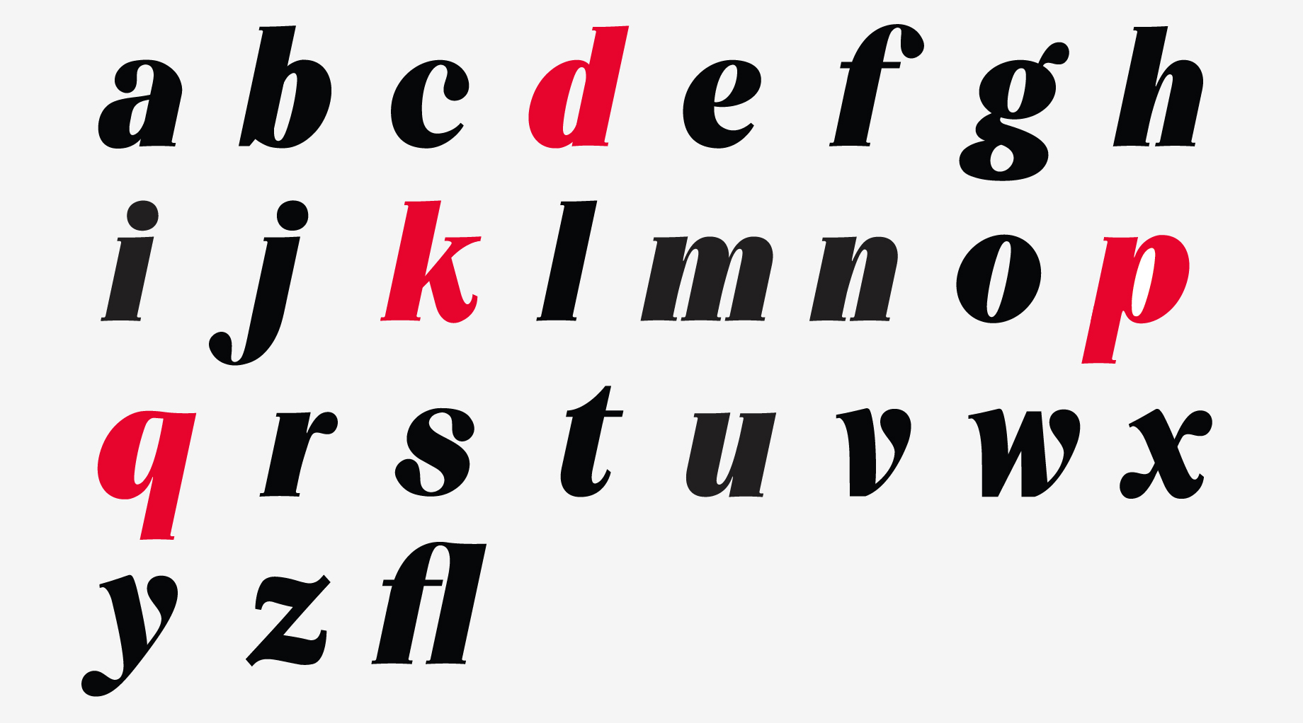
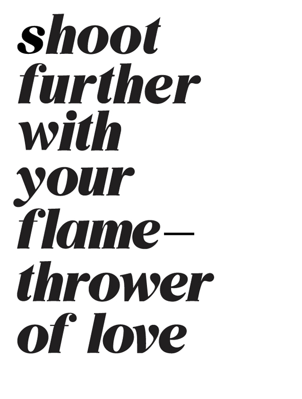
New time poster on typophile from Brighton UK here attempting a typeface based on a logo designed for our company - a design studio in the UK. Attatched is the typeface which is to be printed in a black foil and embossed, but for the moment i have added some lighting effects to give you the idea of the final outcome. Here i am attempting to create a typeface that is of a heavy weight and resembles latex when used as a logo.
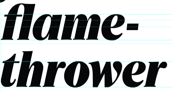
I have developed the typeface for a mailout and am now extending the face into a full working typeface. I believe it could be fairly interesting when completed. The face uses influences from rhythmic calligraphic stokes and from heavy weighted Caslon faces. I have added a humanist element to the face as well.
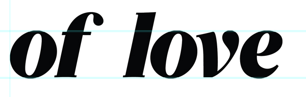
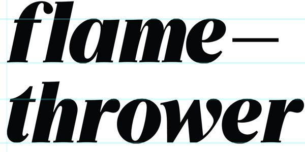
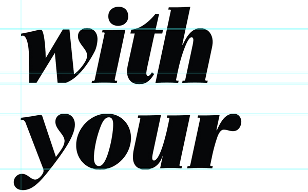
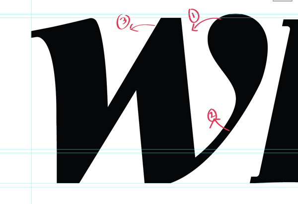
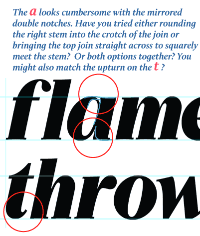
I am doing okay with square based characters such as M and N, however v,w,s are all proving difficult and wondered if I could get a critique and advice from you all. Ill supply more artwork too when i can. Cheers!
| Attachment | Size |
|---|---|
| Screen shot 2010-11-30 at 16.56.20.png | 55.11 KB |
| Screen shot 2010-11-30 at 16.56.37.png | 51.26 KB |
| Screen shot 2010-11-30 at 16.56.57.png | 45.3 KB |
| Screen shot 2010-11-30 at 16.57.47.png | 45.18 KB |
| Screen shot 2010-11-30 at 16.58.47.png | 30.48 KB |