Typophile

logo for artist

cpix

This is a logo for a disco/hiphop/dance type of artist. I'm mainly looking for critiques concerning the type but if you have comments on the heart planet, I'm open to that as well. I know the heart shape is a little jagged but it'll be fixed when I vectorize it.
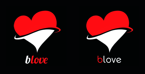
I don't really get planet from your mark.
Also the feel of the whole thing is to my mind a bit odd for an urban music vibe.

Having said that i quite like the type in the second version - digital feel but with character.

Will

I'm seeing "Vintage Hat Shop", or a slightly odd arrangement of a bikini top & bottom!

I prefer the second version type, but you might need to rethink the red & white. I'm presuming the name is B Love, and I think that works better with the b in red, however it gets a bit lost from a distance. Also, if others designers are going to be using the logo, for example on a poster with a few different artist's logos, they aren't necessarily going to be able to use two colours it so it will end up as blove.

I too think the mark is way off. I'm seeing "White chocolate dipped strawberry is a great gift idea for the Valentine Day". Between two type options second is certainly a better fit for what you described.

Cpix, can you tell us a bit more about the heart planet idea? Is the top of it supposed to be a B? As in BLove? Is there any reason that it is the shape it is (pointy on the bottom, asymetrical etc)?

http://www.techshout.com/images/beats-by-dr-dre-headphone.jpg

be careful about putting too much emphasis on that B in the second version, even though it does seem to fit the idea better.

Sorry, but my first thought was condoms. Make of that what you will. :-\
I'm getting a three-dimensional «pulling an additional layer over [or off] a heart» idea (so really, much like Alex's white-chocolate-dipped strawberry! :-). If you're shooting for rings (as in Saturn) you might have to make them more distinct.

Regarding the type: Have you tried putting at least the "B" in caps? It might nicely echo the top of the heart.
BTW, are you limited to free fonts in this?

Captured from web.archive.org on 5 Aug 2014. view this capture