Hey everybody,
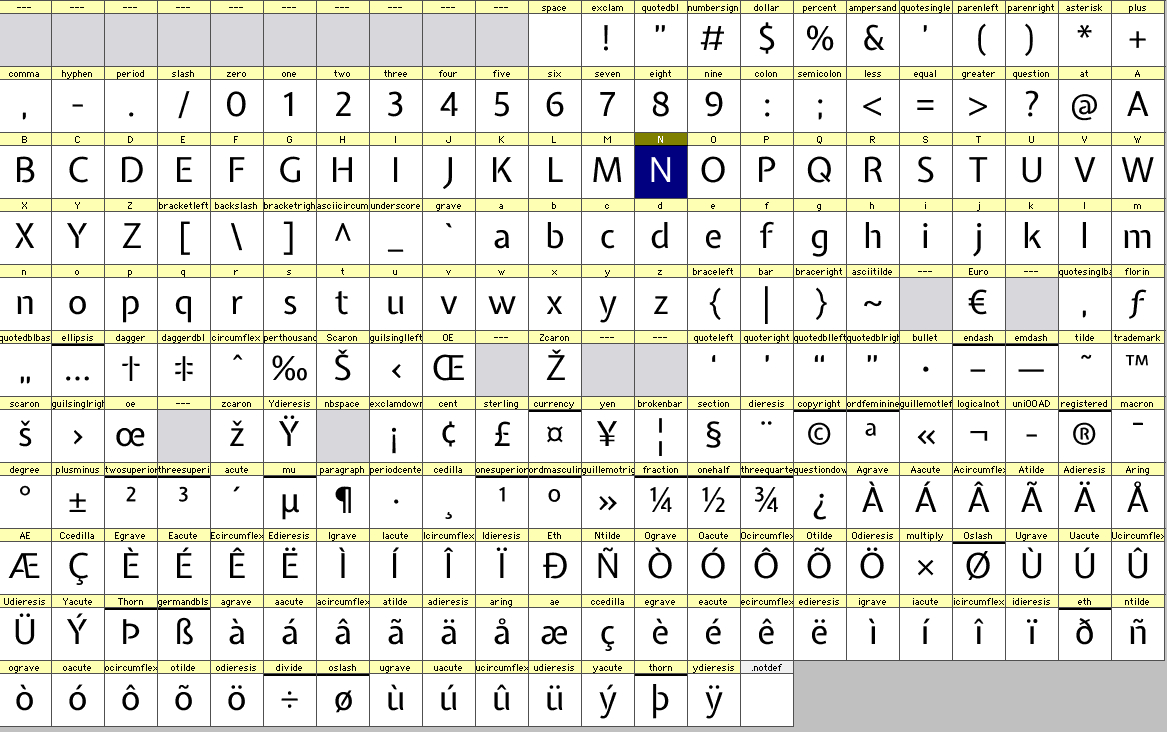
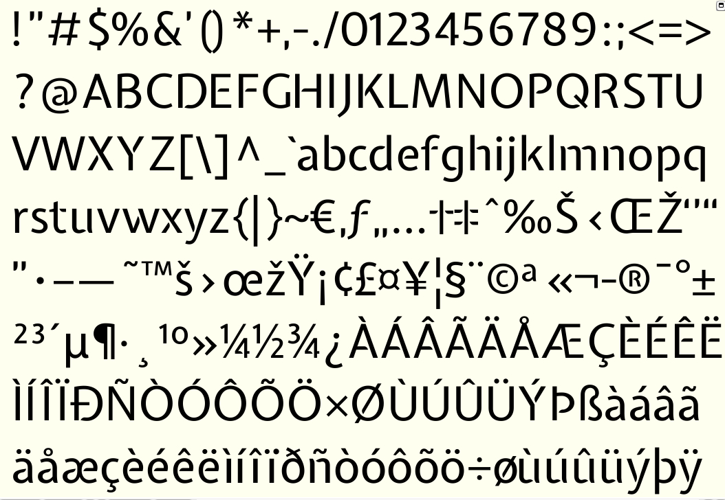
I'm quite pleased with the lowercase, caps and figures in Expletus-sans so I figured it was time to move on. Here are some of the glyphs I've made. Please don't pay to much to much attention to the spacing or kerning. Instead I suggest you focus on colour and style. Hope it's not too bad ;-). I also included a pdf for print. In this critique section are also Expletus-Sans diacritics and Expletus-Sans.
Cheers,
Jasper de Waard
edit: This is the complete Character Set for Expletus Sans Basic.