
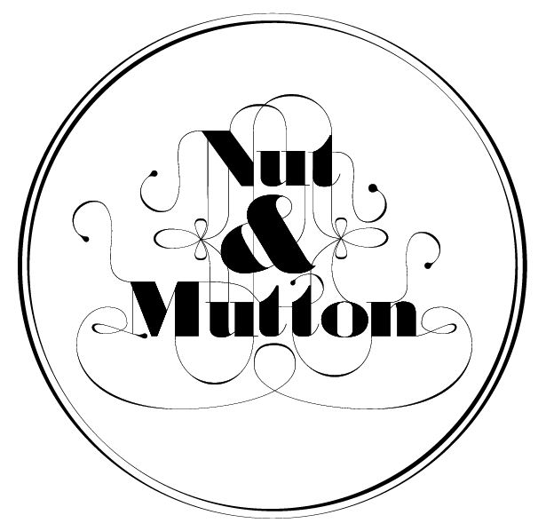
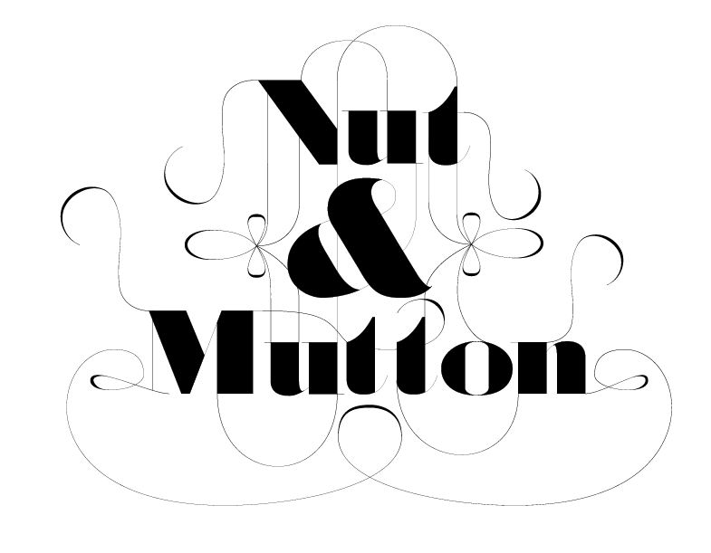
I'm currently working on a logotype for a resturaunt, feel a bit lost with it at the moment as the look & feel is not something I have tried before.
Any comments/crits appreciated.
Thanks,
Mat.
I'm currently working on a logotype for a resturaunt, feel a bit lost with it at the moment as the look & feel is not something I have tried before.
Any comments/crits appreciated.
Thanks,
Mat.

I'd like to see without swashes.
I'm having trouble as it's going to have the swashes or some sort of script element to it as it's a Lubalin inspired piece. I feel its not working at the moment, but i'm not sure where to take it next.
Thanks,
Mat.
Something like this do you mean?

I prefer it without swashes & maybe at this moment the letters look too heavy and the tiny lines are getting lost.
Yeah I agree completely, was working till late on it last night and lost sight.
I'll upload another version i'm working on tonight.
Thanks again,
Mat.
Here's where it's at now, different face now, it's Hoefler Text Italics with some tiny tweaks, suits alot better than the modified Didot/Bodoni bastard face.
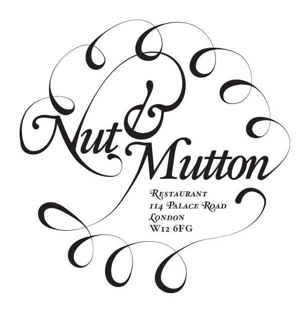
Any suggestions?
The one above would be used for signage etc, and something like this for when printing problems arise, like uniforms etc.
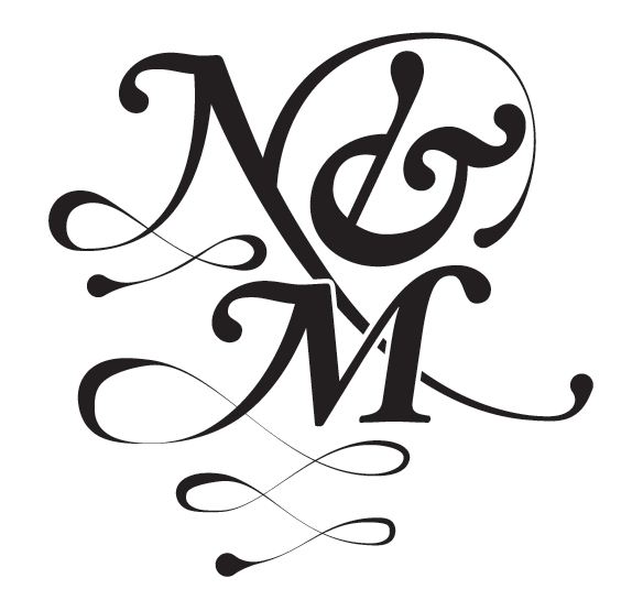
Any suggestions, I'm still rough with the curves, but this seems to be the best practice for me.
Mat.

I like the ring of swash. Was there any intention of looking like the wooliness of the source of mutton? They also look like a pie-crust. They need tidying up but don't make them too geometric or it might look like an old phone dial.
Ahhh yeah thanks for pointing that out, that wasn't intended. As long as I don't play on it too much I think it would be nice for someone to make their own from it.
Yeah thanks for that, phone cord is the last thing I was after, I'll watch out for that!
Mat.
As a plan, it's a decent layout. But you clearly need a lot more practice in drawing attractive curves from scratch. Here's what I think are your best curves:
The connection from N to &.
The third loop from the right, and the arcs connecting it to its neighbors.
The loop just above the N (though composition-wise, it may be too close to the N).
In the monogram, the loop just under the right side of the M.
The rest are hard to rank, sinking into the category of "oh dear."
The most important thing, though, is that your thins are much too thin. Swashes need to harmonize with what they're connected to. So look at the lightest connecting strokes in the Hoefler Text Italics, such as between the t's or inside the u, and never let a stroke get much lighter than that. (And, heh, sorry, I'm picturing the look on a screen-printer's face when you say, "oh yes, this one is for when printing problems arise" and you give him a design which, at five inches tall, contains strokes literally as thin as a human hair.)
Some kind of regularity or consistency in the loops is called for. Pick a point, not necessarily the center, and make sure the axis, from crossing to tip, of each of the loops in a row is pointing to it, like one-point perspective. Perhaps, since there's room above "Mutton", the loops could get progressively larger from left to right. That would have something of the look of a cornucopia, which is appropriate for a restaurant.
Thanks alot for this cerulean, thanks for your honesty. Seems something that lecturers at my university are hard up to give. I'll take all you have brought up into consideration and come back tomorrow with something hopefully not "oh dear"! :)
I'm struggling to learn how to translate my curves from paper to mac, I have read some medicore tutorials on the subject, but still it's proving hard. It seems i'm missing something about the pen tool!
Thanks for the cornucopia reference also.
I'll keep looking for some kind of reference, tutorials for the drawing of elegant curves.
Thanks again,
Mat.
Captured from web.archive.org on 5 Aug 2014. view this capture