Typophile

Packaging Design & Typography

RJClouse

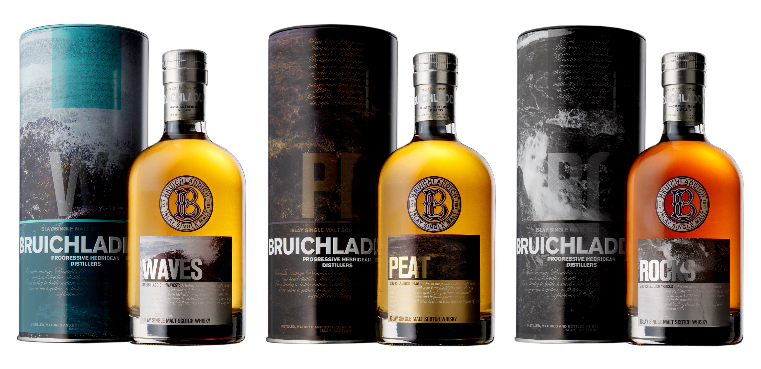
Bruichladdich is a small sophsicated distillery that produces single islay malt whisky in Scotland. I have always enjoyed the typography treatments on almost all of the packaging design they have in my local liqour store. I wonder who designed the fun image & text on those packaging designs. If anyone know, please let me know!

Images are attached below.
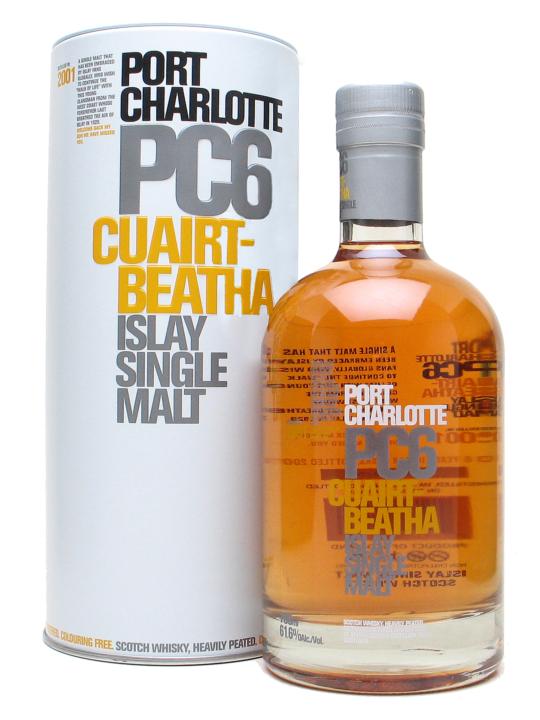
Maybe it's just me, but in the top image, at first glance I thought that was
shower gel. Or maybe aftershave. :-\ Doesn't «feel» like whisky at all…
(Does Bold Blocky Clean Helvetica Style really work for everything?)

Nina,

You are correct, not always. I understand where you are coming from. The word "bold" is definitely accurate description of this whisky.

The reason why I felt that the clean, blocky and bold Helvetica works because the hierarchy of information became interactive when you turn the packaging around.

On the other hand Nina, this kind of 1970s retro design may be appropriate for an aged scotch; but at first glance I would assume PC6 is only six years old.

Captured from web.archive.org on 14 Oct 2013. view this capture