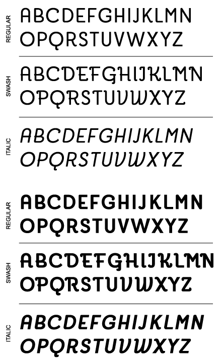
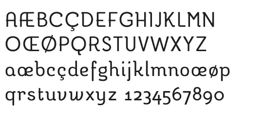
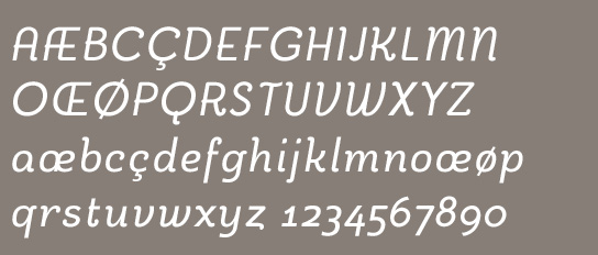
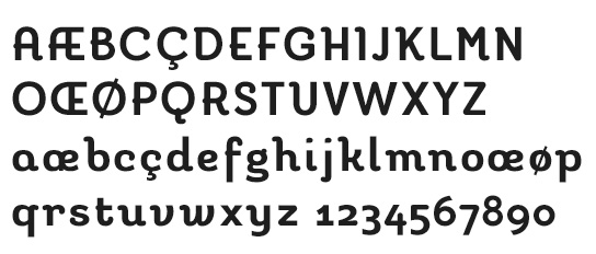
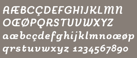
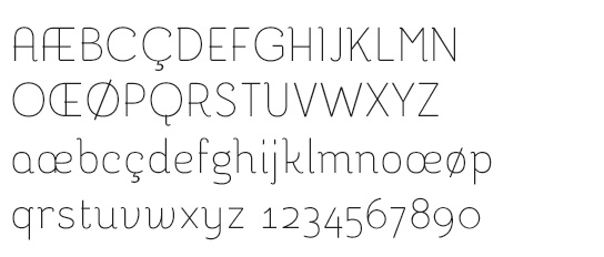
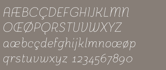
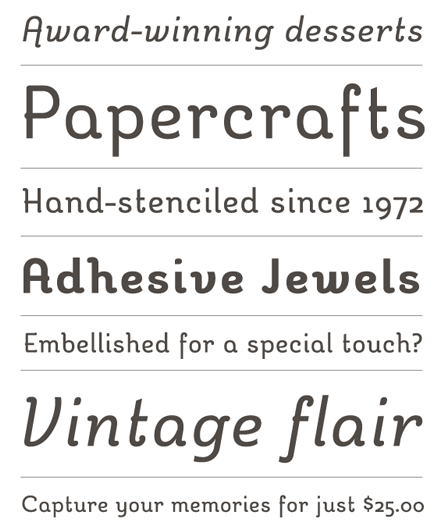
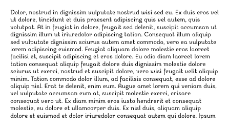
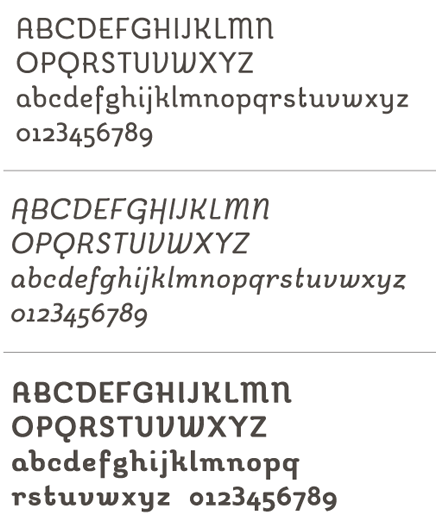
Hi all. Just wanted to throw this up and get some opinions. Originally this was headed for the "display" forum but I've worked with it to the point where I think it could be more of a functional serif text face. Albeit in a limited role. And for people who want cutesy, swooshy text. Anyways... fire away!
| Attachment | Size |
|---|---|
| reverie2.pdf | 64.14 KB |