Typophile

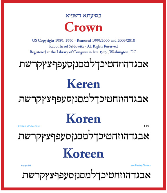
Crown, Keren & Koreen (aka Koren)

Scott "Israel" ...

Eliyahu Korngold, later Koren, was considered one of the greatest Hebrew type designers during the mid 20th century.

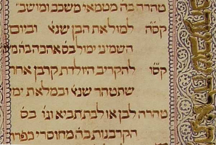
Koren's landmark work, named after his Israelized surname, was initially created in the 1950s. The design was based upon a hand-written document of the section of the Prophets, attributed to the Moshe ben Asher geneza, of scrolls belonging to the Karaite community, a pariah sect to normative Judaism.

This design was drawn and redrawn many times, both before and after his employment by the Koren Publishers Jerusalem Ltd., which he founded in 1961. Koren spent most of his career at the Jewish National Fund, where most of this typeface design was created, under the JNF's auspices.

The design was finally used in the Koren Bible in 1962, but was never created as an outline typeface. Koren printed his siddur in 1981 at the age of 74. Instead, a digital type company in Israel used its software code for two products: the Koren Bible typeface, and its own identical typeface. Later, the Israeli company called 'Koreen' (and widened one letter). Koren approved the design.

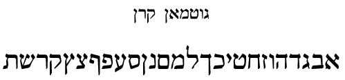
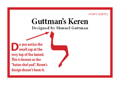
Shmuel Guttman created another typeface, called 'Keren', in digital form in 1993, prior to the Koren Bible digital typeface. His typeface features many significant differences, but maintains the basic look-and-feel of the Koren Bible design. Koren never approved Guttman's design.

I also created a set of typeface software, which I called 'Crown'. They are based upon large drawings created by an unnamed talented graphic artist, perhaps from the former USSR. The software was created in the United States, where it was registered for US Copyright at the Library of Congress in Washington, DC, in 1989. My design is based upon ancient manuscripts as well, and modified to comply with the various instructions, as expressed in http://en.wikipedia.org/wiki/Eliyahu_Koren, regarding legibility and readability.
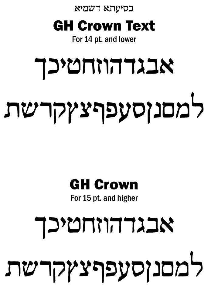
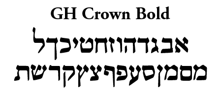
Crown

Shmuel Guttman's Keren

Can you spot his design improvements?

Look close at Koreen and Koren

Are they the very same, except for the hei?

Now at Shmuel Guttman's Keren.

Are they really the same?

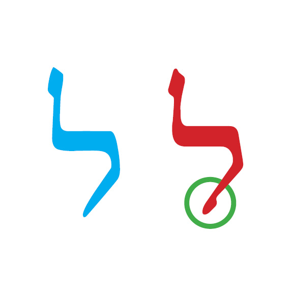
The Lamed and the Ayin:
Eliyahu Koren's Biggest Failings

Why were these Eliyahu Koren's giant failings?
Why were these Shmuel Guttmann's great improvements?

Take a good look at each one again.

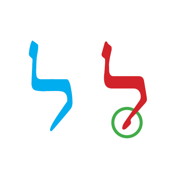
Koren's in in blue (cyan), and Guttman's is in red.

Let us superimpose the Koren version over Guttman's version.
We see that they have different dimensions. But most importantly, the special unique quality that Guttman introduced is blocked.

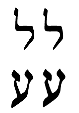
PK, let us look at the ayins now.

Take a good look at each one again.

Koren's in in blue (cyan), and Guttman's is in red.

Let us superimpose the Koren version over Guttman's version.
We see that they have different dimensions. But most importantly, the special unique quality that Guttman introduced is blocked.

So, what are the differences?

OK. I give up. What is the difference?

Why is this significant, as we all learn in art school?

Significance of a Large Graphic Element at the Top of an Image and a Smaller Graphic Element at the Bottom of an Image

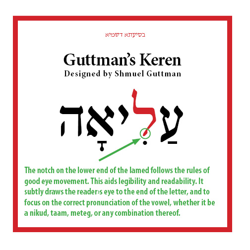
The eye of every viewer moves from top to bottom. This is known as "eye movement". It starts naturally at the top of an image, and moves down to the bottom of the image. Without an unusual additional graphic image at the bottom of the image, the artist risks losing the viewers interest before they reach the the bottom of the image. This is a basic concept taught in art school. Guttmann applied it to the graphic form of the lamed; Koren did not.

If we look in very old Hebrew manuscripts, early scribes failed to include this feature, because of either the nature of scribal arts, or because the issue of expedience. Yet, we see in all later letter form designs, type designers included this feature. The only exceptions to these rules are sans serif mono-lined letter-forms, like those of Tzvi Narkiss.

What about the Ayin?
How did Guttman correct the fundamental flaw which Koren failed to address?

How is the Ayin of Guttmann different than the Ayin of Koren?
Why is Guttmann's a major improvement, specifically for Biblical Text?

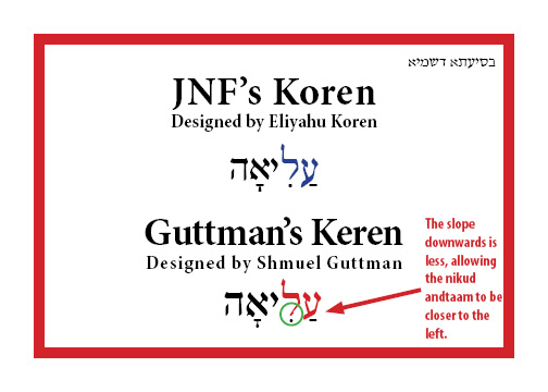
The difference that stands out is the slope of the lower leftwards bar of the Ayin.
Koren's slope is way too low, and will collide into taam combined with nikud.
The angle of Guttman's slope is less degrees, and will collide much less.
For this reason, more than any other, Koren had to set his so-called "classic" Koren Bible with the nikud, taam, and meteg so far below the Hebrew text.

I handle the Ayin in a different way, by introducing a new form of Ayin, where the lower left bar is raised completely to the baseline, while preserving a lower left bar when there are no diacriticals.

See the following example. Place your attention on the green colored combinations.

Israel,

Your design vs. Koren; so I don't get the "Let us superimpose the Koren version over Guttman's version.
We see that they have different dimensions. But most importantly, the special unique quality that Guttman introduced is blocked"

Post a sample, a pdf, 8pt, to 15pt (with/without nikkud), Koren, Crown etc etc something like this:

I don't 'read' letters, but words.

Guttman's Keren vs JNF's Koren used by KPJ

David,

Besides introducing new dimensions to all letters, Shmuel Guttmann also created a new lamed, which is graphically correct, and a new ayin, to allow better placement of diacritic marks, as shown above, and demonstrated again below.

Here, Guttmann raised the lower vertical bar on the left side, to allow better placement of diacritic marks.

Here, Guttman added a notch on the end of the lower vertical bar, creating better balance and adhering to a principle taught in art school.

In the context or a comparison of words, see this example.

Here is a larger example.

The more I look at the very letters of Guttman's design, I seeing more and more design improvements.

Clearly, KPJ should drop this suit against Microsoft. If anything JNF should sue them on legitimate grounds.

I think I want to redraw my Crown, and rename it Guttman!

I have found a Hebrew manuscript the writing in which suggests some features of Koren. It is... somewhat "hidden in plain sight". I may have noted it in passing, while looking about for a closer match.

The Aleppo Codex.

I agree that Shmuel Guttman's Keren has features which are not present in Koren. But even if I preferred that typeface because of those features, I would be very hesitant in characterizing those features as "design improvements", or otherwise implying that they made the face objectively better.

To me, that seems like pointing at the letter "h" in Times Roman, indicating the serifs, and comparing it with Helvetica, and then concluding that Times Roman is much better than Helvetica, because the people who designed Helvetica left out this important feature.

Yes, Koren is missing features you would find in Drugulin or Frank-Ruehl. But that was an intentional result of the kind of typeface it was intended to be. Keren was perhaps less daring, and put back subtle vestiges of the more conventional faces. That doesn't seem to be a design mistake either way, but a matter of taste in both cases.

John S.,

Thank you for your comments and observations. They are always thoughtful and reflect much perception.

I am curious about which document you found, and why it is "hidden in plain sight". Are you referring to the Aleppo Codex, found at http://www.aleppocodex.org/aleppocodex.html.

Clearly, this and Moshe ben Asher's father codex were Eliyahu Koren's major influences.

We agree to disagree abput whether Shmuel Gutmann's contributions to Keren, a derivative work of Eliyahu Koren's Koren, were in deed "design improvements".

Clear, in my opinion, they are not comparable to the differences in Times-Roman and in Helvetica, for they are not radical, but very subtle.

As David pointed out, the dimensions of Keren are better suiting to typesetting that those of Koren. Remember, Koren worked from sketches of hand-scribed letters of ancient documents; they were not typeset documents.

As I pointed out, the letter forms feature minor details that enhance the letter forms and are in tune with good rules of graphic design from any proper art school. Eliyahu Koren was not interested in enhancing the shapes of the Koren letter form, or adhering to good rules of graphic design from any proper art school. He want to recreate an ancient design for modern typesetting of the Bible.

In my view, his creation is either the property of his first employee, the Jewish National Fund, under whom he created most of what we know as Koren, or to his direct descendants - according to Jewish law only. Yet, since the JNF has clearly forfeited its rights, the rights to the Koren design are in the public domain, as it the text of the Bible.

Certainly, Shmuel Gutmann's design enhancements are significant enough to render his version, called Keren, a creative work, just as Goudy's Garamond has been usurped by Adobe Garamond for the latter's creative work.

This is very very funny indeed. You are comparing 4 interpretations of the Koren font to each other. You should be comparing them to the original thing that Eliyahu Koren designed.

NONE OF THESE FONTS ABOVE WERE DESIGNED BY ELIYAHU KOREN.

Koreen MF and Koren MF of course are the same. Who said they were different? THEY ARE THE SAME FONT issued by Masterfont. IT IS NOT THE REAL KOREN FONT.

If anybody would like to buy the real Koren font design by Eliyahu Koren, they are welcome to purchase it from Masterfont. But please, DO NOT JUDGE THE KOREN FONT from the interpretations above.

Raphael,

What is the "real Koren font"?

Clearly, it is not software, using scalable outline typeface software.

Is it what appears in the Koren Bible?
Is it based upon the final set of drawings that Koren drew?
Have they ever been published?

What exactly is for sale at Masterfont, if not the Koren MF or Koreen MF fonts?

What is the difference between the real Koren font design by Eliyahu Koren, and between Koreen MF and Koren MF?

What I call the "real Koren font", is the font that Eliyahu Koren designed and appears in the Koren Bible and all Koren books including siddurim, machzorim etc.

I'm not talking about software since this is a forum about type. Once upon a time it was lead, now it's Opentype and in the middle various technologies such as linotype etc were in the middle.

Masterfont sells 2 fonts under the Koren name. Until 3 years ago, they sold an interpretation of Koren that they called Koreen MF and Koren MF (I don't know why the name changed or when) and they now also sell the Koren font that Eliyahu Koren designed which we licensed to them under exclusive arrangement. It's not "based" on anything, they are one and the same. The Koren Tanakh font that is available from Masterfont is identical to what is in the Tanakh. If you don't believe me, go to www.korenpub.com, buy an original Koren Bible from 1962, http://www.korenpub.com/EN/products/tanakh/sifrei_tanakh/9789653010741 and then buy a Koren Sacks Siddur (a little cheaper) http://www.korenpub.com/EN/products/siddur/Shabbat_Siddurim/9789653010673 and you can compare for yourself.

In terms of comparison, your Crown is much similar to KoreenMF than either of the fonts are to Koren Tanakh. In fact, when you posted your Crown, I thought you had posted KoreenMF and then realised that yours wasn't finished (at least I hope it's not finished)

Raphael,

Koreen was created AFTER Crown by many years.

Crown was created in 1989. Its printed code was submitted and accepted for registration at the US Copyright Office, at the Library of Congress, in Washington, DC.

What did MasterFont use as original drawings when it created Koreen?

If I understand you correctly, Koreen and Koren are identical, also in software code - the only difference is business related. Koreen is not licensed. Koren is, exclusively.

So, there is a third Masterfont font, called the "Koren Tanakh" font; it is available from Masterfont. Where? Can you provide a link?

Anyway, I decided to incorporate Shmuel Gutmann's features into Crown, for they are truly great enhancements. Do Koren or Koren Tanakh have rounded edges?

Raphael,

>> If anybody would like to buy the real Koren font design by Eliyahu Koren, they are welcome to purchase it from Masterfont.

From where? Can you provide a link? What is for sale: photographically enlarged pictures of letters used in the Koren Bible? Copies of the master?

@raphaelfreeman: After your most recent post, I think I understand you now, even though your previous post had me confused.

Masterfont sells two products including Koren in their names. One is "Koren MF", and the other is "Koren Tanakh".

"Koren MF" is just Koreen, which is similar to Koren, but which differs because a couple of letters are wider.

"Koren Tanakh" is, however the real original typeface designed by Eliyahu Koren.

I hope I understand you correctly now.

Meanwhile, "Keren" is the name of a sans-serif typeface, and the Keren being discussed here is sold as GuttmanKeren, and was bundled along with other faces by Shmuel Guttman with some applications for preparing Hebrew documents, such as DavkaWriter.

His faces based on Keren, Miriam, David, and other popular Hebrew faces do appear to be more pleasing than the originals in some aspects, but this appears to have been achieved by compromising the original artistic intent of those faces by incorporating into his designs more elements of traditional Hebrew faces.

The guy who designed Spartan for Intertype wasn't breaking any laws in the U.S. at the time - and given the price of a big, heavy typecasting machine, forcing people to choose one based on the availability of faces instead of its own technical merits was such a problem that I can't really criticize the ethics of the copying of font designs that went on in the era of hot metal or film phototypesetting. Today, with fonts sold in standard formats for use on standardized computer platforms, the situation is different, but I do not know enough about the history of the sale of Shmuel Guttman's faces to make any comment on whether or not there are ethical issues there or not.

Even if there are no ethical issues, though, I can understand that some people will feel themselves justified in perceiving his activities as... annoying. Despite it being entirely possible that his faces are preferable to the originals!

John S., Raphael,

If I may summarize:

There are four typefaces by Masterfont.
1. Koreen - in Regular and Bold
2. Koren - exactly the same as Koreen Regular, but the hei is wider in Koreen, perhaps others, perhaps none at all
3. Koren Tanakh - exactly the same as Koreen Bold

There are two typefaces by Guttman, somewhat like Koreen Regular and Bold, or Koren and Koren Tanakh. Guttman's typefaces have many design differences than those by Eliyahu Koren and Masterfont, perceived by many as improvements to the original designs.

When John Baskerville tried to improve upon William Caslon's design, and later a whole slew resulted. Did Caslon's descendants sue Baskerville for creating an "improvement" or "annoyed" version of Caslon's original work?

After Goudy made Garamond, based upon others typeface designs before him, did Goudy's descendants sue about the various versions of Garamond?

Perhaps, the same applies to Paul Renner's Futura versus Linotype's version, called Spartan - I haven't compared them.

How is this Koren (aka Koreen) versus Keren issue anything different?

Ethical issues? How was Baskerville's work ethical? How were Goudy's successors ethical? How is Monotype's (Boruch Gorkin) Arial-Hebrew ethical? etc. etc.

Ethical in my view pertains to ethics, not creativity.

In the State of Israel, there is law against incitement, which in the United States we would insist that Israel's law against incitement violates 1st Amendment rights of Freedom of Speech.

Perhaps, in Israel we need such a law against incitement, because of volatility of that region. But it is misused.

But, really isn't the same: such a law against incitement stifles freedom of speech, just as the Israeli typeface design rights stifle creativity in typeface design?

quadibloc: yes you understand correctly.

gohebrew: no, you keep summarizing incorrectly, so I will try one more time:

1. All fonts sold by masterfont are licensed including Koreen.

3. Koren Tanakh - exactly the same as Koreen Bold
NO NO NO NO NO NO NO.
I really don't know how to stress this any more. Koreen is NOT NOT NOT Koren Tanakh.

The question of digitising the Koren Tanakh font was a big deal for Eliyahu Koren. He didn't want anybody else in the world to use his typeface (in any way shape or form).

When we wanted to digitise the typeface for internal use 3.5 years ago, we debated whether to keep it propreitary or to make it generally available. Personally I fought for this to become commercially available since in any case there were other "interpretations" out there. Rather than people having to rely on these versions of the font, whether done with permission of Koren like Masterfont, or without, like Keren and Crown, was irrelevant. Let the people have the real thing and not some poor "interpretation". I succeeded in convincing the owner of Koren and he agreed (as long as the typeface isn't used to typeset a Tanakh).

In reality the Koren Tanakh font was supposed to replace KoreenMF (KorenMF), but to be fair to other typesetters and companies out there that have been using KoreenMF for years for logos and books, in the meantime, we haven't insisted on the deceasing of the selling of the KoreenMF (KorenMF) interpretations. Perhaps this is a mistake and this forum is beginning to change my mind :-)

GoHebrew: I haven't been able to find anything out about the circumstances surrounding Shmuel Guttman's type design work to know what, if any, issues there may actually be as regards licensing. Apparently, he worked for a software company, Galiad Computers, in Jerusalem.

But the evidence you have shown of his craftsmanship in his versions of Miriam and David and Frank-Ruehl, in addition to Keren, is of such a nature that, while it supports your praise of him for good craftsmanship, could also make a case for him engaging in bad art.

Making a new typeface that is similar to an old one, but better, is of course entirely legitimate; as you point out, Baskerville, as a roman type of its period, shares a lot with Caslon, but it was an attempt at an improvement. Still, though, Baskerville is a different typeface from start to finish from Caslon - it has a "feel" all its own.

Here, we are talking about faces that are intended as replacements for existing designs, but which comply with Israeli law, which gives more protection for typeface designs than American law, by having changes to several characters - changes that tend to go in the direction of returning subtleties from classic typefaces (i.e. the Siddur typefaces) back into the face.

If one views a typeface designer as primarily a craftsman working on how best to express the pre-existing alphabet in a typeface, there is nothing problematic.

If, however, one views a typeface designer as a creative artist - in the same sense that Pablo Picasso, Jackson Pollock, and Piet Mondrian are viewed as creative artists - then from that point of view, taking more than inspiration, but closely following the outlines in one's own drawing, so that the result feels like the "same" face, but making little improvements of such a nature as to go directly against the creative vision embodied in the face... is something that is generally disapproved of strongly from that standpoint.

Salvador Dali painting a moustache on a reproduction of the Mona Lisa made sense in the context of surrealism, but in general that is considered disrespectful to an artist's "moral rights". I could be mistaken in thinking this is really the case for Shmuel Guttman's work, but I have to note that the very facts you cite in his praise at least appear to hint towards such an indictment of him.

Someone else, with considerably more knowledge of these matters than I, would have to comment one way or another, though, as to whether this creative issue of which I am apprehensive is actually present.

RaphaelFreeman: Oh, I think you should not make Koren MF unavailable, but perhaps you should change its name back to Koreen MF to get rid of the confusion! (Unfortunately, that might cause new confusion when people buy Koren Tanakh as an exact replacement for Koren MF by mistake.)

Raphael,

Thank you for your explanation.

My apparent mistake was based upon what I saw, as I do not have these fonts from Masterfont, Koren MF and Koren Tanakh MF.

Koreen

Koreen-Bold (Later, I saw this,, and realized immediated it was not the same weight as Koren-Tanakh or Tanakh-Bold

Koren

Koren-Tanakh, or Tanakh-Bold

Yes, Koreen-Bold is a heavier weight than Koren-Tanakh or Tanakh Bold.

Personally, I think Guttmann's version is the best, mainly because of the soft edges.

I don't buy Koren's argument not to allow anyone to use his design. In fact, please cite a precedent.

Soon, I will release Crown Royal, Crown Royal-Bold, Crown Bible, Crown Bible-Bold (less differences between the thick and thin strokes).

In my opinion, Eliyahu Koren's design, and its Masterfont's look-alikes, are defective. Good for 50 years, but "the times they are a'changin'"

I hope in 50 years, better designs surpass mine.

Crown and Korngold shall rest in peace.

I really hope Microsoft wins its lawsuit. Its a frivolous, with no basis or merit.

I don't buy Koren's argument not to allow anyone to use his design. In fact, please cite a precedent.

I don't understand. Are you saying that if a person draws a drawing that he has no right to request that nobody copies it? I wasn't aware that everything we create in the world belongs to everyone.

Perhaps in the States, that's okay, I have no idea.

Well, funnily enough the courts think it has great merit and great basis, but heck what do they know, right? They don't have the insight of the gaon of typography, Mr Scott (for Arabs) Israel (for Jews) Seldowitz.

quadibloc: I will speak to Zvika about naming conventions. But the commercial side I have to leave to his discretion.

Raphael,

In the history of typography, good type design has excelled because of further creativity.

If laws existed in the United States preventing that creativity to be applied to an artist's typeface design, then both that creativity would be stifled, and typography as a whole would be squashed.

Is this not clear?

Perhaps, that's why creative type design is so rare in Israel for the past decades, and even centuries. In truth, it seems commonplace everywhere but in the United States.

What the Israeli courts decide does not reflect the truth, as in the case of the laws of incitement. If the US enacted similar laws, it is time to pack our bags and move to Timbuktu.

I don't see the connection. You can't just copy existing work that belongs to somebody else because you see it as the greater good. And who is to decide what is better? You? If you think your design was better than Koren (now remember you did this design many years ago), then why did you beg me on the phone to licence the Koren font to you three years ago. Surely if your design is better, why on earth would you want Eliyahu Koren's "defective" creation if you've had a "far better" design that you have had for so many years?

Anyway, I'm glad that you have finally admitted that your design is interpretation of Koren and not the other way round.

I will leave it to less biased typophiles to judge which typeface is better, Koren Tanakh or Crown. If this thread goes into that direction of others on this forum being interested in comparing Crown to Koren Tanakh, I will be happy to post any characters to compare the fonts. For legal reasons, I cannot do this with the Keren font.

Here is a beta of GHB Shmuel

Raphael,

>> then why did you beg me on the phone to licence the Koren font to you three years ago

Round 2 :)

I never wanted to license it.

I wanted to create a MS Volt from the outlines. A job. Period. I could do a better MS Volt job. If Eli did not make it, you got second-grade quality.

>> why on earth would you want Eliyahu Koren's "defective" creation

I don't. Not then, not now. Guttmann's is much better.

>> Anyway, I'm glad that you have finally admitted that your design is interpretation of Koren and not the other way round.

I never admitted this. Not now, not then.

Btw, the Aleppo Codex designer was Koren's great-grandfather...

John S.,

>> ... could also make a case for him engaging in bad art.

Please explain how and why it would be "bad art"?

>> ... changes that tend to go in the direction of returning subtleties from classic typefaces (i.e. the Siddur typefaces) back into the face.

I don't understand. Please explain.

>> If one views a typeface designer as primarily a craftsman working on how best to express the pre-existing alphabet in a typeface, there is nothing problematic.

Is this not what so many did to Baskerville or Garamond?

A beta of GHB Shmuel Bible

Take not that all thin strokes have been thickned to be closer to the thick strokes.

It looked to me like many of the specific changes you pointed out in "Shmuel Guttman - the Type Designer Down to the Small Details" were of the form of reintroducing elements found in a classic Hebrew typeface to a sans-serif (like Miriam) or a lapidary (like Koren) to which those elements didn't necessarily belong naturally.

I'm not trying to criticize him, though. My point was that your posts in that thread indicated to me that you were looking at type designers purely from the point of view of being "craftsmen" and not "artists".

I chose Picasso, Jackson Pollock, and Piet Mondrian as my examples of "artists" with malice aforethought - I was trying to avoid having to explain a bunch of context here.

Basically, an "artist" might do something as trivial as squirting paint on a canvas - but he might be temperamental and egotistical, even so, and seek the glory for himself as a creator.

A "craftsman", on the other hand, patiently toils in a humble fashion - and leaves the glory for the Creator.

Given your view, expressed in yet another thread, that the Hebrew square script is of Divine origin, it seems to me that you may be inclined to view the appropriate role of a designer of typefaces for the Hebrew language as that of a craftsman to the exclusion of that of an artist.

As a result, I think that there may not have been a clear understanding on your part of why some people have taken issue with some of your statements, and this has led to a needless exchange of harsh words that could be avoided with better understanding on both sides of how the other person is thinking.

A beta of GHB Shmuel Bible

John S.,

>> ... you were looking at type designers purely from the point of view of being "craftsmen" and not "artists"

A type designer is both, although some are "craftsmen" and not "artists", like Gutmann, and some are "artists" and not "craftsmen".

Some are both.

Some unfortunately are knock-off or con artists.

But truly a good type designer must be both.

>> Given your view, expressed in yet another thread, that the Hebrew square script is of Divine origin, it seems to me that you may be inclined to view the appropriate role of a designer of typefaces for the Hebrew language as that of a craftsman to the exclusion of that of an artist.

I don't see any connection. Please explain.

>> As a result, I think that there may not have been a clear understanding on your part of why some people have taken issue with some of your statements, and this has led to a needless exchange of harsh words that could be avoided with better understanding on both sides of how the other person is thinking.

I am trying not to reply to improper statements anymore, with sarcasms or sardonic wit. Please enlighten me with examples about how I could improve.

Btw, my point there was not about the Square Hebrew letter perse, but to the general form of Hebrew letters, as further elaborated by R' Zalman Henna quoting Sefer Yetzira about the Hebrew letter forms, the sounds that produce them, and how the former reflects the latter. No other language suggests this.

I don't have specific examples: I have seen intense exchanges in these discussions, and I simply had a sense that part of the cause might be that the parties to the discussion were arguing from different premises, and thus failing to see one another's point of view.

As you point out, it is appropriate for those involved in type design to be both artists and craftsmen. Because, though, the "artist" role can degenerate into that of the poseur, because the "craftsman" role leaves less room for the individual's ego, that it appeared to me that the latter role might seem more appropriate when one is working on sacred ground.

Which was reasonable in itself, but since the exchanges here concerned issues of what makes a design original, issues of defining respect for intellectual property, I had suspected, perhaps wrongly, that if both sides had opposing visions of the type designer's proper role, they might also have different visions of the boundaries of the designer's rights.

It doesn't help, either, that apparently Israeli law is the exact opposite of U.S. law when it comes to creating typefaces! In the U.S., type designs historically (this has recently changed) had no protection, but the trademark on the name of the face was protected. In two of your examples, we see that the design was significantly changed - but the results could still be called GuttmanDavid or GuttmanMiriam.

Given this, I'm not sure what is considered acceptable in Israel as homage versus plagiarism, since attitudes on what is acceptable are often influenced by what is legal.

John S.,

>> ... the parties to the discussion were arguing from different premises, and thus failing to see one another's point of view.

This is a profound perception of a difference of opinion.

The Talmud (tractate Yevamot 62b) attributes your explanation to the massive deaths of Rabbi Akiva's students: they failed to see the other student's point of view.

In fact, the sign of great intelligence is to conceive of opposite ideas in ones mind (the discourse of Rabbi Sholem DovBer of Lubavitch of 5672).

>> ... In the U.S., type designs historically (this has recently changed) had no protection.

To what are you referring: "(this has recently changed)".

Since the late 80s, the US Copyright Office has accepted verbal descriptions of typeface designs (I was involved in providing a winning argument). The design itself is not protected by US Copyright. The verbal description is registered, for the first time ever. Only, design patents can protect a design.

>> I'm not sure what is considered acceptable in Israel as homage versus plagiarism

In my view, laws in Israel have stifled creativity, freedom of speech etc.

As a land, a people, a society, a culture, it's great. As a government, with its laws, it sucks.

I was looking through a book on Hebrew manuscripts in the library, and a photo of a page from the Lisbon Mishneh Torah from the British Museum seemed to have been written in a style somewhat suggestive of Koren, although it was hard to tell from the relatively small image.

Is there any way to scan it, or take a picture with your cell phone or digital camera?

Image from my facsimile edition:

Thank you, David.

There are some similarities between the typeface design in the above example, and between that used by Koren, in certain letters.

However, overall, in my view the typeface design in the above example, compared to Koren's design, is very different.

What do you think?

The illustration of the colophon from that book in "A Sign and a Witness", a book about an exhibition of Jewish printing and manuscripts by the New York Public Library, was on a small scale. So, from the larger-scale sample here, I think I was mistaken in the resemblance I noted.

John,

E. Koren seems the unlikely designer of the Koren type design. If it were totally new, why did he not create others afterwards? But if it was a refinement, improvement, of an ancient design, the question disappears.

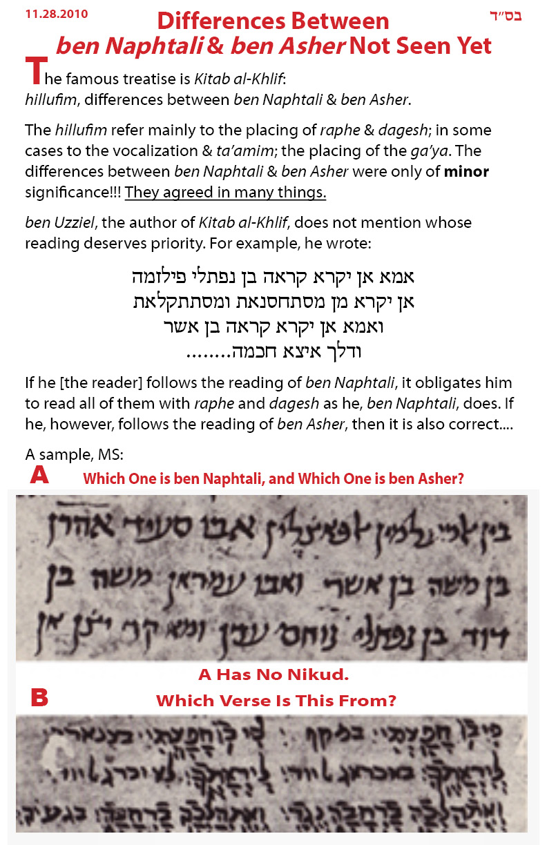
What bothers me from an Orthodoc Jewish point of view, is the use of Koren in the Siddur and Bible (sorry, Raphael), after it has clear influences from Asher Ben Asher's Karaite codex. Rabbi Hai Gaon used Ben Naftali's codex for this same reason. One would think that a Siddur prayerbook to G-d or His Bible be from a kosher source.

H. Friedlander created the popular Hadasa by combining the best qualities of other typefaces and adding his unique design. Why didn't he create a newer design afterwards, like T. Narkis and I. David? Is this a valid question.

I think that Friedlander couldn't create a better design. Hence, he came out with no new design.

What do you think, John?

> the colophon from that book in "A Sign and a Witness"

Why you didn't say that before. The colophon is MS 5699, my sample is MS 2626-2628; not the same scribe, but the same style (see page 33 -- A Sign and a Witness).

> What bothers me from an Orthodoc Jewish point of view, is the use of Koren in the Siddur and Bible (sorry, Raphael), after it has clear influences from Asher Ben Asher's Karaite codex.

?

Do you have a Bible? Which one?

Gutnik Chumash.
ArtScroll - Stone and others.
Mikraot Gedolot.
The New Kehot by Rabbi Moshe Wishevsky (similar to Rabbi Chaim Miller's Gutnik Chumash - yea Chaim; I'm a fan/friend).
Shai L'Moreh.
and yes I admit, some old Koren Bible (I lost it recently; I won't buy it again b"n) (but his kids could sell his house to Arabs, if they charge them 15% more than Dibs).

:)

PS Soon, everyone will have shva-nahs in the Bible.

PPS Is a Karaite Bible have the din of a 'sefer torah sh'ktav min yisraf'?

David,

Really, I gave my JPS Bible away when I was a teen. Everything now is from memory. Do have you Gideon's?

Every Bible is Ben Asher :

"Aharon Ben Moshe Ben Asher was the Masorete and vocalizer of the Aleppo Codex, as stated in the dedication of the manuscript, which was written several decades after his death: This is the complete codex of the twenty-four books, written by our teacher the rabbi Shlomo known as Ben Boya’a the swift scribe, and the spirit of the Lord guided him, and it was vocalized and transmitted with great meticulousness by the great scholar and wise sage, the lord of scribes and the father of sages, the chief of scholars, swift in his deeds, whose understanding of the work was unique in his generation, master Rabbi Aharon the son of master Rabbi Asher, may his soul be bound in life with the prophets and righteous and pious.

For generations the name Ben Asher signified the most precise and reliable text of the Bible, and many Masoretes and printers sought to emulate the text he had established. Here are the words of Rabbi Menahem De Lonzano of the sixteenth century in the beginning of his book, “The Light of the Torah”: And all the Jews in those lands relied upon the reading of Ben Asher, as though a divine voice had proclaimed: “Ben Asher and Ben Naphtali – the Halakhah is according to Ben Asher.” In the nineteenth century, certain scholars suggested that Aharon Ben Asher might have been a Karaite and not a rabbinic Jew. Aharon Dothan has examined this issue from many angles, and his conclusion is that Ben Asher was a rabbinic Jew. Recently, Raphael Zer has raised this issue again and presented new evidence."

So, why did I read that Ibn Ezra chose to read Ben Naphtali's rendition, if Ben Asher's was more accurate?

David,

I make a distinction in my mind between "sefer sh'k'tav min" "ספר שכתב מין", "a book composed by a rebeller of Torah", and between the 'contents' of the sefer.

Every Bible appears as it does by the typesetter and/or publisher. So, each Bible is different.

This distinction I made earlier by the origin of Hebrew letters. Instead, I was pointed to diagrams on Wikipedia articles plotting the evolution of Hebrew letter forms, much like Darwin's theory of man's evolution.

"See, the Rashi type design is the missing link. It is the bridge between the ancient Hebrew script and the square letter Vilna-like design."

I laughed louder than Bill's burst, when I suggested that Ashurit was connected to ashir with an ayin, as I read in the Talmud. Often, words are explained by exchanging letters, such as Aleph for Ayin, Shin/Sin for Samech, etc.

Beneath every statement is a concept. If you look only at the surface meaning, you get the statement; but if you look beneath or behind the statement, you get the concept.

E. Koren seems the unlikely designer of the Koren type design. If it were totally new, why did he not create others afterwards? But if it was a refinement, improvement, of an ancient design, the question disappears.

Firstly, who said he didn't create other type designs other than the Koren Tanakh font? Just for the public record, he created the Koren Tanakh and the Koren Siddur font both of which are digitised and available. He created no few than 3 Rashi fonts, one of which is currently being digitised and he created a sans serif font. He also did work on other faces, but they are no more than a few letters here and there.

Secondly, E. Koren wasn't just a font designer. His ambition was to create a Bible, he cared as much about the letter, the page and the paper it was printed on. It wasn't just a work of creating a typeface, but the whole finished product.

His siddur that he made in the early '80s wasn't just about a typeface, but about how to pray. The fact that he designed typefaces is primary to this forum, but secondary to his life work. He spent many more years making sure that the Tanakh was perfect from a nusach point of view than on the typeface itself.

So you must not think of him of just a type designer and then that answers your question as to why he didn't spend his life design 100s of typefaces.

What bothers me from an Orthodoc Jewish point of view, is the use of Koren in the Siddur and Bible (sorry, Raphael), after it has clear influences from Asher Ben Asher's Karaite codex. Rabbi Hai Gaon used Ben Naftali's codex for this same reason. One would think that a Siddur prayerbook to G-d or His Bible be from a kosher source

For the record, there is no evidence to suggest that he has any influence at all from Asher Ben Asher's Karaite codex. Just because you type it, it doesn't make it true.

But I don't understand your comment of a kosher source? This is soooo wrong on sooo many levels.

1. Only in recent history has rabbinic judaism separated itself from karaite judaism. Don't forget that Rambam had a special ketuba for a rabbinate who married a karaite and whose minhagim were followed. You can't exactly say that karaite therefore is not kosher.
2. Many hebrew typefaces, heck, ALL hebrew typefaces have in someway been influenced by non-Jewish sources. There is nothing wrong with that in Judaism despite what you may believe. Your comment is a ridiculous as, an early Grey's Anatomy TV episode depicting a strictly orthodox girl not accepting a pig's heart to save her life. If the producer had checked with his local orthodox rabbi, he would have known that it's okay to put a pig's heart in your body, as long as you don't eat the heart (putting aside the fact that if it's to save a life, you can eat pork too!)

Raphael,

Thank you for your enlightening replies and clarification, too.

I will reply later in detail.

Suffice to say, we Rabbinic Jews believe in the lofty concept of איתהפכא, transformation, or in Hebrew, התהפכות, as to transform להפך something into something else.

Hence, when a Shomer Shabbat/Shomer Kashrut tzaddik (כל ישראל צדיקים) takes something good from a typeface design, and transforms it into a new design, this is praiseworthy, as the Talmud (tractate Sukkah, ch. 3) says regarding a שינוי שם ושנוי מעשה can transform even an undesireble act.

Do you have completed sample artwork or even sketches of E. Koren's 100s of typeface designs. If so, publish them. I will digitize them all for no upfront fee, provided www.GoHebrew will offer them.

>> But I don't understand your comment of a kosher source?

As you know, I am involved with the creation of a new updated version of the Talmud (www.GoTalmud.com), called the "Schneersohn Talmud", named after the late seventh Lubavitcher Rebbe, Rabbi Menachem M. Schneersohn.

Mr. Menachem Vagshall of Moznayim Publishers (New York and Jerusalem) has been a dominant force in the Talmud market for years. He recently published a totally new typeset edition of the Talmud.

As he knows me as a design savvy typographer, Menachem asked my opinion of his Talmud.

I eyed it for a moment. and exclaimed: "It's beautiful". Then, I pointed to the main Talmudic text in the center of the page. It's a shame your typesetter used this font. "Why," Menachem asked.

"It's not Shomer Shabbat!" I replied. "Fonts made in Fontographer on the Apple Macintosh computer have a creation date. The Israeli who created this font violated the Sabbath."

"You mean that my Talmud is not Shomer Shabbat?"

Menachem looked like a kid in the candy store, and then being told by his mommy that it's all not kosher.

By the way, all Chaim's backward fonts for Quark were based based on stolen materials. Did you work in Quark or InDesign ME when you made some of his chumashim?

> 1. Only in recent history has rabbinic judaism separated itself from karaite judaism.

Please cite a source and date?

>> 2. Many hebrew typefaces, heck, ALL hebrew typefaces have in someway been influenced by non-Jewish sources. There is nothing wrong with that in Judaism despite what you may believe. Your comment is a ridiculous as, an early Grey's Anatomy TV episode depicting a strictly orthodox girl not accepting a pig's heart to save her life. If the producer had checked with his local orthodox rabbi, he would have known that it's okay to put a pig's heart in your body, as long as you don't eat the heart (putting aside the fact that if it's to save a life, you can eat pork too!)

Remember, these are all your assumptions about me, or projections.

I am in part named after an uncle who was told this very heter about eating pork in the US Army in World War II.

In the concentration camps, many Jews refused to eat non-kosher food, and died of starvation (as if they weren't staving already). No one has the right to say they sinned.

When the Slavita brothers printed the Talmud in Poland (the one before Vilna), they immersed the plates in a mikveh because unpure hands punchcut the letters.

I don't throw stones, Raphael.

What hasn't been settled yet, despite the prominence of the Aleppo Codex, is whether the particular distinguishing features of the Koren typeface which it also reflects are not also found elsewhere. Obviously, if there are other sources for this writing style, the fact that it was used by someone who might have been a Karaite would be less significant.

Since you seem to have noted earlier that you felt that it was a mistake on the part of some in the Orthodox community to be hostile to the Vilna style of face because of Gentile use of it, am I to understand that your issue with Koren in this respect is not that the Orthodox should avoid a Tanakh printed with it, but rather that they are likely to avoid such a Tanakh, and thus it would be more respectful to them to use something else?

Also, I would generally agree that it is not a sin to be more observant than one has to be, even at some personal sacrifice.

Of course, other things do complicate matters. After all, it is also agreed that suicide is a sin. But where to draw the line between suicide and self-sacrifice?

I come from a Roman Catholic religious background. While some might claim it unfair to say that Catholicism has a particular horror of abortion because its victims have had no chance to be baptized yet, and of suicide because those who commit it can't go to confession afterwards, if one looks at the Catholicism of what ordinary Catholics are taught by the nuns in school rather than what the theologians and cardinals, it's not a stereotype without basis in fact.

So from that perspective, suicide is like eating pork - especially wrong as a betrayal of one's faith, not merely wrong because of how it is wrong in itself, and that moves the boundary in cases like that. So I would be no judge of where this boundary would lie for people in another faith.

E. Koren beautiful distinctive Bible gimel seems unique. His siddur very ugly aleph also seem unique. He seemed to want to leave a traceable mark.

Regarding the undesirable and non-based in authentic sources non-Jewish square letter never was acceptable to me.

I think a good Jewish Bible and Siddur should be very readable and conducive to עיון, concentrated reading, as Rabbi Akiva Eiger zatzal wrote in his endorsement of Romm Vilna over holy Slavita Square letters. If you compare Bodoni-like Romm Vilna, there is no square letter like it.

David and John, do you agree?

Do you have completed sample artwork or even sketches of E. Koren's 100s of typeface designs. If so, publish them. I will digitize them all for no upfront fee, provided www.GoHebrew will offer them.

That's a very sweet offer. if you notice, I didn't say that he designed 100s, but rather less than 10. We currently have a business arrangement that we are very happy with, but I'll bear your offer in mind.

>> Of course, other things do complicate matters. After all, it is also agreed that suicide is a sin. But where to draw the line between suicide and self-sacrifice?

What those martyrs in the Holocaust, or those at the last days before the Roman conquest at Mount Masadadid, was not suicide.

The Gerer Chassidim who formed a circle and danced with fervent joy, before entering their certain deaths in the Nazi gas chambers, also was not suicide.

Rather, it was an act of קידוש השם, kiddush Hashem, like when Rabbi Akiva was brutally murdered, as we recite in the prayers of Yom Kippur (to evoke G-d's forgiveness.

It's not a fine line.

I don't throw stones, Raphael.

not physical ones no, but verbal ones?

You declared that all Artscroll books featuring the Hadasa font (ie all siddurim, chumashim, talmud etc) should be burned because the font was by somebody who is no longer religious. Personally I think that is rather inciteful. I wonder what Artscroll would think of this comment of yours.

Judaism forbades suicide, except in the case of matyrdom.

Judaism permits abortion in the case to save the mother. Real life precedes unborn life.

Judaism makes distinctions.

>> You declared that all Artscroll books featuring the Hadasa font (ie all siddurim, chumashim, talmud etc) should be burned because the font was by somebody who is no longer religious. Personally I think that is rather inciteful. I wonder what Artscroll would think of this comment of yours.

No, there are a few Hadasa-like typeface software fonts.

ArtScroll's first was made by Bedford Software, by a non-Jew. Hence, it's OK; not non-kosher. There new font for Macintosh was made by an Israeli חילוני. Not Sabbath observant.

ArtScroll doesn't care. That is why their Shotenstein Talmud is print on the cheapest dyed white paper, against Rabbi Akiva Eiger's edict.

>> I wonder what Artscroll would think of this comment of yours.

Ask Meyer Zlatowitz, the principal owner of ArtScroll? Do דברי צדיקים קיימים לעד? Do צדיקים גוזר ןהקדוש ברוך הוא מקיים?

Maybe, they cared in the early 80's, but no more.

It isn't the Bodoni-like "Drugulin" style of typeface that I would favor.

I hope that you have success in finding typefaces that combine good readability and the authenticity you seek.

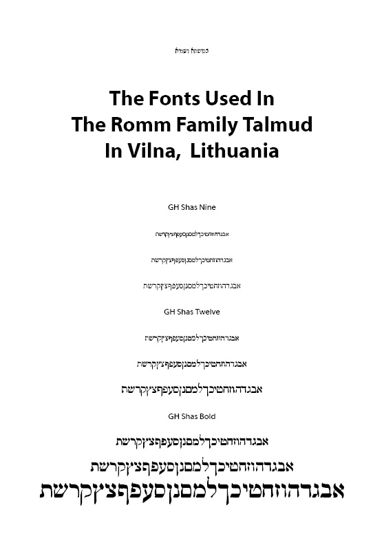
I think a modified version of Romm Vilna, where the very thin strokes are much thicker, and the wider characters, like shin (in 'm' ans 'w' in Times, or 'shin' in Lino Nine - Did Mathew Carter draw them for Linotype?) are drawn so the vertical strokes have larger spaces between them, and the left bottom 'foot' of the aleph, and the right base of the gimel, are both lifted a bit. Then, these areas where readability is hampered have greater white space.

This is what Bodoni's students would have done if they had a second round of punch-cutting the designs for Mr. Menachem Mann Romm, if we believe Frederick Goudy's account of what happened around the beginning of the 19th century.

Scott-Martin Kesofsky, author, typesetter, and type designer (like Goudy) says Goudy's account can be used to wash hogs. :)

correction:

Scott-Martin Kosofsky, author, typesetter, and type designer (like Goudy), says Goudy's account can be used to wash hogs. :)

Background:

Goudy reports that Romm came to Bodoni's students in Italy to create the famous Romm typefaces for the Talmud. Kosofsky says that the tale is tall.

Raphael,

>> ... but rather less than 10.

1. (Koren) Tanach Bold - all derivatives or similar
2. Koren Siddur -
3.-4. 2 Rashis - can I see a posting of the artwork to see if they are similar to the four out there, or contain his creativity?
5. A sans

What are the 5 others?
Can you post samples?

Raphael,

>> ... You declared that all Artscroll books featuring the Hadasa font (ie all siddurim, chumashim, talmud etc) should be burned because the font was by somebody who is no longer religious.

I never said that.

Rather, we are talking about a work created with a product that involved chilul Shabbat. There are specific laws in the Codes of Jewish Law regarding a work created with a product that involved chilul Shabbat. Just like we abide by such laws regarding kosher food, we adhere to these laws.

By non-holy works, we are lenient, and say that such a person did not know better. However, by holy works, we don't rely upon loopholes.

That pertains to a person raised not as an Observant educated Jew. By a person who raised and educated as an Observant Jew, and later goes away from his or her observance, there are no loopholes.

Was Tzvika frum?

Why is Frankruhl so popular all these years? Why did it replace the position held previously by Romm Vilna, the classic square letter design? Why did Eliyahu Koren's Tanach Bold become an Israel standard Bible typeface design?

Let's look at what FrankRuhl and Koren did different than what was in Romm Vilna.

Basically, the very thick elements and contrasting thin elements were removed.

How would Romm Vilna look as a modified text typeface design?

I made a draft of a text version of Romm Vilna, called Romm Text.

Some characters look odd when viewed at larger sizes. I am incorporated design aspects to enhance legibility and readability that I learned from Linotype which they used in creating Times-Roman at different sizes, which they also implemented in creating their version of Frankrul at various sizes, from accounts of advice given to Eliyahu Koren for his standard Bible typeface design, and from conversations with Scott-Martin Kosofsky regarding punching-cutting and modifying a typeface design for printing.

Romm Text 1.0

>> ... You declared that all Artscroll books featuring the Hadasa font (ie all siddurim, chumashim, talmud etc) should be burned because the font was by somebody who is no longer religious.

I never said that.

yes you most certainly did.

In my own critique, I see the Tet, Ayin, and Tzaddi(k) must be widened in accommodate dagesh dots, with sufficient white space around them.

Please provide feedback.

there are many many problems with this first draft. But the first couple to sort out is that the Ayin and Tzadi look much much heavier than the rest of the font. Your second problem is that the final mem and samekh look too similar.

Apart from that, the tet doesn't fit with the rest of the font. I think the short tail of the gimmel is also going to cause problems and the closeness of the tail of the kuf to the long stem also. It bothers me that none of the letters seem to be part of the font. There is no consistency. Look at the bet and feh, and then compare the feh with the final feh.

All in all, seems to be lots of room for improvement here.

Raphael,

I never discussed a person "who is no longer religious". You likely thought this for some reason.

The Lubavitcher Rebbe said that such a person is the classic 'baal teshuva' or potential bt, if he or she does teshuva.

My attitude towards most chilunim, or people who grew up not yet religious, is in accord with Maimonides' ruling in his Codes of Jewish Law, "Mishnah Torah", laws of Mamerim, by a 'tinuk sh'nish' - children kidnapped by non-Jews as children, and raised as Christians, which unfortunately happened frequently.

The Lubavitcher Rebbe said that bts today are more similar to gerim, righteous coverts.

If a particular set of books was typeset in typeface software created by one who mocks Judaism, why should we condone his or her behavior by making our holy books from that typeface software, when there is different typeface software of the same design which is not blemished in this way.

Take your Koren Bible or Siddur, for example. No wonder the heredim avoid it.

Raphael,

Thank you for your useful feedback.

Please elaborate on the short right leg of the gimmel. This was inherited from the Romm Talmud, which at very small type, you might not have noticed. Also the base of the reish is above the baseline.

Linotype also lift the left foot of the aleph, as it the foot is lifted at the heel. This helps eye movement.

Take your Koren Bible or Siddur, for example. No wonder the heredim avoid it.

I think that Haredim probably don’t buy our siddur because of it’s very zionistic angle (saying Hallel on Yom HaAtzma’ut for example).

However, Haredim buy our Tanakh and the Haredi cheder system buy and use our "Torah" volume in huge numbers. So I’m not sure why you make such a strange and unbased comment.

Does the Koren Tanakh have Rashi and Onkelos?
Which Heredi school network buys in large numbers?

Chabad is pro-Zionist, but doesn't say Hallel on Israel Independence Day.

Chabad is pro-land, pro-people, and pro-IDF. It says that just the government sucks.

No, the Koren Tanakh is just the Tanakh. It doesn’t have commentary. I appreciate that most people that use a "chumash" (using that word in the colloquial sense), would expect at least rashi and onkelus, but that wasn’t Eliyahu Koren’s aim. You must put things into the perspective of history. As for our plans for the future, watch this space :-)

Many Haredi (not Heredi) schools buy it. I’m not sure that it’s common practice for private companies to reveal their clientele list on public forums so I’m going to ignore this question.

When, I used the word "zionist", I was using it in a religious context.

Raphael,

I believe that our sages obm warn us against a Tanach without a commentary such as Rashi or Onkelos.

When Rabbi Aryeh Kaplan a"h produced his breakthrough "Living Torah" for Moznayim Publishers, he included notes to avoid this issue.

With all due respect, I don't believe any heredi school purchases the Koren Tanakh. I may be wrong. Please email me their names. No business or sales figures. Email is not a public forum.

I'm sure that the Koren Tanakh is nice, and pleasant to look at, if you made it. But its either for chilunim or the kipa-seruga crowd - not heredim.

Please can you quote a source where our sages warn against a Tanakh with commentary? I've never heard of such a thing. What did they do before Rashi? Or did Judaism only start when Rashi wrote his commentary. Really, you do have the most interesting of opinions.

You don't need to believe me. I'm not trying to prove a point. You are the one that said that no Haredi would buy our product. The onus is on you to back up your wild accusations. I think that my word, as a director in the company should be enough. Why on earth should I make it up? You have an incredible amount of chutzpa of basically accusing me of a liar on a public forum, then making me back up my "claims" to refute nonsense that you pull out of thin air.

Really, a little derekh eretz please.

Raphael,

Judaism began when Adam taught the animals, birds etc. to sing praises to G-d as each of us chant on Friday night. You do pay attention to want you read in the Koren Siddur?

Commentary or Targum is not limited to Rashi. Onkelos I believe was a descendant of Romans, if I am not mistaken. He of course preceded Rashi, who lived in medieval times. Prior to Rashi most of us learned Onkelos, who offers much more than an Aramaic translation. There have been many other great commentaries over the past 2000 years.

I don't think that it is an issur, but I'll look since you ask. It's an established Jewish tradition.

I think that this argument about Heredim buying or not buying a Koren Bible is stupid. Ask any Heredi. They're in Jerusalem you know. Here we have Chassidim, Sephardim, Litvich etc. Heredim is an Israeli invention, like Kipa-Serugotniks.

Clearly, you are nogaah bedavar, and a good sales representative of your company.

I'm sorry that you got angry, and lost your cool. In modern psychology that is as they say in Talmudic language a "modeh b'miktzat".

I have been poking around on the Internet to get some background to this.

One reference noted that a distinctive feature of the Haredim is that unlike more secular but still believing Jews, they place the Oral Law, the Mishnah and the Talmud which contains the Mishnah and commentaries on it, in a central role, as containing the authoritative interpretation of the Written Law.

When it comes to a Tanakh with commentary, though, it isn't the Talmud, or even the Mishnah that is in the margins; instead, it is the Targums that are in the margins.

The Talmud notes that only Targum Onkelos and Targum Jonathen ben Uzziel are authoritative. But the Rabbinic Bible, and similar works, also include other Targums as well.

Of course, Wikipedia may be misleading; it seems to use a different definition of Haredim, which lumps the Hasidim in as a kind of Haredim.

from: http://en.wikipedia.org/wiki/Jewish_commentaries_on_the_Bible

Who was Onkelos?

Onkelos wrote the most literal translation of the Bible.[5] with a few exceptions. Figurative language, is usually not translated literally but is explained (e.g., Gen. 49:25; Ex. 15:3, 8, 10; 29:35). Geographical names are often replaced by those current at a later time (e.g., Gen. 10:10; Deut. 3:17).
According to the Talmud,[6] the Torah and its translation into Aramaic were given to Moses on Mount Sinai, because Egyptian slaves spoke Aramaic. After the Babylonian exile, the Targum was completely forgotten. Onkelos, a Roman convert to Judaism, was able to reconstruct the original Aramaic. Saadiah Gaon disagrees and says the Aramaic of Onkelos was never a spoken language. He believed that Onkelos's Aramaic was an artificial construct, i.e. it was a combination of Eastern and Western dialects of Aramaic.[7]
[edit]

Without asking my experts, I recall as a yeshiva bachur young man in rabbinical studies that it was forbidden to study either a Biblical text by itself, or even the main body of the Talmud, known as the Gemara.

For example, Shir HaShirim by King Solomon is, according to Rashi, a beautiful dialogue between G-d and His People. Yet, without a commentary, it could be understood a mere love song between a man and a woman.

Similarly, the surface meaning of words is deceiving. In the case of King David's affair with Batsheva, many non-Orthodox Jewish people insist that this episodes shows that King David sinned.

Yet, the Talmud argues that this isn't so. "Anyone who says that David sinned is mistaken", says the Talmud.

In fact, Psalm 51 was included in "Seder Kriat Shmah Al HaMitah", "the prayers to recited before going to bed", in order to guide us to do teshuva.

This is why Scripture with Commentary is misleading.

I now see that I was wading in much too deep in my ignorance of these matters; a Mikraot Gedolot does not have a bunch of other Targumim in it; instead, it has other things to which the Haredim would not object, even though they would not give them the same authority; they don't object to Rashi.

>> ... Haredim, which lumps the Hasidim in as a kind of Haredim.

This is accurate. Heredim is a generic term for an "ultra-Orthodox" Jew. Heredi literally refers to a person is very devouut or scrupulous in his or her observance.

Hasidim, or Chassidim, are simply those who follow in the pathways and according to the teachings of Rabbi Israel, the Baal Shem Tov.

These teachings have filtered far and wide, and have seeped into the modern psyche. The teachings of the Baal Shem Tov have become the foundations for modern psychology and modern physics, the ways we define how people react and how we perceive the universe.

>> I now see that I was wading in much too deep in my ignorance of these matters; a Mikraot Gedolot does not have a bunch of other Targumim in it; instead, it has other things to which the Haredim would not object, even though they would not give them the same authority; they don't object to Rashi.

Mikraot Gedolot normally refers to a great collection of commentaries, centered around Scriptures. There are multiple Targumim, as well interpretors like Rashi, Ibn Ezra etc. There is an old Jewish custom to review the Weekly Portion, together with Targum Onkelos and Rashi. Other people study much more, and review these points at the Friday evening Sabbath meal, admidst singing of Sabbath songs, known as Zemerot and Niggunim, songs and melodies.

There is a distinction as to how a person should learn Torah and how it should be printed. For example, originally, when the Torah was taught (before there were books), a Sefer Torah would be brought down do the lecture hall and Torah was taught. Obviously, in the holy scroll, there were no commentaries written, but just the 5 books of Moses.

Today, a wide variety of different sources are available to be learned and not all of them can fit into one volume. For this reason, it is traditional to own a Tanakh WITH NO COMMENTARY and then this can be used either as a base text or as a reference. For example, the Talmud scholar may want to look up a quoted text to see the context that the Talmud is trying to explain from that one fragment.

We at Koren have a very nice project underway (details will be available in about 5.5 years hopefully) which will provide a very compelling volume, but for that Talmud scholar, he won't want a huge volume to look up one pasuk.

I find in my work at Koren, that I'm constantly referencing the Tanakh. I like to use a large volume (fortunately we have lots at my work :-) ), but I just need the pasuk, not the Rashi or the Onkelus or anything else.

It should also be noted that in Israel where learning Tanakh is compulsory for all students, that a Tanakh with any sort of commentary is not allowed. Also in the Haredi (not an "e" but an "a") cheder system, they teach the kids with a separate volume for Torah and then different volumes for the various mefarshim. It's their system of learning which is NOT the same as the general Israeli curriculum. I know you don't believe me, but it's still true nevertheless :-)

Raphael,

>> There is a distinction as to how a person should learn Torah and how it should be printed. For example, originally, when the Torah was taught (before there were books), a Sefer Torah would be brought down do the lecture hall and Torah was taught. Obviously, in the holy scroll, there were no commentaries written, but just the 5 books of Moses. <<

In old times, and we speak in the times prior to the Gaonim, most everyone had a keen insight into reality and the presence of G-d in ones life. The commentaries which we know today were understood in of themselves in the words of the Torah and in oral explanations of the talmid chacham Torah scholar teaching the common readers.

Today, things are different. We do not have a keen insight and the feeling of G-d's presence anymore, unfortunately. Hence, G-d delivered great people, like Rashi, Nachmonides, etc. to write these commentaries, which were implied in the written words of the Tanach, the Talmud etc.

>> Today, a wide variety of different sources are available to be learned and not all of them can fit into one volume. For this reason, it is traditional to own a Tanakh WITH NO COMMENTARY and then this can be used either as a base text or as a reference. For example, the Talmud scholar may want to look up a quoted text to see the context that the Talmud is trying to explain from that one fragment. <<

I never heard this before. Do you have a source?

Is this a chidush, a novel idea, from Reb Raphael Freeman? Such a great chidush that Moses did not even hear it on Mt. Sinai (and our sages obm say that Moses heard the entire Written and Oral Torah)?

>> I find in my work at Koren, that I'm constantly referencing the Tanakh. I like to use a large volume (fortunately we have lots at my work :-) ), but I just need the pasuk, not the Rashi or the Onkelus or anything else. <<

No true Torah scholar avoids the words and explanation of our great sages.

>> It should also be noted that in Israel where learning Tanakh is compulsory for all students, that a Tanakh with any sort of commentary is not allowed. Also in the Haredi (not an "e" but an "a") cheder system, they teach the kids with a separate volume for Torah and then different volumes for the various mefarshim. <<

What? I have 8 kids, thank G-d. They all learned in a cheder or school for girls. No one had a compulsory volume of Tanach without commentaries. Rather, they had a separate volume of Bereshet/Genesis, Shmot/Exodus etc. that had Onkelus and Rashi, even when they only learned the volume of Chumash/Pentatuech.

Site one cheder that learns as you say!

==========================================

>> It's their system of learning which is NOT the same as the general Israeli curriculum. I know you don't believe me, but it's still true nevertheless :-) <<

Swear on a stack of Koren Bibles. :)

Look this argument is circular. You don't believe me. I don't care. We sell tens of thousands of Tanakhim every year and we are not the only publisher of Tanakhim. Feldheim also has a Tanakh without commentary and they are most definately a Haredi publisher. So if you take our sales, and theirs and others, you are talking about 100s of thousands of Tanakhim being sold. Clearly we all have a different view to you. I think we kind of outvote your 8 kids.

Let's now end this argument since it has nothing to do with typophile and it think is definately off-topic. You have your view which I respect. But let's leave it at that.

I agree.

Apparently, ultra-Orthodox Jews in America may differ from Haredim in Israel.

In Israel, money generally is very tight, especially at private parochial schools. Clearly, a Chumash or Tanach without commentaries costs far less than one with two commentaries of Onkelos and Rashi, for the page count is less.

When I printed a volume of the Talmud, paper was a 40% cost factor. So, to save 10 pages does save some money.

Also, in America, cheders kindergartens study only one volume of the Chumash or Tanach at a time, and don't those heavy books of the entire Chumach or Tanach.

Clearly, things must be different here than there, like the Chanukah dreidel says a 'shin' instead of a 'peh'.

Now that the argument has settled, I will mention something that surprised me a bit. I was doing some web searches concerning the Mikra'ot Gedolot, that is, the Tanakh together with its major commentaries.

There was a web result for the Haketer Mikraot published in Israel, which, among other departures with tradition, is using a conventional typeface instead of a Rashi typeface for the commentaries, trusting that a smaller type size is enough so that readers can tell which is which.

In the United States, the Jewish Publication Society it producing "The Commentators' Bible", as the first of its kind, something that I would have thought would have been done long ago. But perhaps I misunderstood.

What I thought someone would have done long ago is prepared an edition of the Mikra'ot Gedolot in which the Tanakh itself remained, as in any other edition, in the original Hebrew with vowel points - but the Targums, the commentaries, would all be translated from Aramaic, whether into Yiddish or into English. (I didn't look carefully at the result for The Commentators' Bible to find out if it also contained the Tanakh only in an English translation: EDIT - I have checked now; it includes the Hebrew text flanked by their own two English translations).

Also, since some parts of Daniel are in Aramaic rather than Hebrew, which is why Christians have reference books with titles like "A Hebrew and Chaldee Lexicon of the Old Testament", Aramaic being known as Chaldaean as well as Syriac, it may be that I am underestimating the level of knowledge of Aramaic in the Jewish community (but none of the Torah is in Aramaic, and that is what is used in the bar mitzvah...).

After all, not avoiding the sages and commentators is surely asked of all the faithful, not merely those who minister to them.

Actually, at least for the Torah, it was done at least once before: "The Gutnick Edition Chumash", but in that case entirely in English.

>> ... it was done at least once before: "The Gutnick Edition Chumash", but in that case entirely in English.

What was done once before?

I know no other work like "The Gutnick Edition Chumash". Besides a Bible to use in the synagogue for the Torah reading and for profound study, the Gutnick Chumash serves as a fascinating tour de force in that it cites the classic questions on the verses of the Chumash, and answers them magnificently, so no question remains.

>> In the United States, the Jewish Publication Society it producing "The Commentators' Bible", as the first of its kind, something that I would have thought would have been done long ago. But perhaps I misunderstood.

Even to this day, most Torah literature is out the reach of those who do not understand the original. These great books of knowledge in ethics and morality, modern psychology, modern physics, medicine, etc. etc., are like the size of more than one Encyclopaedia Britanica.

Perhaps, in this century we will find these matter accesible, as it is written in the Zohar about the Flood and the bursting forth of the waters as an analogy to the revelation of knowledge in our times.

John,

Did you see the "Bible Unauthorized"?

Read and see it at http://www.chabad.org/library/article_cdo/aid/145019/jewish/The-Bible-Un...

At http://en.wikipedia.org/wiki/Jewish_English_Bible_translations it is also discussed:

The Bible Unauthorized

In 1942 A. H. Moose published a volume titled The Bible Unauthorized that included a translation of the first few chapters of Bereshit (Genesis) and a "treatise" that "proved" the existence of God, the Biblical account of creation, and other parts of the Bible. Moose claimed that "the real content of the Bible differs greatly from the many erroneous translations" that preceded his, and that his was "likely the first accurate translation".[29]

According to the correspondence of Rabbi Yosef Yitzchok Schneersohn Moose was the pseudonym of Rabbi Aaron Hirsh Levitt, who had worked with Schneersohn.[30][31]
The Bible Unauthorized has been reprinted several times, most recently as In the Beginning: The Bible Unauthorized (Thirty Seven Books, 2001).
[edit]

I had not heard of that book.

I had noticed the historical controversy about Matthew 1:22-23 quoting from Isaiah 7:14.

I was astonished at this. Since Isaiah 7:14 was known to be a prophecy concerning events to take place in the time of King Ahaz, while the prophecy could also have referred to the Virgin Mary, with the other woman being what Christian Bible scholars call a "type" of Mary, since this other event did not involve a virgin birth, clearly the "young woman" translation is appropriate - in both Testaments.

The word "parthenos" in the Septuagint is also ambiguous; it's only the Old Latin translation that turned it into an unambiguous "virgin". Given the orthodox Christian belief in the plenary inspiration of Scripture, including the New Testament, Matthew could not have put an incorrect quotation of Isaiah 7:14 in Scripture, and one with "virgin" would have to have been incorrect from the original context of that passage.

Thus, this is not a question of modernism versus traditional belief, but rather how false tradition, ignorance, and bigotry have led people into error. The Virgin Birth is unequivocally stated elsewhere in the Gospels, there is no need to create a false controversy in order to add another reference.

John S,

I want to transfer this discussion to another arena. Typophile is a site dedicated to type. Lets discuss Bible ideas at www.GoTalk613.com - I will post a reply in awhile (around 1 pm EST).

John S.,

Thank you for your blog post at www.GoTalk613.com about the Christian belief of Virgin and its basis in Scripture, based upon Gospel interpretations in Matthew, and in other Gospels.

The reply was intended for Jewish readers, but I hope that they were enlightening to you as welll.

There is an issue that you mention 2 or 3 times which concerned me. But I choose not to post it there, since it's more of an inquiry nature, and pertains to a negative portrayal of Christianity - and my intention there is to focus only upon positive matters.

You mentioned that certain interpretations by Christian of Hebrew scripture has been misused to incite violence upon Jews.

Christianity portrays itself as the loving and brotherly religion. In contrast, some Muslims (many are peace-loving and highly respectful of diversity among people) describe their faith as zealous, even murderous, to either defend its honor to punish perceived infidels.

Yet we see throughout history, except in recent times, that many Christians have behaved towards Jews that make Muslim violence pale by comparison.

I was in the former USSR for business. Many people from many different background approached me, and heartrendingly and sincerely apologized for what was done to Jewish people. "We destroyed most of your people in Russia," they cried. "We owe you so much."

Can the history of Christian violence and massacre against Jews be defended?

Of course not. At least, not by me.

I could defend some things that are sometimes counted as Christian bigotry against Jews. Thus, the Gospel accounts do clearly state that the then Jewish religious hierarchy, not the Romans, instigated the Crucifixion, so one can't really expect Christians to abjure their Scriptures in favor of a politically-correct interpretation of history.

But violence against peaceful people because they are of a different faith is indefensible. And, of course, the Jewish people have made inestimable contributions to Western Civilization. Mendelssohn, Einstein, Irving Berlin, W. F. Friedman, Georg Cantor, Barbra Streisand, Natalie Portman... and hundreds of others have contributed to the arts and sciences.

>> ... the Gospel accounts do clearly state that the then Jewish religious hierarchy, not the Romans, instigated the Crucifixion ... <<

This incorrect historically. Is this written anywhere in Church literature?

Jesus was among many people subjected to a cruel death by crucifixion. His however became the most famous.

The then Jewish religious hierarchy did not instigate or directly cause his crucifixion. The Roman government which organized these cruel murders by crucifixion were the sole culprits.

There was however Jewish rabbinical courts (not the High Court called the Sanhedrin) that tried Jesus, and ruled that his actions were worthy of spiritual punishment from heaven. This occurred also to the late former Prime Minister of Israel, Mr. Yitzchok Rabin. He was tried a kabbalistic rabbinical court of being a 'rodef', a person who encourages others to sin. Shortly afterwards, he was assassinated.

Ironically, the Oslo Accords that President Shimon Peres and Mr. Rabin worked so hard to formulate, are now falling apart. Clearly, since 9/11, President Peres has repented his position.

The Gospels do not express justification for genocide. Id they do, and I was the Pope, I would delete such a thing.

>> ... so one can't really expect Christians to abjure their Scriptures in favor of a politically-correct interpretation of history. <<

There is a Biblical command to pursue justice, which also is the seventh Noahide law, bing upon every non-Jew. As our forefather Abraham told G-d Al-mighty, "Shall the Judge of all judges not carry out justice."

If there is injustice, every person is bound to oppose it.

This is different that being "politically-correct", which is purely a social issue. For example, in Nazi Germany it was "politically-correct" to ship Jews off to concentration camps, and later to even gas them in the gas chambers.

In my view, followers of Christianity should emulate the Russian people and repent.

By "defended" means by virtue of true facts and beliefs, not by ignorant arguments and hateful jealousy.

I cannot defend any violence against the Jewish people. And, indeed, there was much in the Western world. In Russia, there were the pogroms until more recently, but in Europe Jews were indeed often slaughtered during the Middle Ages.

They may have been treated as inferiors under Muslim rule, but they were usually safe.

These are facts, and the West has recognized them. It is largely due to the Holocaust that the West finally has recognized the evil of bigotry and discrimination. The change of heart that led to resulted, in a few short decades after the Second World War, in the downfall of segregation.

As the New Testament specifically forbids Christians from any kind of violence, those who would use it as an excuse for violence against Jews are not following it.

In honor of the first Jewish Tanakh produced in almost 500 years and the first published in the Land of Israel, Israel Post will issue a stamp commemorating the fiftieth anniversary of the 1962 publication of the Koren Tanakh in 2012.

Unbelievably, all editions of the Hebrew Bible published since the early 1500s have been based upon non-Jewish Scholarship and Sources. Eliyahu Koren produced the first Hebrew Bible with Jewish Scholarship, a newly designed Hebrew Font – Koren – and Israeli Design.

Raphael, you wrote that Koren type face was inspired by a Karaite manuscript. Is a scan of that a page of that available?

I think the reference is to the Aleppo Codex, and indeed there are many scans of that famous document on the Web. There has been some controversy about other possible sources of inspiration for the typeface, but none of the other possible inspirations have been identified yet.

Wililam, no, gohebrew wrote that. I don't know what he was inspired by.

Ah. Apparently my understanding of the discussion is in error. I remember Israel Seldowitz (gohebrew) making the following statements:

He believed there was an Ashkenazic manuscript (which he is currently unable to identify), the style of writing of which closely resembled Koren; and

He stated that the makers of Koren claimed they were inspired by one or more Sephardic manuscripts instead.

I thought, though, that both he and the other side in the discussion (if not Raphael Freeman, someone associated with the company responsible for Koren) agreed that the Aleppo Codex was an influence on the design of Koren.

Whether or not the Aleppo Codex should be considered a Karaite document is, I think, another matter of some controversy.

The Wikipedia says that Koren is based on "Moshe Ben-Asher Codex of the Prophets", and I believe Raphael said that that information comes from him. That codex seems also to be called the Codex Cairensis, and seems to be different from the Aleppo codex. Also according to the article it was not written by a Karaite, but rather came into possession of Karaites.

Now I have found a scan of this on line, linked from the Wikipedia article. It is here. The Koren Tanakh typeface is by no means a simple copy of it.

Raphael,

I quoted a Wikepedia article that you said that you wrote.

Bill,

Can you provide the link of the scan that you found, "linked from the Wikipedia article."

The Koren Tanakh typeface does have some special qualities unique to it. Note the shape of the gimel, for example. The middle ride side, that protrudes out. I haven't seen another font design with that.

David, what's your view?

The Codex Cairensis is indeed very different from the Aleppo Codex.

Its text is close to the Ben Napthali recesnsion, whereas that of the Aleppo Codex is close to the Ben Asher recension. It's Ben Asher who has been suspected by some to be a Karaite.

I personally think that the typeface Koren resembles the script of the Aleppo Codex with respect of some of its distinctive characteristics, but, yes, it is by no means a copy of that hand.

Koreen Gimel from MyFonts

2 Identical Korens

Gutmann is the left in red, and Masterfont's Koreen is on the right in black
Masterfont's is licensed from Koren Publishing

from:
http://en.wikipedia.org/wiki/Koren_Type

Koren Bible Type

... The font was based on the Moshe Ben-Asher Codex of the Prophets manuscript, belonging to the Karaite community in Cairo, the earliest Medieval manuscript with a colophon, written in 895 CE in Tiberius.

I said that that the Koren typeface design, like Hadasa, and unlike Frankrul and David, were inluenced by Ashkenazic typeface design, based on my research and review of most Hebrew typeface designs.

Evenough the main audience for these Israeli designs (Koren and Hadasa) were Sephardic Jews, of the others (Frankrul and David) were Ashkenazic Jews, the designs themselves were either Ashkenazic (Koren and Hadasa), or Sephardic (Frankrul and David).

Israel, here is a direct link to the PDF of the Codex Cairensis. I don't know what all the Koren typeface is influenced by, but certainly Aaron ben Moshe ben Asher is not Ashkenazi, as he lived in Tiberias according to this article.

According to that article, there is debate over whether he was a Karaite, though apparently secular scholars agree that he was, based on information in the Cairo Geniza. However, almost all Jewish bibles rely on his work, as he put the nikkud on both the Cairo Codex and the Aleppo Codex.

According to the Wikipedia article on Aaron ben Moshe ben Asher Saadia Gaon attacked ben Asher as a Karaite, and for that reason preferred the nikkud system of ben Naftali. However, he is the exception, not the rule, as ben Asher's system is the generally accepted one, partly based in the influence of Maimonides, who praised it. Israel, do you object to the system of nikkud in the Aleppo Codex? Does Chabad?

By the way, the gimmel in the Cairo Codex does not have the bump on it as a general rule, that I can see.

> According to the Wikipedia article on Aaron ben Moshe ben Asher Saadia Gaon attacked ben Asher as a Karaite...

Essa Meshali by Saadia Gaon was against Shmuel Ben Asher -- known as Abu al-Tayyib al-Jabali.

Saadia Gaon lived in Tiberias, but he didn't know Ben Asher, or his work; he didn't mention Ben Asher in his important grammatical work Kutub al-Lughah because Ben Asher wasn't famous/widely known (only later on).

Bill,

>> Israel, here is a direct link to the PDF of the Codex Cairensis. I don't know... <<

The link doesn't work by me.

Another Reform conspiracy! :)

>> Israel, do you object to the system of nikkud in the Aleppo Codex? Does Chabad?

No, should I?
No. Chabad is education. No politics.
Chabad wants every person, Jew or gentile, to be the best person that they can. They simply say, "Do another mitzvah."

>> ... the gimmel in the Cairo Codex does not have the bump on it as a general rule ... <<

I've never seen any gimel like that one. Has anyone?

>> ... for that reason preferred the nikkud system of ben Naftali ... <<

How is ben Naftali's nikud system differ?

>> ... Saadia Gaon lived in Tiberias, but he didn't know Ben Asher, or his work ... Ben Asher wasn't famous/widely known (only later on). <<
and
>> ... Saadia Gaon attacked ben Asher as a Karaite ... <<

This appears contradictory.

>Should I?

Israel, I thought in one of your comments you said that no holy book should rely on a Karaite, and apparently Aaron ben Moshe ben Asher, who is said to have done the nikkud in the Aleppo codex, was a Karaite. That's why I ask.

>Appears contradictory.

It is; David is correcting the Wikipedia article I was quoting.

>The link doesn't work.

It works for me.

> I've never seen any gimel like that one. Has anyone?

Cairo Codex:

Mishnah MS:

These gimels, particularly the top example, look like the gimel, in Koren. But there is no protrusion to the right.

Bill, did Asher ben Asher apply the nikkud based on preexisting rules? Or invent the entire system and rules?

Bill, your links usually work for me.

If I can trouble you, what's the whole address for that html page?

Here's the html page: http://en.wikipedia.org/w/index.php?title=File:Cairo-codex-nevi%27im.pdf...

It has the link on it for the PDF of the scan of the Cairo Codex.

According to one of those linked articles, if I remember rightly, Aaron ben Moshe ben Asher is said to be a fifth generation Masorite in Tiberius. So he would have been applying ideas he knew well about nikkud, but apparently he was very good at it, and also wrote his own grammar. David I'm sure can tell you more. I just know what I read and David pointed out that some of it is wrong!

Thanks. This works.

>> According to one of those linked articles, ... <<

So the nikud he rote in the Allepo Codex was following a tradition that preceded him. How did ben Naftali's nikkud different? Was it the same tradition, but they differed in their skill set?>

>> ... also wrote his own grammar. <<

What does this mean?

>> David pointed out that some of it is wrong <<

I have been told that Wiki is great, but should be taken with two grains of salt, because its words are not cast in stone.

The famous treatise is Kitab al-Khlif: hillufim, differences between ben Naphtali & ben Asher.
The hillufim refer mainly to the placing of raphe & dagesh; in some cases to the vocalization & ta'amim; the placing of the ga'ya. The differences between ben Naphtali & ben Asher were only of minor significance!!! They agreed in many things.
ben Uzziel, the author of Kitab al-Khlif, does not mention whose reading deserves priority. For example, he wrote:

אמא אן יקרא קראה בן נפתלי פילזמה אן יקרא מן
מסתחסנאת ומסתתקלאת. ואמא אן יקרא קראה בן אשר ודלך איצא חכמה........

If he [the reader] follows the reading of ben Naphtali, it obligates him to read all of them with raphe and dagesh as he, ben Naphtali, does. If he, however, follows the reading of ben Asher, then it is also correct....

A sample, MS:

Can you send me everything on the previous page: your words and two images, at highest resolution that you've got, pdf it, and email it to mean. See your indox.

> Can you send me everything on the previous page: your words and two images,....

why do you need that?

I want to study them very carefully. Do you have other examples too?

I see things that you may not.

David, you know letter forms of old manuscripts, and Hebrew grammar seemingly very well.

What about typesetting, or letter setting by hand?

From the illustrations of a Mishnah MS given, I would only draw the conclusion that it is impossible to be certain of a protrusion to the right. I am inclined to think that a very slight protrusion (about 1/5 the size of that in the Koren face) is definitely a possibility from the images given.

That is, the stroke for the lower part of the Gimel basically ends at the right of the vertical stroke, but the rounding added by the shape of the pen extends beyond.

> your words and...

which words? That stuff: .....אמא אן יקרא קראה בן ?

What differences?

JS,

Koren invented the protrusion to the right by drawing it unnaturally. Then, it became like Letraset.

This is athafcha mamash. It no longer was ben Asher's gimel.

David's MS samples seem to be a testimony of ben Asher script, which was large, clear, and readable, while ben Naftali's was cramped, unclear, and small by comparison. As David writes that their pointing of nikkud was nearly identical, with a few exceptions. Perhaps, Saadia Gaon, who preferred ben Naftali's work, disagreed with ben Asher's concoctions.

The top manuscript appears to be a letter or non-religious document. I assume that it was ben Asher.

The bottom manuscript appears to be notations about certain nikkud pointed words with comments. The shape of the kuf, with left lower vertical bar reaching up to touch the top horizontal bar appears unique, like Narkiss and David at times. I assume that it was ben Naftoli.

If however the authors are reversed, it is very puzzling.

John, you are much more articulte with intent than David.

> a testimony of ben Asher script... while ben Naftali's was cramped, unclear, and small by comparison...

?????

The scribe/author is ben Uzziel! The author of Kitab al-Khlif. Both samples! Who said anything about ben Asher/ ben Naftali?
The first sample is Judeo-Arabic. The second sample is Hebrew + Judeo-Arabic.

Both samples are from the same scribe? this is hard to believe.

>> Who said anything about ben Asher/ ben Naftali?

That's what we were talking about.

ok. so, i got this wrong. back to bottle washing.

David,

What does this show us?

> Both samples are from the same scribe? this is hard to believe.

"Drastic times" call for "drastic measures"; that was the only way to end this new theory -- "Koren invented... It no longer was ben Asher's gimel", ben Naftali's was cramped, unclear, ben Asher is better etc.etc. etc. So, for our purpose sample 1 is Kitab al-Khlif ; sample 2 is Kitab al-Khlif. Not ben Asher/ben Naftali handwriting!

Not finding any Google results for "Kitab al-Khlif", I managed to find one result in a search for "ben Uzziel" which was for Mishael ben Uzziel, rather than Jonathan ben Uzziel, which allowed me to find out that the usual transliteration of the work in question, the "Book of Variants", or "The Book of Differences between the two Masters, ben Asher and ben Naftali", is "Kitab al-Hulaf".

David,

Do you have samples of "Kitab al-Hulaf", "The Book of Differences between the two Masters, ben Asher and ben Naftali", the "Book of Variants"?

If I understand correctly your words, John S., and those implied by David, the content of the manuscript is about the different approaches of ben Asher and ben Naftali, and were scribed by the sample person, Mishael ben Uzziel, who is the author as well.

These two manuscripts, Kitab al-Khlif and Kitab al-Halaf, are not visual examples of the handwriting of ben Asher and ben Naftali. This does not concern us. Rather, they have descriptions of their different approaches. These descriptions then define for use the differences between ben Asher and ben Naftali.

Davis says that these differences between ben Asher and ben Naftali are minor.

David wrote:
"The hillufim refer mainly to the placing of raphe & dagesh; in some cases to the vocalization & ta'amim; the placing of the ga'ya. The differences between ben Naphtali & ben Asher were only of minor significance!!! They agreed in many things.
ben Uzziel, the author of Kitab al-Khlif, does not mention whose reading deserves priority."

ben Uzziel had no preference to either one's approach, said David. Though Saadia Gaon preferred ben Naftali.

Futher, only some scholars believe that ben Asher was a Karaite. Hence, Saadia Gaon objection to ben Asher's approach may regard a technical issue, and not because he viewed him as a Karaite, which he likely did not.

Is this correct?

What has me confused is this quotation: "If he [the reader] follows the reading of ben Naphtali, it obligates him to read all of them with raphe and dagesh as he, ben Naphtali, does." I would have thought that if we're talking about rules for placing vowel points and accents, it doesn't matter what rules the reader prefers, if he is reading something written by a follower of ben Napthali's rules, he should interpret the points according to those rules, and if he is reading something written by a follower of ben Asher's rules, the pointing should be read according to those rules - because the goal, when reading a text, is to arrive at the vocalization of that text which was intended by the scribe.

Which can, of course, be accepted or rejected as an accurate depiction of the vocalization intended by the author depending on which school of textual criticism one follows. But one doesn't try applying a set of vowel pointing rules to a written text which don't match the ones it was written with.

I would have thought that this would be obvious even to people who didn't look at things with the "modern perspective".

May I make a request when discussing the Koren font? When posting examples of the font, please use the real font and not Gutman's or Masterfont's old versions that was available from places like myfonts. They are not the real thing. They are interpretations of the font.

The real Koren font that Eliyahu Koren designed is now available for purchase from Masterfont, but gohebrew does not have this typeface. Therefore ALL the samples that gohebrew is posting are NOT THE KOREN FONT!!!!

So please, when discussing the influences of the Koren font, please discuss the real thing and not other people's interpretations of the font.

Thank you.

>> Masterfont's old versions

Are their different versions?

When I post samples, and use Gutmann's font, I call it "Keren", as he did.
When I post samples, and use Materfont's Kareen, I call it either "Kareen" or "Koren", because Raphael said that they are the same. Plus, Tzvika of MF received E. Koren's approval, that his Koreen is a replica of Koren.

Did E. Koren approve Materfont's old or new version?

--

My Henri is a version of Hadasa approved by Henri Friedlaender. The others were not. Do you see the difference?

Why was ben Naftali occupied with a rafe and a dagesh, and ben Asher was not?

What is a rafe glyph?
What is its function?

Are there different views for a dagesh?

When I post samples, and use Gutmann's font, I call it "Keren", as he did.
When I post samples, and use Materfont's Kareen, I call it either "Kareen" or "Koren", because Raphael said that they are the same. Plus, Tzvika of MF received E. Koren's approval, that his Koreen is a replica of Koren.

Did E. Koren approve Materfont's old or new version?

Okay, let me try, once again, to clear up this confusion. There are many variations of the Koren font out there. Gutman did one, Masterfont did one, heck even you did one! Gutman's Keren was not done with permission of Koren. On the other hand, Masterfont did, he asked Koren to look it over and pays royalties every month to Koren on sales of the font. However, it is a variation. It's not the original font.

About 4 years ago, Koren decided to digitise the font. We decided to use Masterfont as our font foundry so now Masterfont sells 2 versions of the Koren font, the "variation" that they created many years ago with the consent of Koren and the real Koren font that we use at Koren.

I'm using the word "variation" so that this thread doesn't dissolve into a legal argument of rights etc on the font.

Again, since the difference between the variations and the original are quite large when it comes to this forum (although of course to the ordinary guy in the street the differences might not be noticeable), I would request only posting the original real Koren font for comparisons and not Gutman's or Masterfont's variations.

And yet again, the real Koren font is now available for purchase (and has been for at least a couple of years) from Masterfont.

I am confused: is MF's version that they sell,, called Koreen. identical to MF's Koren, as your have said?

GoHebrew has inquiries to sell copies of its Crown? GoHebrew intends to no matter your position, this is permitted by US Copyright law. Our customers are purchasing the software on US soil.

Can GoHebrew secure a license to pay a royalty based on sales from Koren Publishing LTD, even though this is not required?

In addition, GoHebrew will offer CrownBible, Shmuel, and ShmuelBible, without a royalty.
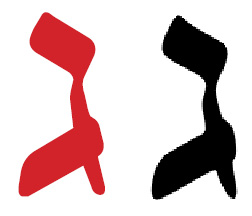
CrownBible and ShmuelBible feature a lesser difference between the thinner and thicker strokes for improved Bible reading.

Shmuel has many of the design characteristics of Shmuel Gutmann's Keren.

Each font will be a true OpenType font, support Unicode fully, have all Hebrew grammar glyphs, and useful typesetting glyphs, unavailable from other venders, such as MasterFont.

I am confused: is MF's version that they sell,, called Koreen. identical to MF's Koren, as your have said?

What I have said previously in other threads, but will repeat for the purpose of clarification, was that Masterfont called their variation of the Koren font, MFKoreen and MFKoren. However, these MFvariations are both the same font (perhaps one has slightly improved kerning due to technilogical advances), ie a varation of Koren, but neither is the real Koren font.

They also sell the real Koren font which is sold under the name Koren Tanakh (and also Koren Siddur for the siddur version of Koren).

In terms of licensing, this is not a conversation for this forum, but I can be contacted off-line.

Raphael,

I want to send you a proposal, but neighter Koren Publishers Ltd., or Jerusalem Type, show an email address. Plus Jerusalem Type's contact form bombs.

Jerusalemtype is no longer operating.

My address is my first name @korenpub dot com.

Thanks.

Every kosher edition of the Bible or Old Testament must have a secondary commentary in a spoken language - The Talmud

?No valid edition edition of the Bible may appear alone without a commentary because the Bible may not clearly understood on a literal basis - The Tslmud

See examples from Orthodox publications

I am going to quote a couple of Rabbis that perhaps will allay any halakhic concerns.

"To my rabbincal colleagues and students throughout the world,
I hereby recommend the publications of Eliyahu Koren, who has performed a great service in publishing the Holy Scriptures according to Jewish tradition, with careful regard for accuracy in spelling, vowels and accentuation, open and closed Portions, and the like.
I call upon my friends and students to assist the representatives of Koren Publishers Jerusalem by distributing the Tanakh in synagogues and Batei Midrash, in schools and in private homes. This crucial initiative is worthy of our added encouragement and assistance.
"...and joyous are those who hold her fast!"
Respectfully, Joseph B. Soloveitchik, Thursday, 26 Tammuz, 5726

And if The Rav isn't enough for you, here's Rav Moshe Feinstein on the Koren Bible:

"I have just viewed the full Koren Bible printed in Jerusalem. I was impressed by the great meticulousness with which the parshiyot in Prophets and Ketuvim are distributed, according to traditoin and the Talmud. The Book of Prophets, too, is divided into parshiyot as well as sdarim symbols which have never been printed until this day. In addition, Koren's editors were very scrupulous regarding vowels and vocalization (taamey mikra), pleasing to the eyes of the great Rabbis of Israel. I consider it of great importance that every Jewish home possesses this comprehensive Tanakh... Most Tanakhim include mistakes and typographic error which may have become embedded in many editions. Yet the Koren Tanakh is well proofread and very reliable, as testified by its users. Therefore it is advisable that such a Tanakh be found in every house as well as each synagogue and Beit Midrash, all the more since it was printed by a Jewish concern.
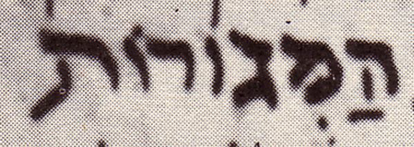
26th of Tevvet, 5726, New York.

For those who are not familiar with the Jewish world, these two Rabbis, Rabbi Soloveitchic and Rabbi Feinstein represent two of the greatest halakhic authorities of the 20th century in the United States and perhaps in the entire world. (There are of course others)

To my knowledge, no other Bible has ever received such praise and in such a manner.

Just thought it might interest you to know that the in the case of Koren vs Microsoft where Microsoft were being sued for providing Gutmann's rendition of the Koren typeface in it's software, Microsoft were found guilty and Microsoft, as well as being fined are no longer allowed to sell software with the Gutmann Keren typeface.

It's nice when the court rules in favour of the designer!

Why wasn't Gutmann himself stopped? Is it because that he never had Microsoft's big bucks?

Regarding GoHebrew's Crown, I redrawing it in the Brooklyn, NY, based on a design created in Rochester, NY, to avoid any legal questions, except by those who use it in Israel (use I don't an Israeli court would oppose).

It's much better than the Koren you have, but Gutmann's design is a definite improvement, as I pointed above with scanned examples.

Every kosher edition of the Bible or Old Testament must have a secondary commentary in a spoken language - The Talmud

Is this not somewhat complicated today by the fact that people do speak Hebrew nowadays? There are still people who use Aramaic as their spoken language, but IIRC, they're not Jews. Does this mean that for a Tanakh to be kosher, it should have the Targum present in translation - into English, Hebrew, or even Yiddish?

Captured from web.archive.org on 14 Apr 2015. view this capture