Hello everyone!
The "Almighty" Seb Lester updated his website with brand new lettering posters.
Here you can read an interview from ILT blog
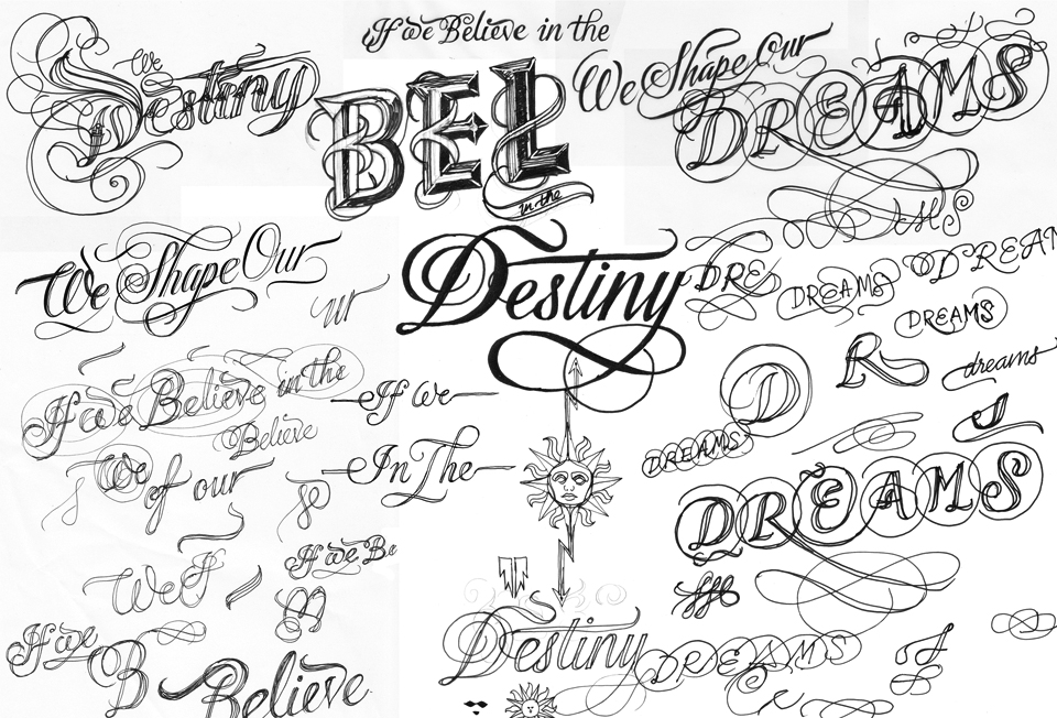
Scketches show us how he got to the final solution, developing the entire process.
I'm a big fan of all Lester works (who is not?...lol) and I wish I could start developing some fine lettering artworks...
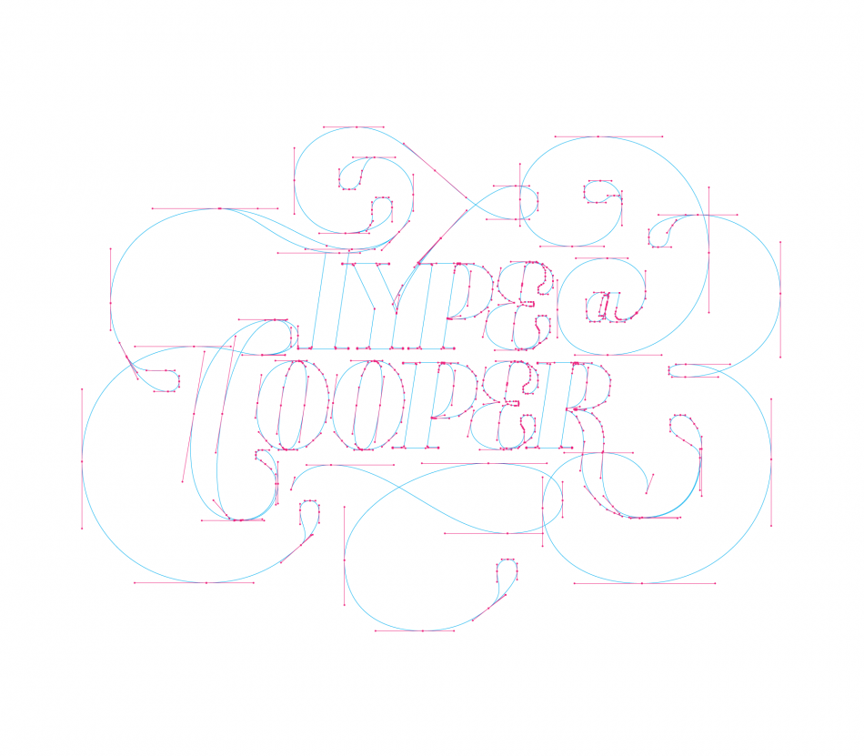
We can see a lot of hand-writing developement, then vectorized.
About the vector-converting process, do you have any, suggestion, tutorials, links, guides, in order to understand the right way to do that?
Is that an amazing and endless pen-tool masterpiece, or we can follow different rules/ using different tools. How can we create the central white lines that we find in the middle of all the curly letters?
Thank you so much in advance.