
Hello,
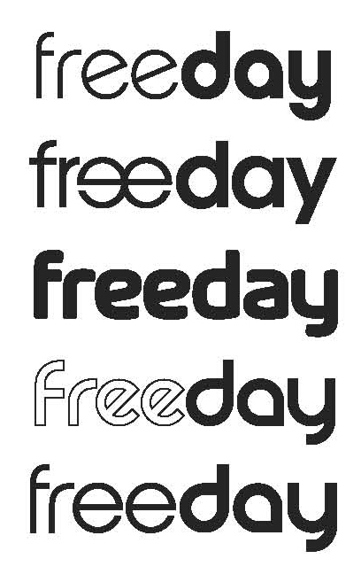
I am working on a typographic logo, for a french society working with freelances on design.
I made some propositions and now I need your opinion/preference to progress...
Thank you!
Hello,
I am working on a typographic logo, for a french society working with freelances on design.
I made some propositions and now I need your opinion/preference to progress...
Thank you!

You'd be better posting this in the Critique forum.

Like the way that #2 is going with the reversed e's, however, I feel that #5 has some nice letterforms which could work well with the reversed e's; the d, a and y (in #5) are particularly modern and inspiring for a successful logo.

I'm not sure I see a concept behind this logo.
I like the fourth one

These seem random, at best. How about some more info/background?
Captured from web.archive.org on 27 Dec 2010. view this capture