Typophile

readable, modern sans for book on art of the 20s

Patricia Fabricant

I have the budget to buy a text font for a new art book project and looking for advice on a readable, modern sans. The subject is the art of the 20s but I am NOT looking for something overtly deco. On the other hand it should be appropriate and not too contemporary in feel. It should be simple, formal, classic and, as mentioned above, readable in small point sizes (notes, captions). The book has a lot of text.

Among the fonts I already have I'm considering Neutra, Seria Sans and Verlag, but those all have very small x-heights. I'm definitely open to suggestions and would love to work with a new font.

Oh and open type preferred. There will be fractions.

Not OT, but handsome, cool and of modest x-height:
http://typophile.com/node/71254

I'm a fan of Benton Sans, which is a modernized version of stuff from that period. Armin Vit did a catalogue for TypeCon using it that was awesome, particularly the way different weights harmonized.

Perhaps 718 might be appropriate.

Stainless by Cyrus Highsmith

Thanks for the suggestions, keep them coming! Lapidaria is lovely but I need a font with an italic. I'll take a closer look at Benton; I had considered News or Trade Gothic, or Akzidenz. 718 and Stainless are both too contemporary in feel and also too wide, I something more space-efficient.

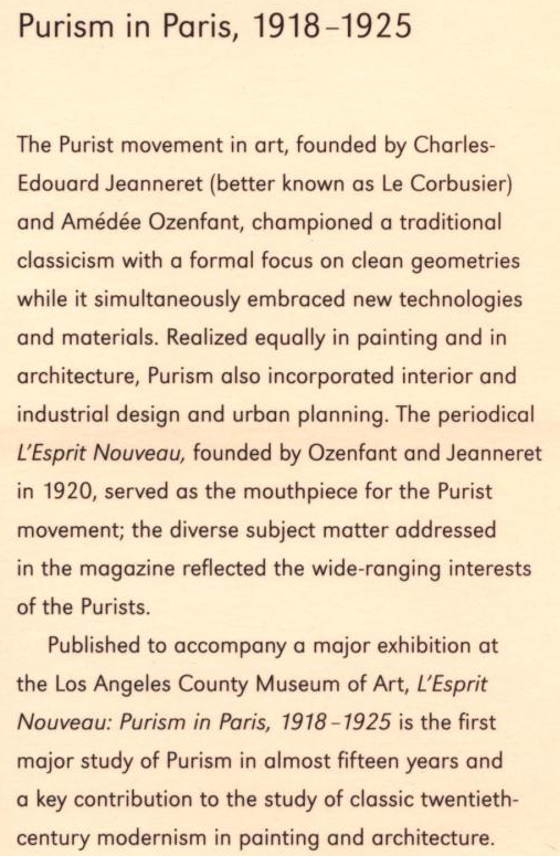
I like this font:

http://www.amazon.com/LEsprit-Nouveau-Purism-Paris-1918-1925/dp/0810967278

Not the display (Geometric 415) but the text font. Still waiting to see if it can be ID'd or if you all know something similar.

James I like Tangent. It's pretty close to Verlag.

Your font might be Metro, by Dwiggins, revived I believe by Akira Kobayashi at Linotype.

I don't think so. The display type is (or Geometric, which is pretty much the same). But the text font doesn't match, look at the t, the y, the numerals, the itals.

Ok, I found your font. URW Grotesk, designed by Herman Zapf. Wow I didn't know this one at all.

.

Thanks William! That's it.

And Alright Sans is very nice, I'm going to look into that one as well. Triton is a bit boxy for this project.

URW Grotesk is only $99 for the family, that's a no-brainer.

Alright Sans doesn't have great pricing options, $40 for individual weights/styles or $300 for the whole family, which has all sorts of bolds I'll never use. I wish they had smaller bundles, I just really want the lighter weights but would end up spending $300 just to get those.

.

Charles, André, why do you just type periods? So this thread gets archived? Or so you are notified if people post?

I guess they are interested in the threads, and this way they can easily track it to see new posts. URW Grotesk is quite an underestimated family, and the price is phenomenal. I already had it in my URW Typeworks collection, but did not use it till now. Seeing it like this it looks very good! There also is a companion serif called URW Antiqua.

@ Patricia : Your second answer.

I thought I knew Zapf's work and had no idea that Zapf had done a straight-ahead sans. I guess I was mislead by reading the information on the Linotype site, as Linotype obviously doesn't own this design. Also Frutiger's statement "Hermann ist nicht ein sans Mensch." And I was underwhelmed by his recent informal Palatino sans, and wrongly concluded that he hadn't ever done a normal sans. But this has a lovely rhythm to it.

The figures are very nice.

Captured from web.archive.org on 17 Oct 2013. view this capture