Hello!
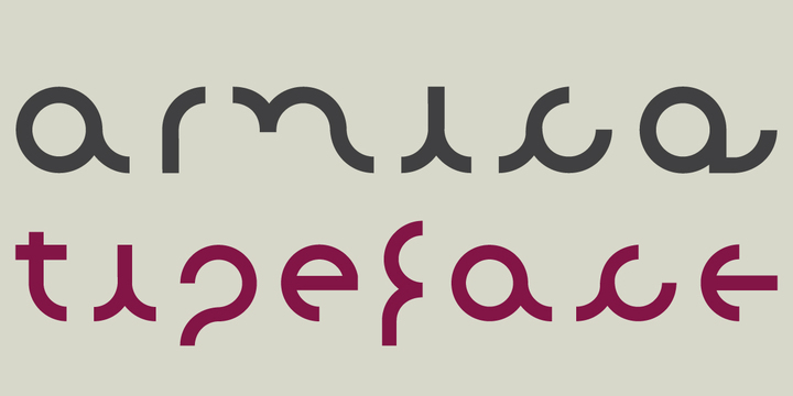
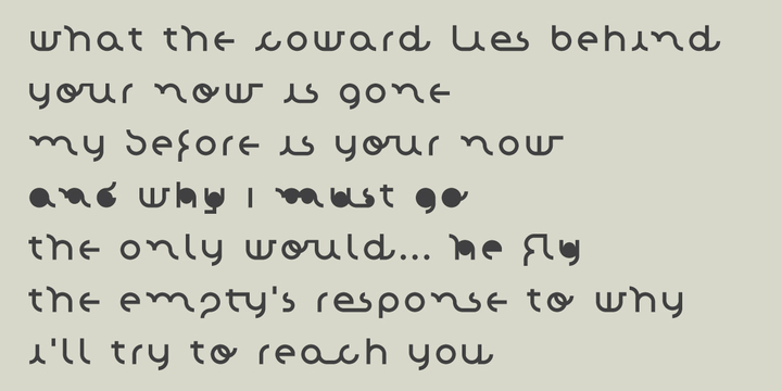
I just release a new font, called Arnica.
http://new.myfonts.com/fonts/danieljusti/arnica/
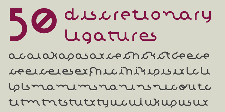
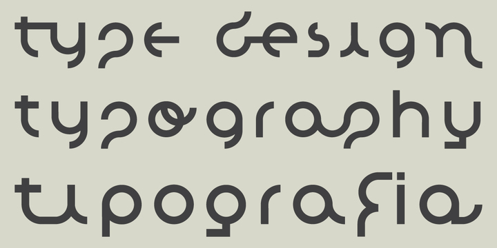
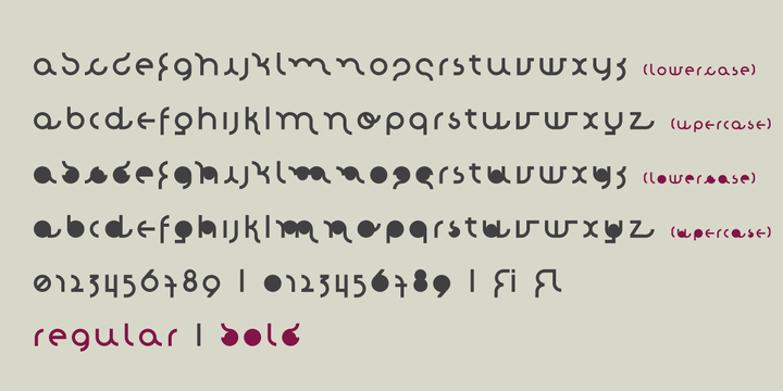
Arnica is a display font based on a simple geometry that uses circles (and modules) as a structure. It is an experimental project where, in place of upercases, has alternate characters and swashes. Furthermore, arnica has 50 discretionary ligatures which, when activated, give a totally different touch to the font and also has the bold weight, which reinforce the experimentalism of the project.
I would love to hear what you think about it.