Hey fellow typophilians,
I am currently designing my own typeface, called expletus which can be viewed here: http://www.typophile.com/node/72368
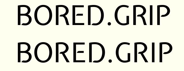
I am confident with all upper- and lowercase glyphs, except the R. It used to have a straight leg, but no matter how I many varaitions I tried, it just always looks out of balance. So I decided to make it more like Myriad's R. At first glance I would say, the latest version (top) looks best, but I'm not sure if it looks 'clean' enough. What do you think? Any comments are welcome, including other critique on expletus-sans. Cheers!