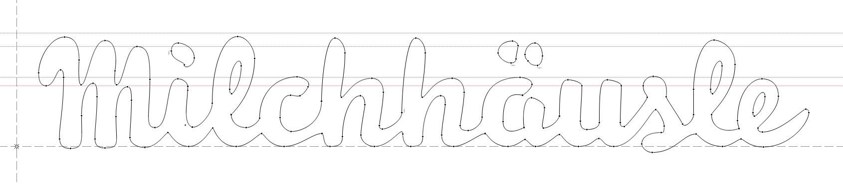
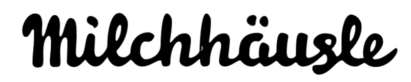
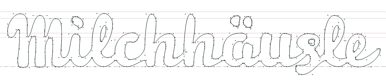
Hi everyone. I am currently working on a logotype for a medium-sized organic food store. Unfortunately, after working on this for some hours, I can no longer discern where the weak points of this thing are.
Anybody care to give me a little backup? Any kind of help appreciated!
Voilà: