
Hello,
I was working on my typography skills and have made Mining logo
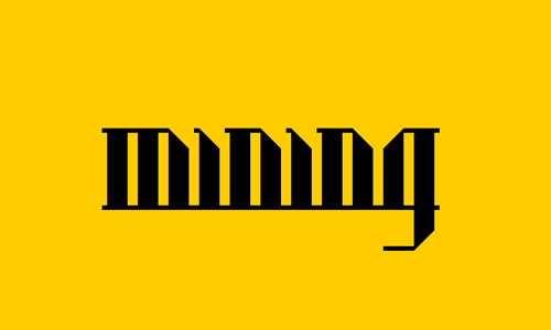
What do you thing guys?
Hello,
I was working on my typography skills and have made Mining logo
What do you thing guys?

It's not attached
ok, you can see it now, sorry

I's say custom.
Easily reproducible, for example, with www.fontstruct.com

Not the type ID section Riccardo :)
I like it. Don't know anything about the company or how this fits with what they do, but I like it.

As a type/design exercise, it's nice. Couldn't really judge it as a logo without knowing a lot more about the project, though.
it was just made for fun, noone is going to use it
Not the type ID section Riccardo :)
Ooops! I’m very sorry!
Well, I think the logo is strong. It reminds me of some geometric style of arabic script. Maybe not so easily readable for non-english speakers.
Very cool.
Captured from web.archive.org on 19 Apr 2015. view this capture