
Hi, does anyone know how they made psychedelic typefaces in the 60s? Was it all handwritten? Why did they make it the way it was? Where did its origins come from? and how did they print the psychedelic art posters?
Hi, does anyone know how they made psychedelic typefaces in the 60s? Was it all handwritten? Why did they make it the way it was? Where did its origins come from? and how did they print the psychedelic art posters?

I am fairly confident that more than one old hippie (other than myself) has done a comprehensive study of the genre, and some dedicated Googling would probably turn something up.
This old hippie's take is that the recognized masters of the art--such as Rick Griffin, Stan Mouse, Victor Moscoso and Wes Wilson--hand-lettered their posters, which were sometimes printed offset and sometimes silk-screened. At the tail end of the phase, commercial typesetters like Photo-Lettering Inc. got into the mix.
As far as origins go, I would opine that Push Pin Studios was probably a strong influence. Their brash revivals of Art Deco probably prompted a look at other style of the past, notably Art Nouveau, which heavily influenced psychedelic poster work.
For the British take on it you need to look at the work of Michael English & Nigel Weymouth. There was a bit more of an influence from the current "establishment" art movements such as Op Art & the British strand of Pop Art from the likes of Peter Blake & Richard Hamilton.

Why did they make it the way it was?
LSD, magic mushrooms -- the psychedelic drugs.
These can cause a disruption of the sense of vision.
Other than taking the drugs, the scene in Terry Gilliam's Fear and Loathing in Las Vegas where the carpet comes alive gives a good idea of the kind of swirling distortions that may occur, providing artists with inspiration to transpose such interesting images to straight reality.
Thank you very much guys :) One more question: do you know why/how the psychedelic art spread so fast al over the world?
Partly because it was on book jackets & record sleeves. It was the graphic style of a scene that had a mass appeal and so became widely marketed.
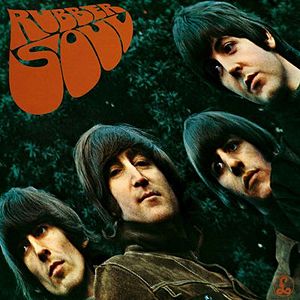
1965.
Lettering: Charles Front
Photo: Bob Freeman. The distortion is an imitation of a "mistake" when Freeman showed his photos to the Beatles, with a slide projector onto a 12" square of cardboard (album sleeve size), which became tilted backwards. Paul liked that effect and asked the photographer to duplicate it.
Paul also invented the "re-recording" tape loop effect on "Tomorrow Never Knows".
Happy accidents.

Are there anyone here that used to design psychedelic art in the 60s ?

If you remember making a psychedelic font during the sixties, you weren't there.

> Paul also invented the "re-recording" tape loop effect on "Tomorrow Never Knows".
Tape loops came from the classical avant garde (Terry Riley to be specific) far before The Beatles used it. 1950s.
That was an interesting time in music, with pop stars learning from experimental classical composers. Terry Riley's A Rainbow in Curved Air for example heavily influenced Pete Townshend's work on Who's Next.
pbc
AFAIK, the specific effect Paul invented was new, whereby an input was re-recorded over itself, slightly out of sync, for a progressive, echoey degeneration. After a certain number of over-dubs, the effect became too muddy, and it became necessary to manually ease up the recording head.
I'm not sure the Beatles' interest in sound effects can be traced directly to contemporary classical music -- they grew up listening to the Goon Show, with sound effects by the BBC Radiophonic Workshop, and George Martin had worked with the show's comedians. Prior to his involvement with the Beatles, he had produced all kinds of music at the dog's body Parlophone, including classical, novelty, and "regional music", and under the moniker Ray Cathode, even released an electronic dance tune, recorded at the Radiophonic Workshop.
So it's reasonable to assume that Martin turned the Beatles on to such experimentations and special effects, which came from a commercial recording studio milieu, rather than an avant garde classical source.
The Beatles were certainly aware of the avant garde. This is from the wikipedia article about Tomorrow Never Knows:
>McCartney supplied a bag of ¼ inch audio tape loops he had made at home after listening to Stockhausen's Gesang der Jünglinge. By disabling the erase head of a tape recorder and then spooling a continuous loop of tape through the machine while recording, the tape would constantly overdub itself, creating a saturation effect, a technique also used in musique concrète.
That Stockhausen piece was realized in 1955-56. Terry Riley had also created what he called a Time Lag Accumulator (2 reel to reels with tape loops) in the 50s which achieved the same thing as disabling the erase head.
It is also true that the BBC was using tape loops in the 1950s for sound effects so the phenomena was concurrent.
Whatever the case - back then pop music was a very different animal, with the largest stars looking everywhere for information/inspiration. This was also true in early punk rock - as many musicians as came from the David Bowie/Iggy Pop school came from the avant garde (think Stockhausen, Mauricio Kagel, John Cage, Sun Ra, The Art Ensemble of Chicago).
People that are serious about what they do tend to be aware of the history of their craft. Nick - you seem to be.
pbc

"Why did they make it the way it was?"
Like, I don't remember why, dude it was like a happening thing with orange sunshine and shit.
Actually, since we old farts were not bound by what was on a pulldown menu and getting type set then was way too expensive compared to dirt cheap today--so we just took out brushes and paint and did it until it looked groovy.
"Are there anyone here that used to design psychedelic art in the 60s ?"
That would be a yes.
You have surely heard about Peter Max an the others listed in previous posts. They were just the commercial successes and the tip of the iceberg. Every headshop, macrobiotic restaurant, and tie--die joint had friends who would just do one-off of posters and menus for food or weed. The REAL stuff got washed away by the rain decades ago--only the high end commercial stuff got printed and has survived until today. Picture a chemically altered 19 year old in 1969 with brushes and jars of Day-Glo paint.
Are there anyone here that used to design psychedelic art in the 60s ?
That would be ditto, also...
BTW, Phil Spector is credited with creating the effect called Flanging, wherein a second tape of the material was delayed intermittently by applying thumb pressure to the flange of the tape reel, creating a swirling--otherwise known as "The Big Hurt--effect.
And, FWIW, something very much like the "Time Lag Accumulator" was marketed as the Echoplex in the 60s and 70s, as was used extensively on Led Zeppelin's first two albums.
Since this thread is back in action, here's a West African take on the style:
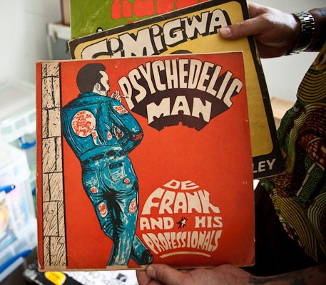
Spotted in the collection of Voodoo Frank on http://www.dustandgrooves.com/
Thanks for your help everybody :) Does any one know if the fonts that were used on the psychedelic posters had a name yet in the 60s, and what they were called? Or if it got it's name after this. Like the Fillmore font and the Arnold Boecklin font? Or do you know which fonts they were inspired by?

which fonts they were inspired by
As the thread I linked to (and this post specifically: http://www.typophile.com/node/16146#comment-94655) mention, psychedelic artists drawn inspiration mainly from early XX century art.
Most never became fonts and occasionally were credited with: "Some happening dude named "?" did this far-out lettering for me"
Jim Parkinson designed Mojo not too long ago, but quite authentic.
Milton Glaser was asked fairly recently to do some work in his '60s style, but said he didn't have the vibe any more.
I wouldn't exactly say his mojo had gone missing, just changed its tune.
Maybe I will try to remember some of the stuff I did then with a brush and an oval nibbed Speedball? I already have a name for it: "Monday Monday" :-)
...the fonts that were used on the psychedelic posters...
You're talking about lettering, not fonts.
It's important to make the distinction.
That's the thing, Nick. Most of the real stuff from that era was hand lettered. Only the Madison Ave slick knock-offs used real type.
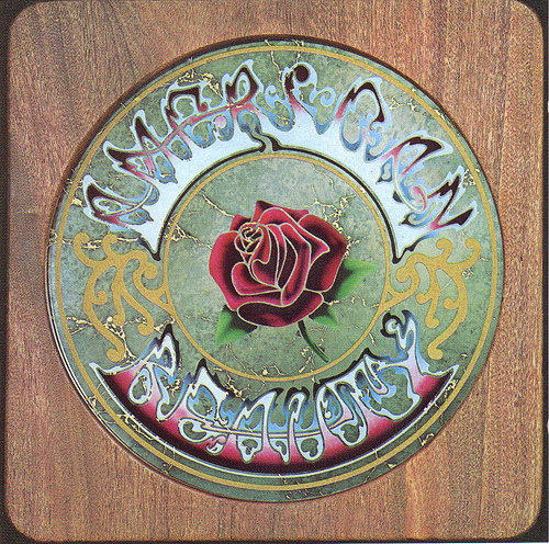
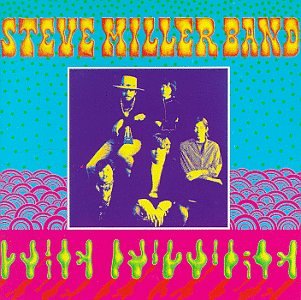
Captured from web.archive.org on 23 Jan 2015. view this capture