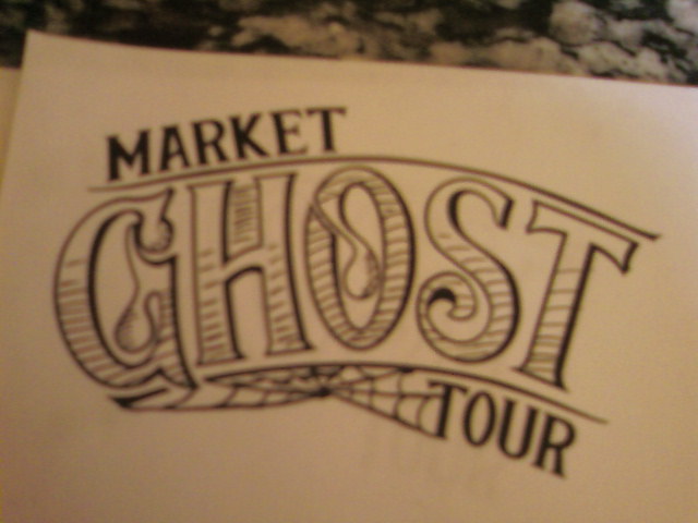
So I'm working on an identity for a ghost tour in Seattle. It's focus is the history around the Pike Place Market.
I agree with the client that it's not quite there. She wants it a bit rougher in form as seen in early sketches with a bit of texture. The exploration file tries to add in a printed, texture look (just sketching over the original).
Thinking I need to take it further with more background elements. Like etching, dollar bill type, etc...
I'm taking any critique anyone can offer. Thanks.
| Attachment | Size |
|---|---|
| ghost2.png | 51.1 KB |
| exploration.jpeg | 50.46 KB |