Typophile

Handwritten book title...

lentine

I'm designing a book for my advanced typography class, the book consists of a bunch of old (handwritten) letters and poems from my grandfather to my grandmother, along with pictures of them throughout the years. My inspiration behind this design is this album cover: http://www.fixtstore.com/img/graphics/tyronewells/TyroneWells_MetalandWo...

Let me know if you like it or think it could work...

AttachmentSize
2010-11-06 21-1.30.33.jpg916.67 KB
2010-11-06 21.31.03.jpg875.29 KB

I don’t know in which years your grandfather wrote the letters, but I think that the period and your grandfather’s own handwriting should be your first inspiration.

from the 40's to the 90's roughly. The book is also going to include handwritten stuff by me...

in other words there isn't one period or style throughout the whole book, even with his writing

I think it's working. One thing that bothers me is the way the tail of the first e goes way up higher than the crossbar of the t.

It's hard to say without knowing more about your concept for the book, or seeing the material; I too think it looks nice in itself, but it does feel quite contemporary, which may or may not work with the older material.

Thanks guys, I appreciate your feedback. They are a little quirky since they are all quick sketches, but I wanted to make sure I wasn't crazy in thinking they sort of worked.

I think they are perfect. I can see what you are going for and it will make a good logo type.

Post the finished work when you can. I would love to see it.

-Charles

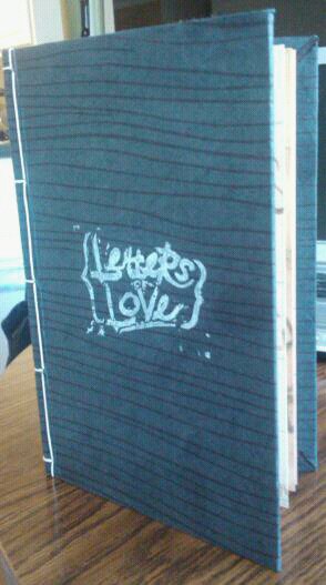
This project has been done for a while, but I thought I'd let you see the result.

This project has been done for a while, but I thought I'd let you see the result.

Captured from web.archive.org on 21 Aug 2013. view this capture