
Master Type Designer: Isamar David zal
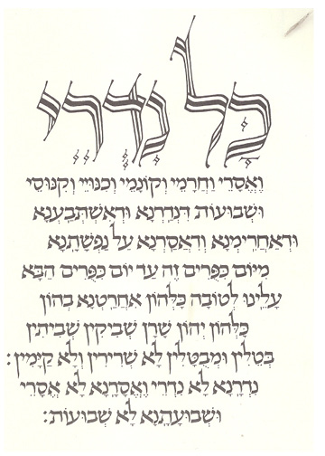
This thread ran to 3 pages of replies and only 2 were recovered, so replies are missing.
Master Type Designer: Isamar David zal

Finally something we agree on Scott. Well sort of, he was first and foremost a calligrapher as evidenced by his book Our Calligraphic Heritage. But that is splitting hairs. And his sculpture was phenomenal.

I agree with Michael—I like that calligraphy better than his font :)
Michael,
>> his book Our Calligraphic Heritage
Where can I find it?
>> ... his sculpture was phenomenal.
Please explain.
Bill,
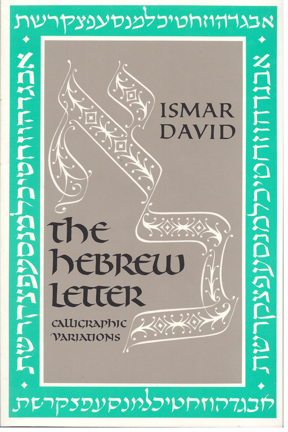
Did you see his book of fonts, "The Hebrew Letter".
Tzvi Narkis and Eli Koren reach his ankles.
Israel, no I haven't seen that book. Do you have a link or a sample? I was talking about the Hebrew font, "David".
The Hebrew Letter by Ismar David
Bill,
He created many font designs. Only "David" was created into a computer font. I created another called "Ismar", based upon this sample.

Bill,
This book is from about 18 years ago. It's out of print, and never was scanned and placed online for eternity.
Years ago, I bought it when it fist came out. Years later I bought it again. I've moved a few times since, and do not find my copy.
Ari Davidow sent me his copy to borrow. I got it today. I intend to create a dozen designs of his, with bold versions, nikkud and taam too.
Everyone pales by comparison. Ismar David zal was the greater known Hebrew type designer.
Bill,
Isn't the modern version of David much greater than the early popular David.
Do we now if he was married?
If yes, what was his wife's name?
Children? What were their names?
What were his parents' names?
Siblings' names?
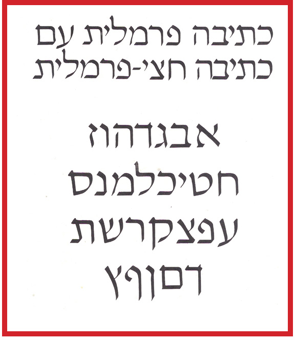
Another beautiful face, better than David Hebrew.
Our Calligraphic Heritage is a boxed set that he produced at Geyer Studio in 1979. It is comprised of 17 historical exemplars with notes, 17 exquisite calligraphic compositions and a writing booklet. It is one of my most prized books.
As to the sculpture, see pages 72-82 of the book you have.
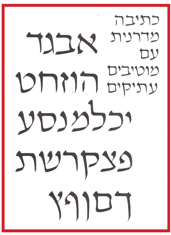
I adore his "even-stroke aleph-bet" on page 64.
I will find out some history... it is dim in my brain at this point but I believe he migrated from Germany, through Israel to New York. Bob Boyajian will know, he knew him.
My brain isn't as old as I expected... here you go:
http://rogallery.com/David_Ismar/david-biography.html
and:
http://calligraphyheritage.com/och_samples/index.html
These are the calligraphic compositions that I spoke of.
Thank you.
Who is Bob Boyajian?
>> I adore his "even-stroke aleph-bet" on page 64.
Multiple weights, too.
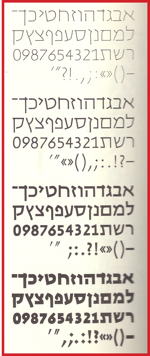
from:
Ismar David, German/Israeli/American (1910 - 1996)
... and on June 3rd of that year, married Hortense Mendel. Ismar had met
Hortense, an associate of Robert Leslie at the Composing Room, during
his 1951 trip to New York to show Intertype hisHebrew alphabets.
The two spent six years together before Hortense died on October 9, 1960.
The whole article:
Ismar David, German/Israeli/American (1910 - 1996)
Ismar David, considered one of the few graphic designers, illustrators, and calligraphers of international reputation, was a
German-born graphic artist who practiced the first third of his
professional career in Jerusalem and the remainder in New
York City. He is noted for his brilliant work in Hebrew and
Latin calligraphy, lettering, and type design, as well as for his
distinctive linear style of illustration.David liked to say that the
hand is the most marvelous tool if properly trained, and his
own handwork supports this conviction.
Ismar David was born in Breslau, Germany (now Wroclaw,
Poland) on August 27, 1910. At the age of fourteen, he left
school to apprentice as a house painter and varnisher. After
receiving his journeyman papers, however, he returned to
study decorative painting at the Arts & Crafts School of Berlin-
Charlottenberg, where many of the finest book craftsmen of
the first part of the century taught and studied.Hans Orlowski
and Johannes Boeland were among his teachers.
In 1932, at the age of twenty-one, Ismar David entered and won
an international competition sponsored by the Jewish National
Fund for the design of its honorary Golden Book. He traveled
to Jerusalem to supervise the execution of the project, and he
settled there for the next twenty years and established a studio
for interior and graphic design. In addition to receiving a
broad range of commissions from private industry, David
accepted commissions from national institutions and the state
government for design projects including posters, postage
stamps, and currency.
During his residence in Jerusalem, Ismar David made one of
his most important contributions to twentieth century graphic
design with the conception and development of an innovative
family of Hebrew typefaces. His interest in developing Hebrew
types that would be in harmony with the modern spirit and
that would help to transform Hebrew into an everyday
language eventually lead to David Hebrew. This unshaded and
unserifed type design was cast for machine composition in
1954 by the Intertype Corporation and was later available on
the Photon machine. In 1984 the Stempel type foundry
commissioned David to rerender David Hebrew with diacritical
marks for digital composition. To this day David Hebrew is
widely used and much copied. The light appearance of David
Hebrew makes it well suited for setting poetry. It is also favored
for use in exhibition catalogs, finely printed books, and Israeli
newspaper supplements.
Before moving permanently to the United States, Ismar David
made several visits to New York City.His first trip, in 1939, was
to work on the Palestine Pavilion at the New York World’s Fair.
In 1947, he traveled to New York to study printing methods.
With the help of Dr. Robert Leslie, he returned in 1951 to make
arrangements with the Intertype Corporation for the casting of
David Hebrew. And finally in 1952, David visited New York to
design and install an industrial exhibition for Bonds for Israel.
Ismar David emigrated to the United States in 1953, and on
June 3rd of that year, married Hortense Mendel. Ismar had met
Hortense, an associate of Robert Leslie at the Composing
Room, during his 1951 trip to New York to show Intertype hisHebrew alphabets. The two spent six years together before
Hortense died on October 9, 1960.
Upon his arrival in New York City in 1953, Ismar David established
a design studio and began teaching Latin calligraphy at
Cooper Union and Pratt Institute. He had expected the bulk of
his commissions to come from designing decorative elements
for synagogues, however, he found his mainstay work in the
1950’s, 60’s, and early 70’s in the publishing industry. David
worked steadily as a designer for leading American publishers
including Alfred A. Knopf; Atlantic, Little Brown; Ballantine
Books; Fleming H. Revell; Harper & Row; Harry Abrams;
Houghton Mifflin Company; J.B. Lippincott Company; McGraw-
Hill; Pocket Books; Random House; Thomas Y. Crowell; and
Viking Press, among others. In a short span, he designed book
jackets or covers for more than 200 books.
Ismar David remained a free-lance artist throughout his career.
In addition to steady work in cover design, calligraphy, and
lettering, Ismar David earned commissions for book illustration
and developed the style of illustration for which he is best
remembered—a style characterized by striking patterns of
lines. This distinctive linear style was particularly well suited
for the Limited Edition Club’s 1971 publication of Pascal’s Les
Pensées, for which David created a dozen full-page, hypnotic
color-illustrations—pre-separated in the tradition of printmaking—
as well as ornamental tailpieces, and text frames. As
would become his custom, Ismar’s conceptions in vivid
oranges, greens, purples, blues, and golds were meant to
accompany the thoughts of the author, not to illustrate them literally.His 58 illustrations for the Union of American Hebrew
Congregation’s 1973 bilingual edition of The Psalms followed
the same non-literal approach. For this project, which David
considered his most personal work, he combined his ideas
about illustration and type and book design, and his efforts
were recognized by The American Institute of Graphic Arts
(AIGA) with a 1973 “Fifty Books of the Year”distinction. Both
Les Pensées and The Psalms proved to be very popular among
collectors, and they stand as two of his best efforts in book
illustration.
Though he never lost interest in graphics, much of David’s
energy in the latter part of his career was devoted to architectural
design and decoration. Perhaps his most important work
in this field was produced during a thirty-year association with
Pinelawn Memorial Park in Farmingdale, NY. Beginning in
1965, he planned the layout of the park, including fountains and
other features; he also designed mausoleums and other
building complexes, and their interiors. He also lettered
numerous inscriptions for wall decorations and architectural
features in the park.
Proof of Ismar David’s uninterrupted
connection with graphics came in 1991, when in collaboration
with calligrapher and partner Helen Brandshaft, he designed
and illustrated a bilingual version of The Book of Jonah,
published by the Chiswick Press in a limited edition.
Teaching was another constant element in Ismar David’s career.
In addition to instructing at the Cooper Union and Pratt
Institute, he gave lectures and conducted workshops on Latin
and Hebrew calligraphy over the years. Eventually he distilled his well-tested teaching materials and summarized his views on the historical, aesthetic, and technical aspects of the Latin alphabet into Our Calligraphic Heritage: The Geyer Studio Writing Book. The three-part work of text, alphabet folders, and
compositions, encased in a box designed to function as an
easel, was published in a limited edition in 1979 by the Geyer
Studio—a professional calligraphy studio for whom David
worked as a contractor from the late 1960’s through the early
1980’s. Ismar produced the Hebrew counterpart to Our
Calligraphic Heritage with the 1990 publication of The Hebrew
Letter: Calligraphic Variations. This instructional work
includes a text and alphabet charts, and is a writing book in the
tradition of European writing books. In both works, David
fuses the rich historical background of the calligraphic arts
with practical and aesthetic aspects of the art of writing in the
twentieth century.
In the early 1990s, Ismar David continued to take on select
commissions for graphic design; however, he also expressed his
personal interest in three-dimensional form with the creation
of such objects as a folding baby cradle and a paper Elijah’s cup
and folding seder plate. Before he died on February 26, 1996, in
New York City, Ismar David produced his 1996 greeting card—
the last in a forty-odd-year series that traces the evolution of
his lettering and illustration styles, and the constant influence
of biblical themes.
Bob was a lettering "guy" on Madison Avenue for decades. In touch with many of the lettering artists and type designers in New York. It was literally a band of brothers :-)
Ismar was a giant as you are now discovering!
These books look fabulous. I've got to have a peak at them at the Library of Congress some time...
William... David Pankow at RIT produced at RIT that is still available. I think it is 30$. Definitely recommended!
Who owns his intellectual property works?
he and wife are deceased.
no kids.
no copyright notices.
i think gohebrew should print an ebook/pod on him.
whadya think?
Michael,
Is Bob still around? Where?
Is David still running the Type library at RIT in Rochester, NY?

Yotam,
Thank you.
I thought his second wife was still alive. But alas she is not.
"Who owns his intellectual property works?
he and wife are deceased.
no kids.
no copyright notices."
To be honest you are starting to sound like a vulture!
Michael, what is the title of the Plankow book you are referring to?
David Pankow is the head of the Cary Library. They were the publishers of the book about Ismar. The images were chosen by his partner I believe. It is available through the RIT website William. You can go on the site and order.
Enjoy.
Sorry. The book is : The Work of Ismar David.
Michael,
I think a vulture picks his food from the ground.
Anyway, I want to let people view his works at places like Barnes and Noble, and not just at the Library of Congress.
Is publicizing the work of a giant vulture feed?
William, his 3 dimensional stuff is in the second book mentioned. I saw his "Remember the 6,000,000" many years ago and was stunned at its beauty.
Not publishing his work, but your expressed desire to digitize his letter designs when you would be the one to benefit.
Where a vulture "picks his food" is not relevant. Just make sure there is no one who has a concern in that endeavor. I spoke with him when I wanted to use his even-weight letters for a printed piece I did. I would probably bypass it were it now, because there is noone to ask. Out of respect for him.
William,
I do not understand you. Say it clearly.
If it's money to which you refer, Ismar's stuff won't make a bundle, or even half a bundle.
But there should be some books out, for whoever wants the stuff, it's there.
About his fonts, if 10 or more are digitized, I think he'd be proud.
Am I wrong, or a money-hungry capitalist?
Jerusalem
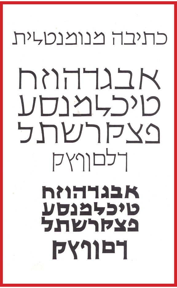

> Tzvi Narkis and Eli Koren reach his ankles.
A. I disagree
B. why compare between Itamar David with Zvi Narkiss or Eliyahu Koren
they all were great designers.
Zvi Narkiss in considered to be the Father of modern hebrew.
they all were great designers.
c. i agree
>> Zvi Narkiss in considered to be the Father of modern hebrew.
by taking narkis tam from a concentration camp victim.
i hope he did tsuva.
i consider him a great designer. but not the greatest.
> by taking narkis tam from a concentration camp victim.
> i hope he did tsuva.
You should realy stop talking L'shon Ho'rah about people
> i consider him a great designer. but not the greatest.
You know, who was a greater designer, is children talk and realy makes no difference.
>> Zvi Narkiss in considered to be the Father of modern hebrew.
avak d'lashon hora
it wasn't ankle. it was dirt under his feet.
baba sali zatzal described the late lubavitcher rebbe:
he is like the nesher hagadol
(this means: the great eagle, an allusion to maimonides),
and WE are like zevuvim flies buzzing around.
>>>
> i consider him a great designer. but not the greatest.
You know, who was a greater designer, is children talk and realy makes no difference.
<<<
i think it's a shame that ismar david of manhattan is not yet recognized as the great modern hebrew type designer - way ahead of everyone else.
why is this lashon hora?
> by taking narkis tam from a concentration camp victim.
when we say that robin hood stole..., that's lashon hora.
The Beginnning of the Revival
Invitation


The book is available. Somebody from work just bought it only last week!
According to Shmuel Gutman z"l, he told me that Ismar David was happy for people to copy and/or change his font, so there are no copyright issues here.
This is of course hearsay from a person who is no longer alive but it looks like that there is no copyright on this typeface.
I also know that there is no copyright on Hadasa either. This I know from a recent legal ruling.
> also know that there is no copyright on Hadasa either. This I know from a recent legal ruling.
From last week???
no. before that. not sure the exact date, but I was only told about it recently.
If so, what's the debate between masterfont and Henri's grand doughter????
off line.
>> I also know that there is no copyright on Hadasa either. This I know from a recent legal ruling.
HHenri Friedlaender returned to me a roalty check that I sent to him in the mid-eighties. He explained that the Amsterdam type foundry bought the intellectual ptoperty rights.
According to halacha Jewish law, zchus hayotzer the creator's ownership is inherited by his or her descendants forever.
Hence, I asked Michael about his wife and children. Perhaps, it reverts to his parents and siblings, or even next of kind.
>According to halacha Jewish law, zchus hayotzer the creator's ownership is inherited >by his or her descendants forever.
According to the Halacha there is no such thing as "Zchus hayotzer" at all
Eli,
It is called sometimes "Zchus hayotzim", or "Zchus hamechaber".
There are only two thin books published on the topic.
One book, with a dark blue cover, was published by a now defunct publishing house, "Machon L'Ohalei Shem" in the nineties. The other book is much older, with a gold cover. I think its called: "Zchus hayotzim".
Very few rabbis are expert is this topic, which is like why you think that it does not exist. Fewer can rule on this matter.
The famed Tzemach Tzedek rule of this matter over two hundred years ago. No one since then has refuted his views about "Zchus hayotzim". He delineates 5 factors that can earn worldide exclusivity forever.
This responsa is published in Hebrew in two other books, "Chidushei Tzemack Tzedek Al Hashas", with commentaries, pp. 78-??, by "Machon L'Ohalei Shem", 1992, and "Chidushei Tzemack Tzedek Al Hashas" by Kehos (in print).
So does that mean you'll be sending royalty checks to Koren's children on your Crown font? :-)
Raphael,
We haven't established true ownership.
But from your point of view, KP bought all rights.
Did KP buy the rights to his Tanach, and to the font he used to produce it only, or to every font created from derivations of its drawings?
That is a legal question. I am not a lawyer so I can't comment whether it's legal for you to copy Koren or not.
However, since you have stated publicly on this forum and verbally on the phone to me about 3.5 years ago, that you would pay the children of Koren for your Crown font, this means that you publictly admit that your Crown font is a copy of the Koren typeface and that somebody in the Koren "family" deserves royalties on the typeface. Your only contention is who should receive the money – Koren's descendants or the company that owns the rights to the font.
I guess the question is, is the Crown font vaguely influenced by Koren, or is it a copy. I think that most people on this expert forum on type would agree that your image is very much Koren and would be considered a copy.
I haven’t forgotten my manners. They are where they belong.
>> You have, in your esteemed ignorance, compared 4 copies of the Koren font to each other to try and prove a point that you can’t prove since they are all copies (including yours!!!) <<
What point is that?
I simply compared them.
MF had not changes, except for the hei? How do you know that MF just duplicated the file, and renamed it?
Keren had many changes to the letter forms, but preserved the widths and heights.
Mine is much nicer, fully legal in the USA, and I didn't copy Koren's Bible (thank G-d for a dozen others: ArtScroll, Kol Menachel, Vagshall, Zunder Berman, etc. etc.).
When the British rains obnoxious words, then it pours!
>> The "Koren" that you posted and Koreen are the same font from the same designer (Masterfont) just under 2 names. We know that they are versions of the original because Masterfont says so! Keren we know is a copy because the designer of Keren, Shmuel Gutman, told me to my face. It’s just your amazing Crown font that somehow was created from ancient manuscripts and just by chance happens to look just like the other 3 copies.... hmmmm.... I wonder what that means. <<
This thread started with david and now its evolving toward Koren.
What is the point of this entier discussion??????????
go to court to clearify this issue, why does this discussion have to talk place over this forum?????
>> MF does not write that Koreen is from any specific date.
An 'old' Bible is not a disgrace. It sells well in Israel, to people of many backgrounds. I do not think that it sells well here in the USA, as there are many better products.
Name one.
<<
OK.
No one no one NO ONE heredi uses a Koren Bible.
Why?
Well, you tell me.
According to Jewish law, a Bible may not be printed without a valid commentary. Why? We Jews do not believe in the Written Torah without an Oral Torah.
The text of the Bible is the Written Torah, and the Commentary is the Oral Torah.
So, who buys the Koren Bible?
Researchers (they are few), Dat Leumi Jews (well-Orthodox Jews who have learned very little), Christians (who are constrained to buy without a commentary, some members of other Orthodox group who also have learned very little, and non-Orthodox Jews who want to have an inexpensive Jewish Bible.
I never ever saw in a dozen synagogues what Raphael claimed, that if there is a question about the accuracy of the Torah reading, people commonly look into a Koren Bible.

> A 'typeface design' is a set of letters in ordinary sentences each embracing a single design.
> Again, I have two sources:
> a) an old book that has a manuscript featuring a typeface design that I suggeest Eliyahu Koren used to draw his typeface design. > The book is located at RIT, in the Cary Graphic Art Library, in Rochester, NY.
Israel,
are you talking about a printed sample -- typeface design? a manuscript?

David,
Yes, anything printed in a book, eg a manuscript printed in a book as a photograph, hand-written or not. Your sample seems like a reproduction of a page from an old book. It seems hand-written.
But a typeface design can be a machine-made text, too - in a book, or from a desktop printer.
When I revived the Romm family letter forms, what is mine? Only the computer code which produces the images.
The fact that the image of your aleph appears a particular way is your effort. But, in this case, the image is public domain.
If you make the same font, it's not copying - it's just another rendition. Do you agree?
> So, there never was, or is, a bold weight of Koren, or Koreen, or Keren?
Gutman designed 2 weights (regular + bold); most of the time.
Gutman knew Eliyahu Koren for a loooong time, since the old days of KKL (Jewish National Fund, Keren Kayemet LeYisrael). Eliyahu Koren was the head of the graphic dept., Later on Gutman designed his first typeface (the Bible that was published by Yedioth Ahronoth)
I just downloaded Guttman's versions of Koren for free at:
[Links removed by a Moderator.]
His other fonts are at:
[Links removed by a Moderator.]
Israel,
you have to remove that link!
It's illegal?
How do you remove it?
> It's illegal?
Well, let's see. I'll wait to your Crown, Ismar etc etc, buy it and give it for free -- this is OK with you, right?
> How do you remove it?
Edit your post or...
Contact Moderators for Assistance
http://typophile.com/readme
But I did that...
Why didn't they remove the last link?
Henri Friedlaeder zal told me that my version was the closest to the original.
Can I see it somewhere?
The typeface design, better known as Hadasa (after the Hadasa Printing School where he taught) was named at first, "Queen Esther". This is allusion to Hadasa, for the Talmud tells us that "Esther's real name is Hadasa". When I worked closely with John Hudson (who designed the nikkud and taam), "Queen Esther" was renamed after its great creator, Henri Friedlaender zal.
Mr. Friedlander told me in 1988 that my version was closest to the original drawings. The is likely due to the fact that I did not use photo-typesetting specimens. Rather, I used old magazines and newspapers as specimens. I created it by eye only, and a crude grid system. In those days, I didn't have a scanner.


> Rather, I used old magazines and newspapers as specimens.
Israel,
Just out of curiosity -- are you talking about religion magazines? newspapers? Yated Ne'eman? Hamodia?
Nah, David, they were not around in the late eighties. I found them in a trash can in Tel Aviv. I think it was the magazine section.
"Great! Just want I'm looking for."
I cut out the letters of the alef-beis, and assembled them by categories. In my grid system, size wasn't an issue. I just wanted clarity.
Now, I look back and think it was impossible.
יגעת ומצאת
Yes, Henri was born in a garbage can. :)
Maye, it was 85 86 or 87
the year the mac plus came out, and fontographer turned from 1.0 to 1.1.
>> I haven’t forgotten my manners. They are where they belong.
London.
from:
http://en.wikipedia.org/wiki/Koren_Type
Koren Bible Type
Judah L. Magnes, President of The Hebrew University of Jerusalem asked Eliyahu Koren, then Korngold, to create a new font for an entirely new edition of the Hebrew Bible that he sought to publish under the University's auspices during World War II. The Bible was to be the first Bible designed, edited, printed, and bound by Jews in nearly 500 years. A design competition was held, and Korngold's font won.
The preliminary version of the font that grew out of the competition was used in an edition of the Book of Jonah issued in 1946 by the publishing house of The Hebrew University (later Magnes Press). The font was not cast for this modest publication, but rather drawn by Korngold and reproduced photographically. The font was based on the Moshe Ben-Asher Codex of the Prophets manuscript, belonging to the Karaite community in Cairo, the earliest Medieval manuscript with a colophon, written in 895 CE in Tiberius.
yes. who do you think wrote the entry!
This article says that Koren drew the font before there was a publishing company on his name.
If so, the font was his own work, and not a work for hire.
Hence, his children do deserve to receive a royalty according to Jewish law. Yet, according to secular law, it is a public domain desisn. The current code from Masterfont may belong in part to KPJ, but not those derived from earlier drawings.
Do you agree, Raphael?
According to KPJ, who owns the design for this?

According to KPJ, who owns the design for this, if the design existed before KPJ?

Captured from web.archive.org on 14 Apr 2015. view this capture