
i came across a poster on the tube (london underground) about a year ago for an exhibition at the hayward gallery and was struck by the typeface used.
http://storage.canalblog.com/26/82/119589/41008435.jpg
earlier today i found a similar typeface used within a young designers portfolio and it re-awakened my curiosity.
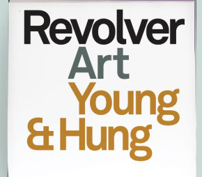
on review, they are two different typefaces - though it is not easy to see on the example i have found online, the hayward gallery face has and angled terminal on the top of the lowercase t, where as the revolver face has a horizontal terminal.
help identifying either one would be very appreciated.

