[Updated]
Hello everyone!
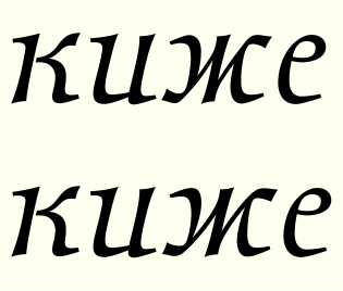
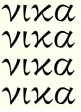
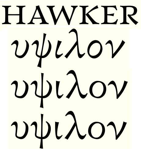
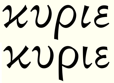
I made a new font. I would call it a text font somewhat in the vein of Electra. It has heaps of OpenType features and it supports lots of languages, including Greek and various Cyrillic-alphabet languages (as exotic as Mongolian).
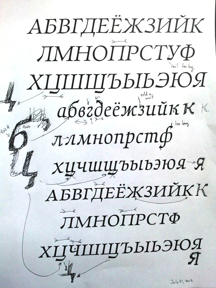
How does it look? I could especially use critique on the Cyrillic and Greek alphabets, but all critique will be useful for me.
| Attachment | Size |
|---|---|
| WalleyeStarts.pdf | 174.26 KB |
| WalleyeStarts2.pdf | 176.74 KB |
| WalleyeBig.pdf | 692.75 KB |
| RomanArchLeadin.pdf | 38.4 KB |
| WalleyeBig2.pdf | 696.48 KB |
| Stannum.pdf | 36.18 KB |
| WalleyeBig3.pdf | 696.77 KB |
| WalleyeBig4.pdf | 705.39 KB |
| WalleyeBig5.pdf | 707.96 KB |
| Upsi.pdf | 68.04 KB |
| WalleyeBig7.pdf | 718.45 KB |
| JustCyr.pdf | 82.46 KB |
| JustCyrBold.pdf | 79.67 KB |
| JustCyrAll.pdf | 133.07 KB |