i would like to take the opportunity and ask for some advice/corrections in regard to the following project:
a while ago i had downloaded the free font "say it fat" by timo titzmann -- http://www.id84.de/type/say-it-fat/
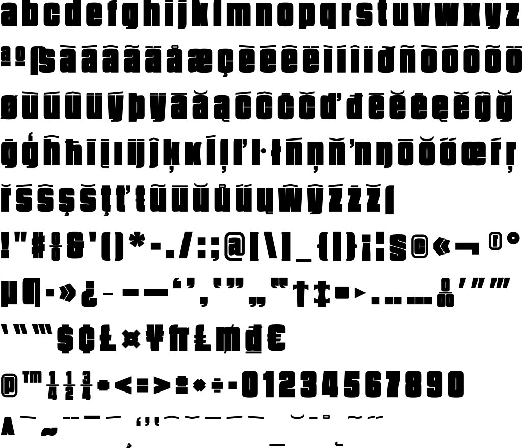
while i like the style a lot, the original is very basic (~95 glyphs). i thus decided to overhaul the typeface and have completed the following codepages (the font is lowercase only):
0000 - c0 controls and basic latin
0080 - c1 controls and latin-1 supplement
0100 - latin extended-a
cyrillic is almost completed and greek and vietnamese latin are in the works, too. however, as this is my first font work proper and i am no type designer, there are loads of issues -- but it's a start.
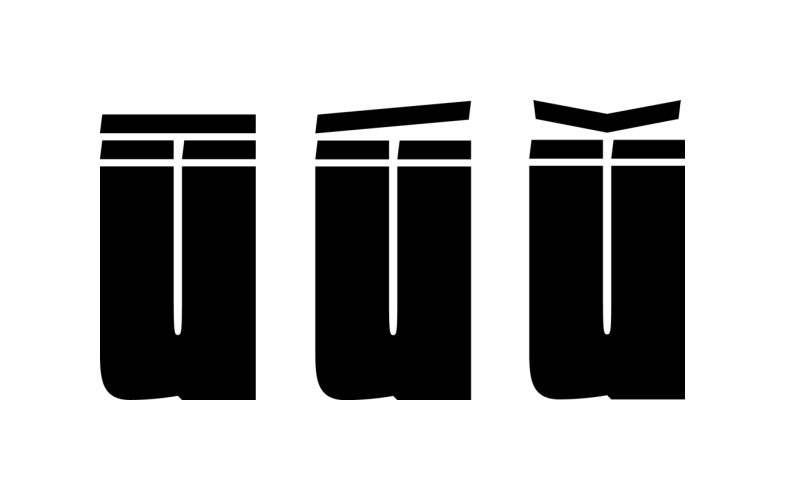
-> đ and ħ need to be worked on, but the low ascender is a big problem here -- suggestions on how to handle it are very welcome. it would also influence the design of the cyrillic glyphs ћ and ђ.
any feedback, tips, and/or help is appreciated (weird looking characters, inconsistency in design/appearance or the like).
the original author has been contacted and has expressed interest in a possible update.