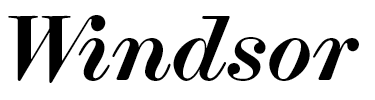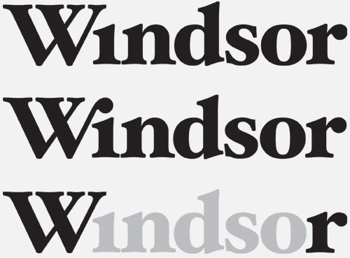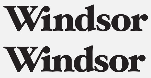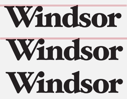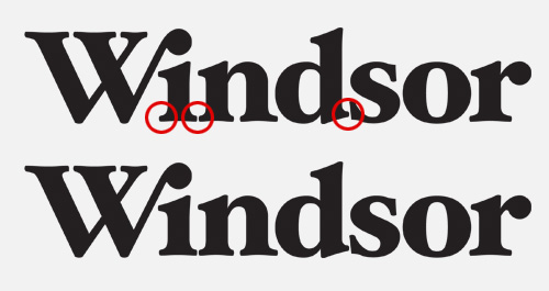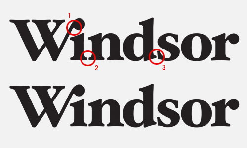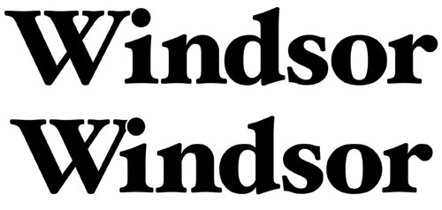
I'm working on a new project for a conference based in Windsor, UK. I'm experimenting with faces like Hoefler Black but I'm struggling with the spacing and kerning between the first two characters of the word Windsor. I'd like tight kerning on the whole word but as you can see with the basic example image (above), the upper case w seems disjointed from the remainder of the word causing an imbalance (to my eyes at least!).
Any input, help and advice from all you Typophiles would be appreciated.
weemac