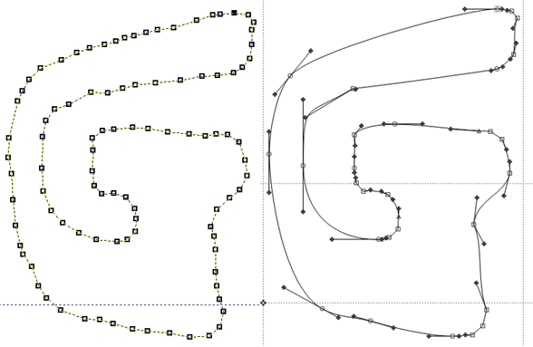
At Typekit, we've had to turn away several really nice typefaces because their amount of detail equates to significant file size. Especially type with a built-in sketchy or distressed look. They're just too large, and cause too long a wait as people browse Typekit.com and the websites that use these fonts.
Solid versions of such typefaces might help, as might editing the details a bit. Are there strategies for simplifying overly complex letterforms? Have type designers had to consider file size in this way before?