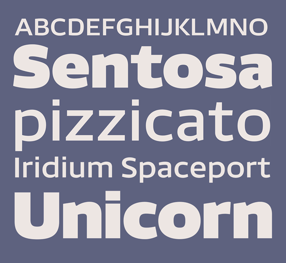
To me, the top one is nice but not fantastic. Carnet on the other hand IS fantastic. So, blending it with a 'nice but not fantastic font' is not really worth it. Sure, it's a quick way to get an extra typeface, but I don't think it actually adds something. Just something I notice in Carnet:
Because the descenders are so short, there's little room for your g. It looks to me as if it has a smaller pnt size. Maybe try to make it wider, or just go for a single story g. Hope this helps.
Polyester is a 'blended' sans that came about through experimenting with interpolation. I took two other fonts I'm working on and did a 50% blend, tidied up the stray points and here's the synthesis. (Top is untitled techy sans, bottom is Carnet, also up for crit in this section.)
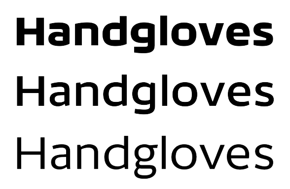

I'd be interested to hear anyone's thoughts and/or recommendations.
| Attachment | Size |
|---|---|
| Polyester.pdf | 484.75 KB |
| Polyester Full Glyph Set.pdf | 903.04 KB |